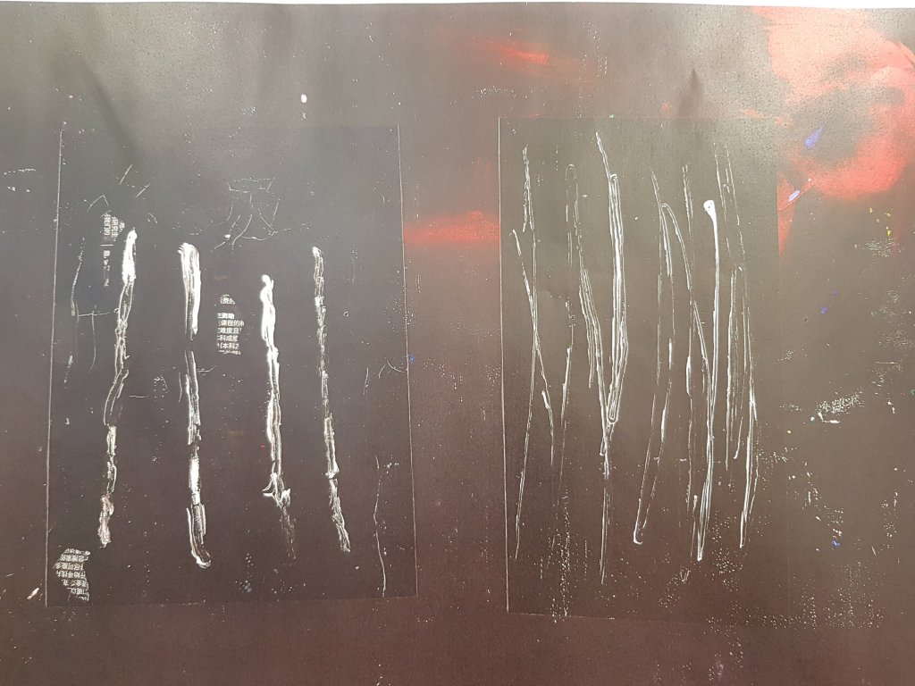
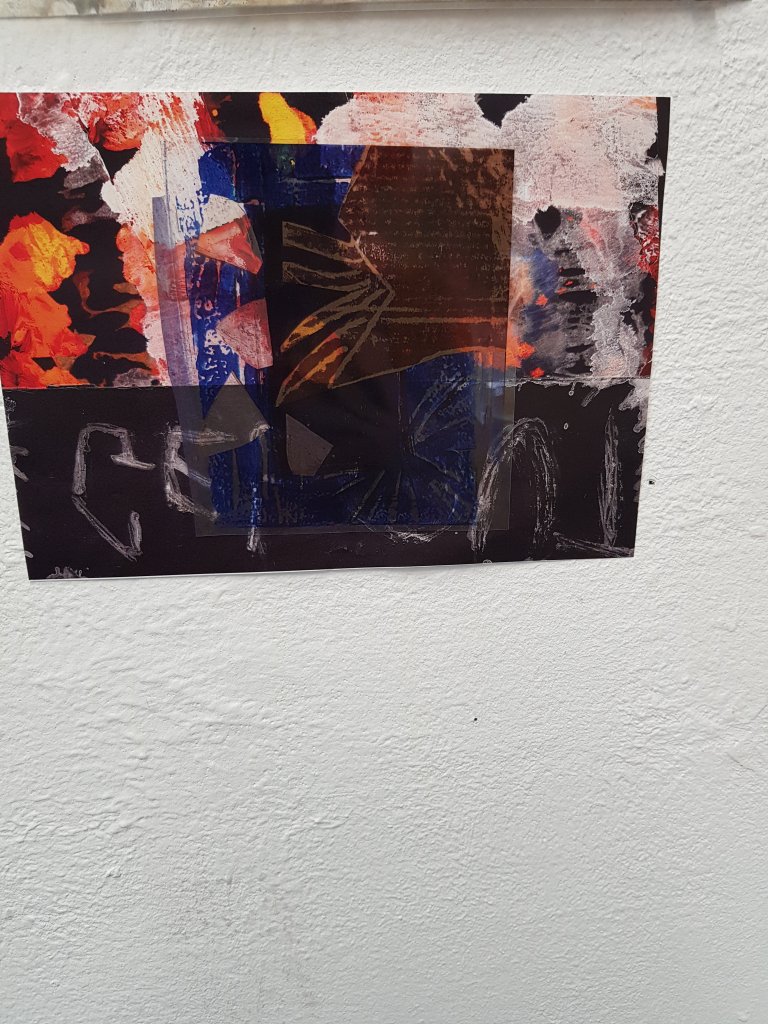
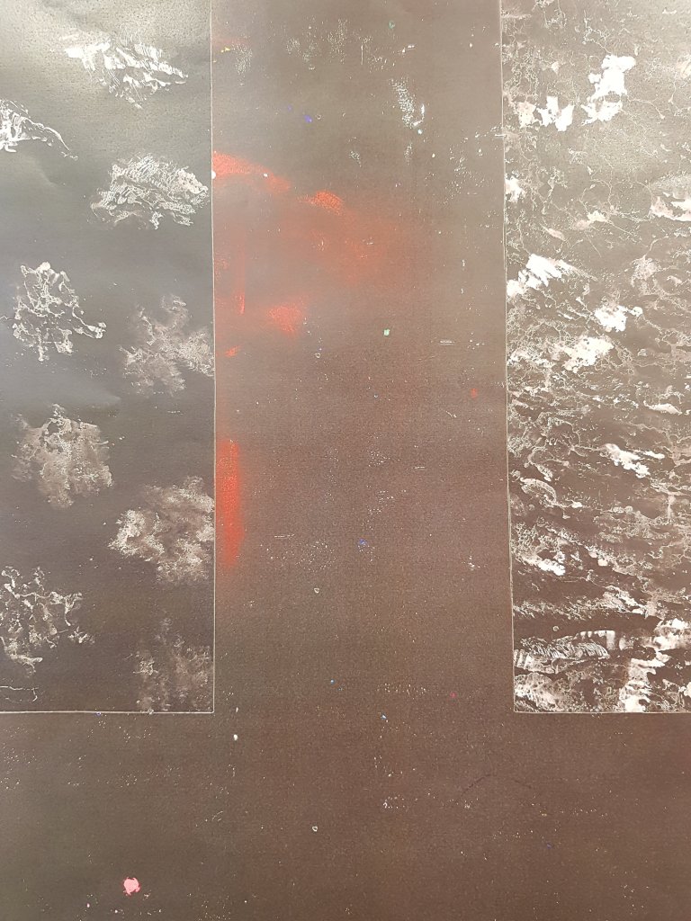
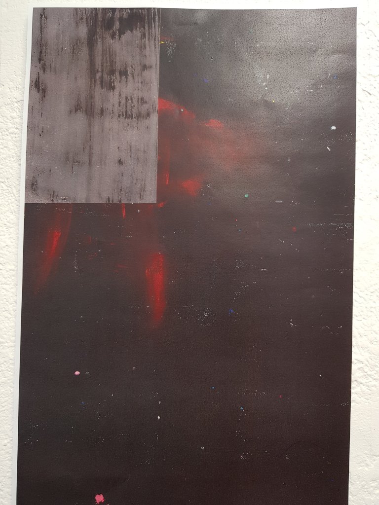
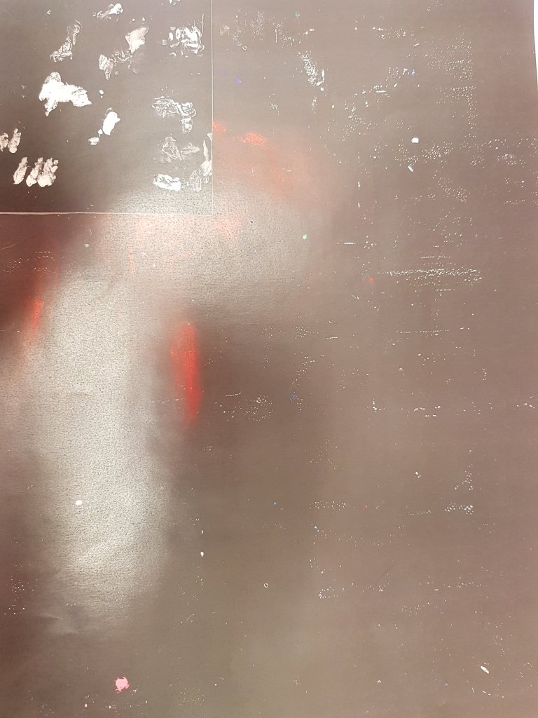
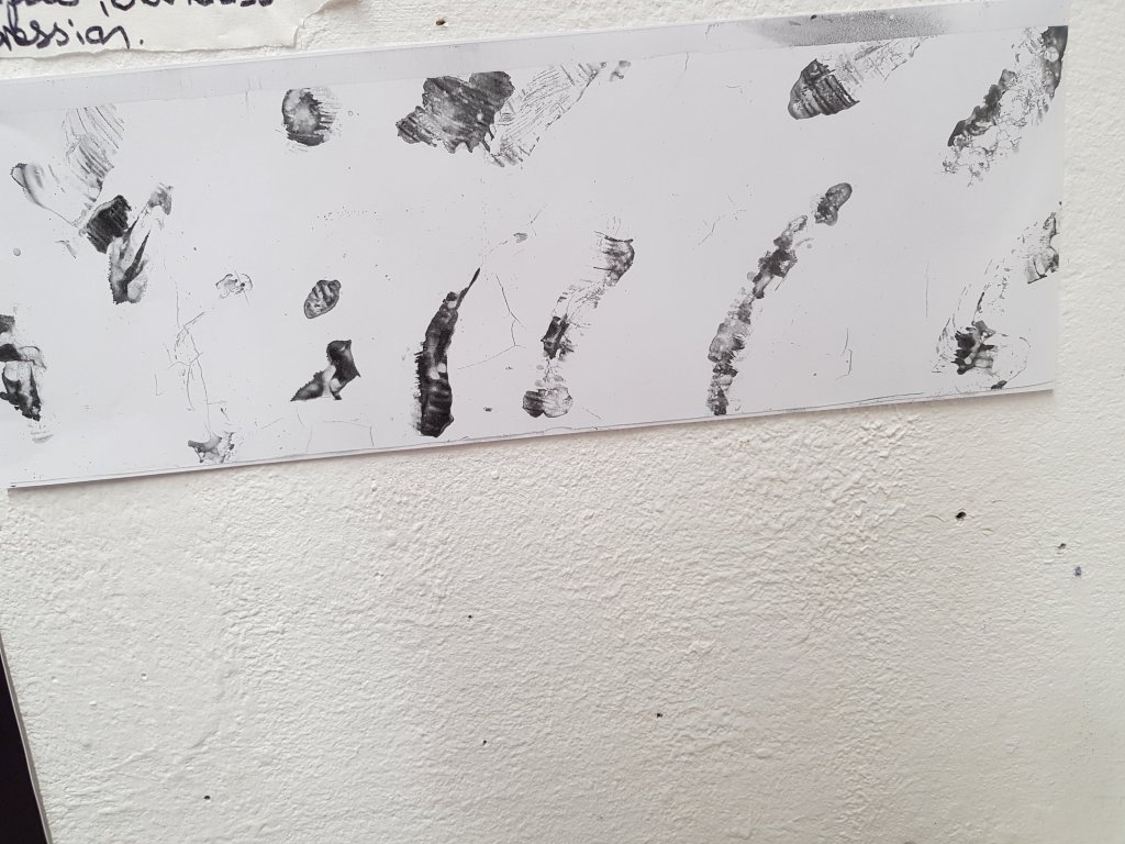
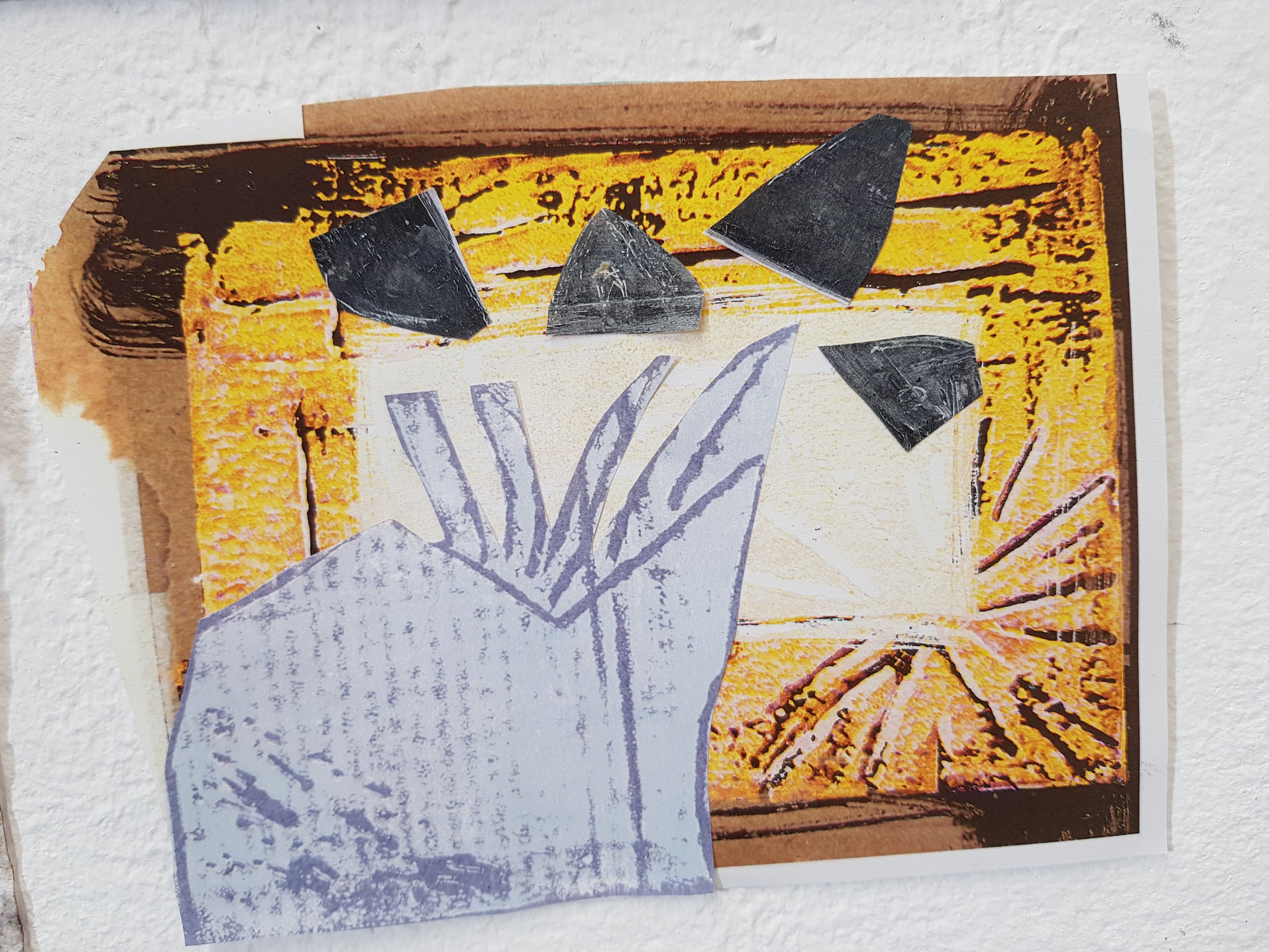
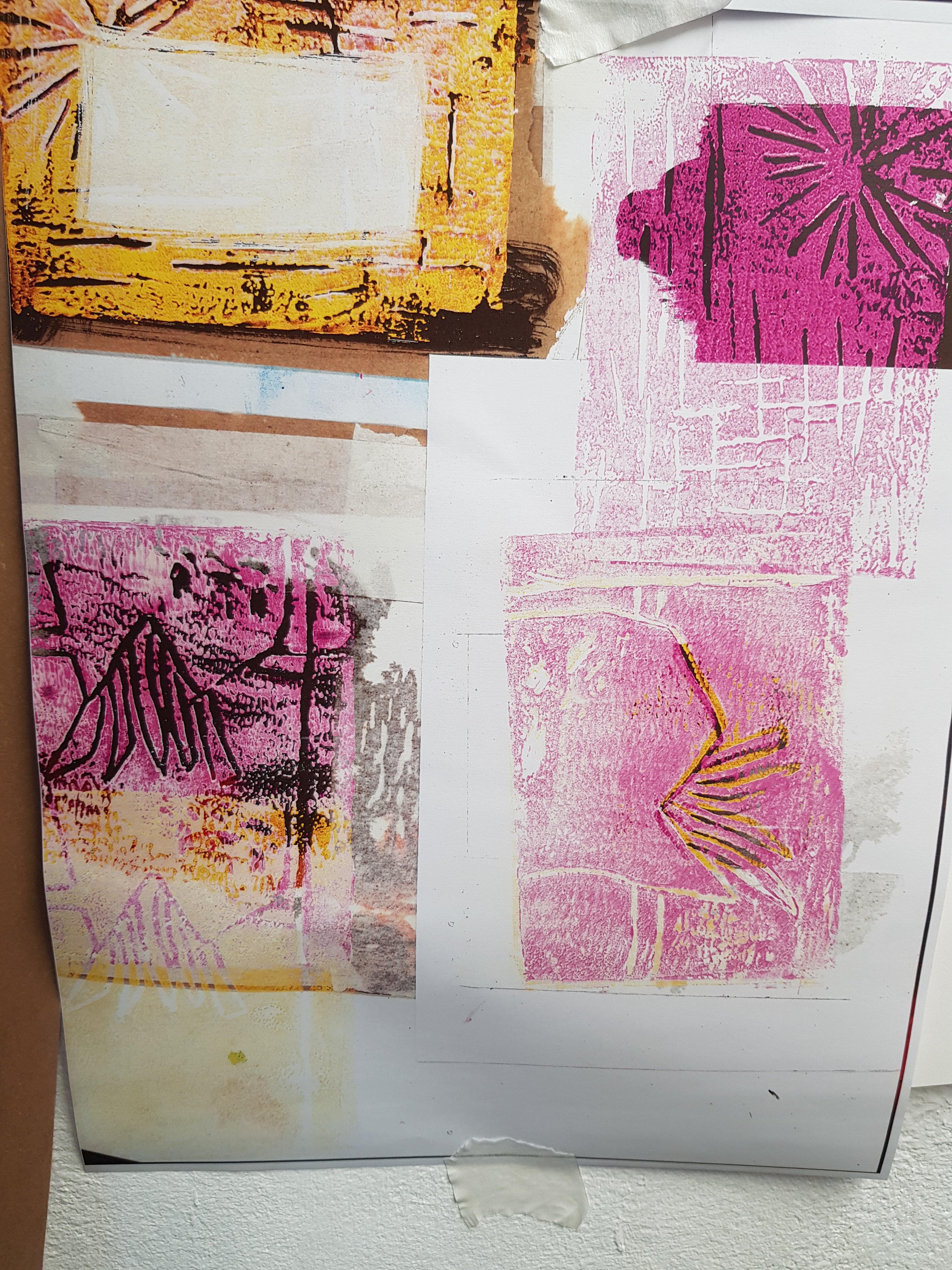
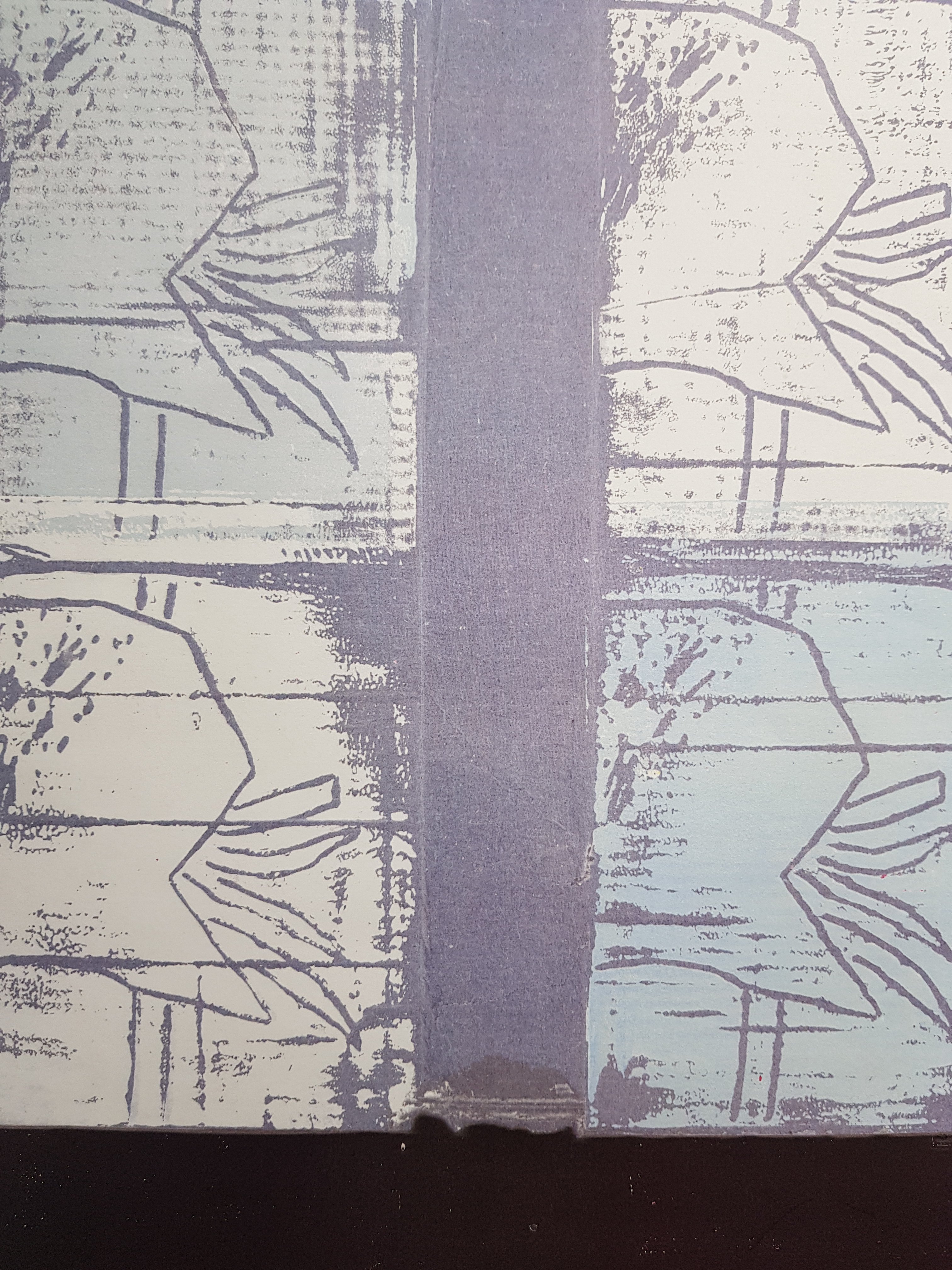
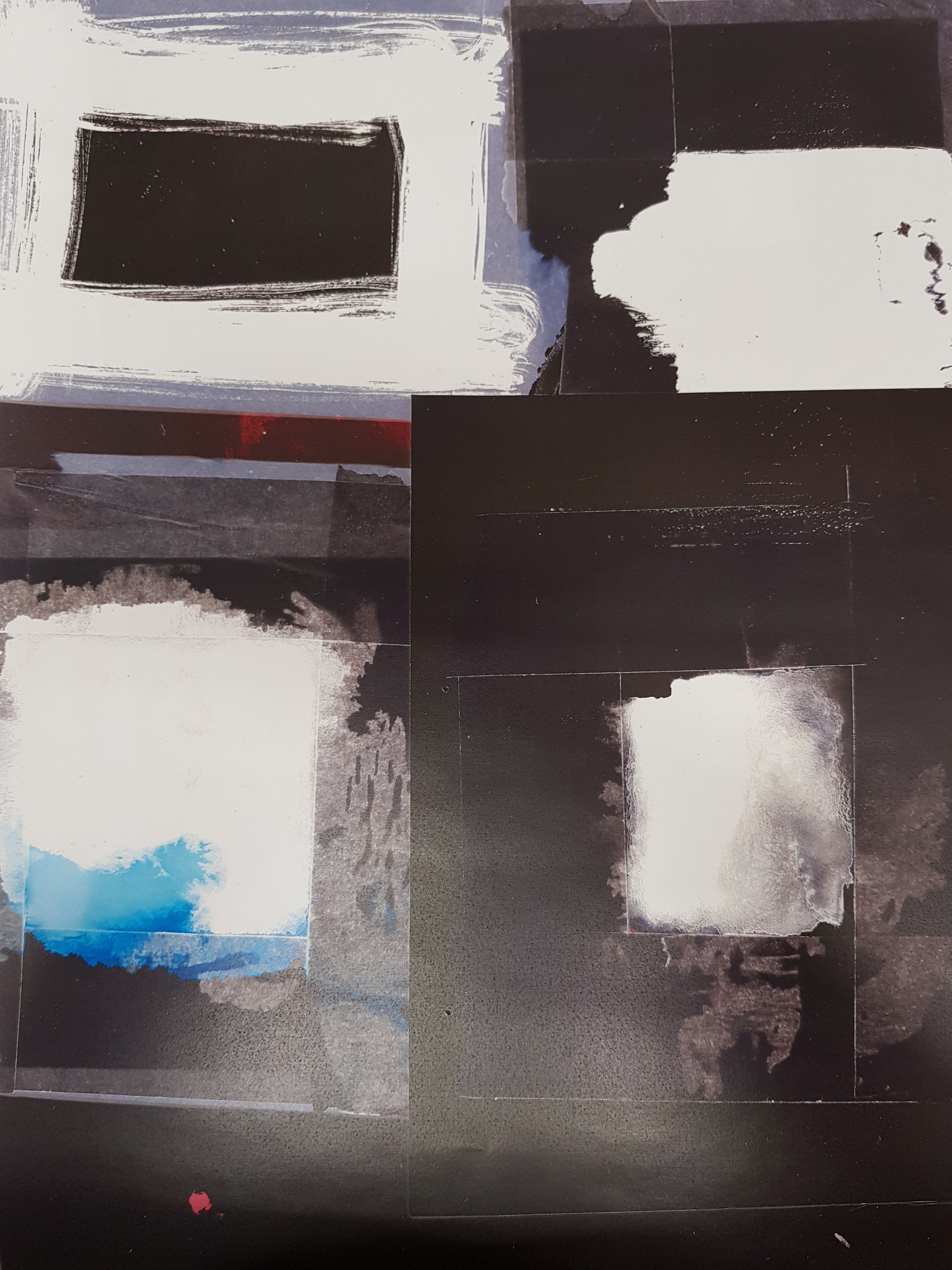
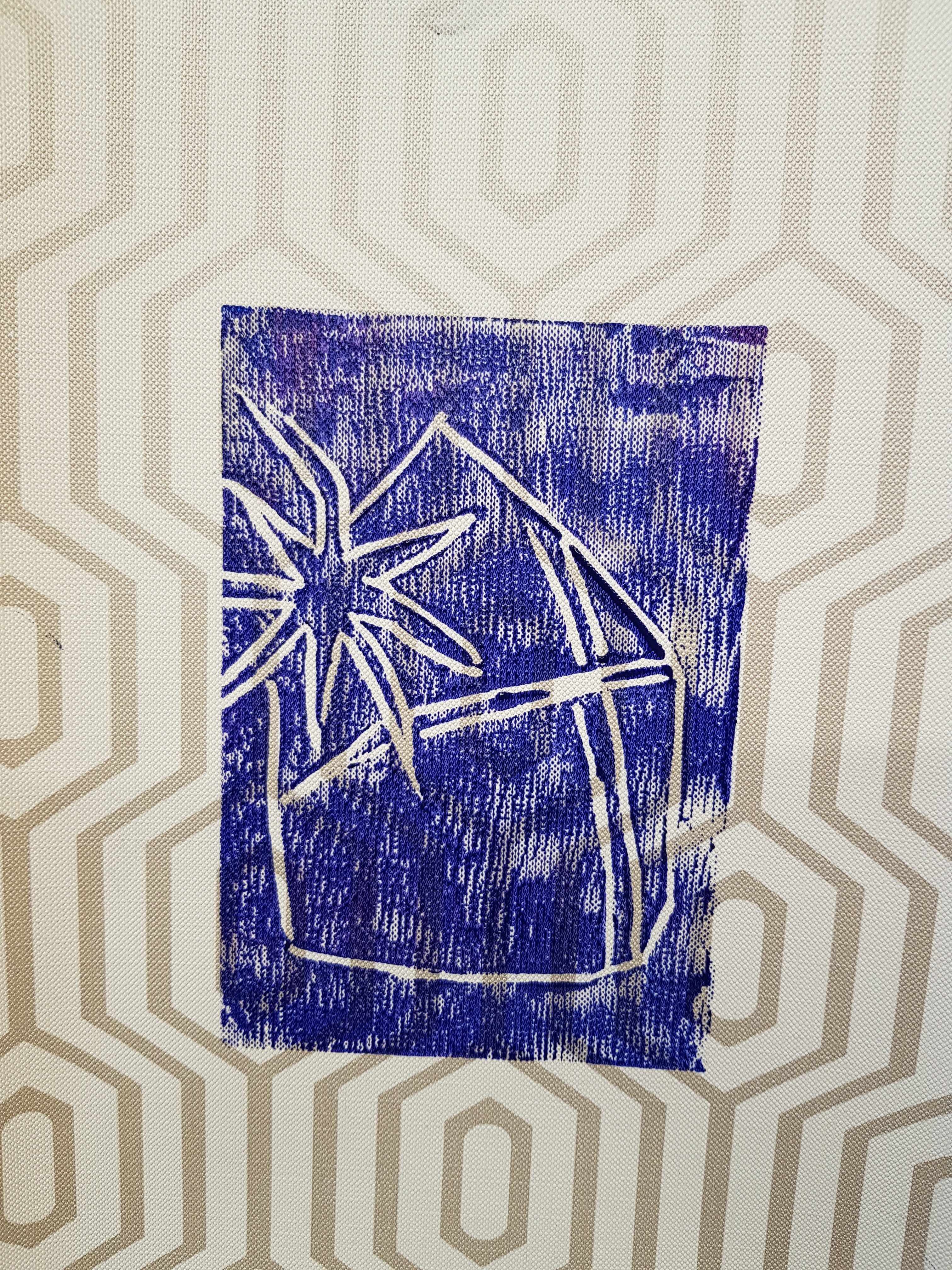
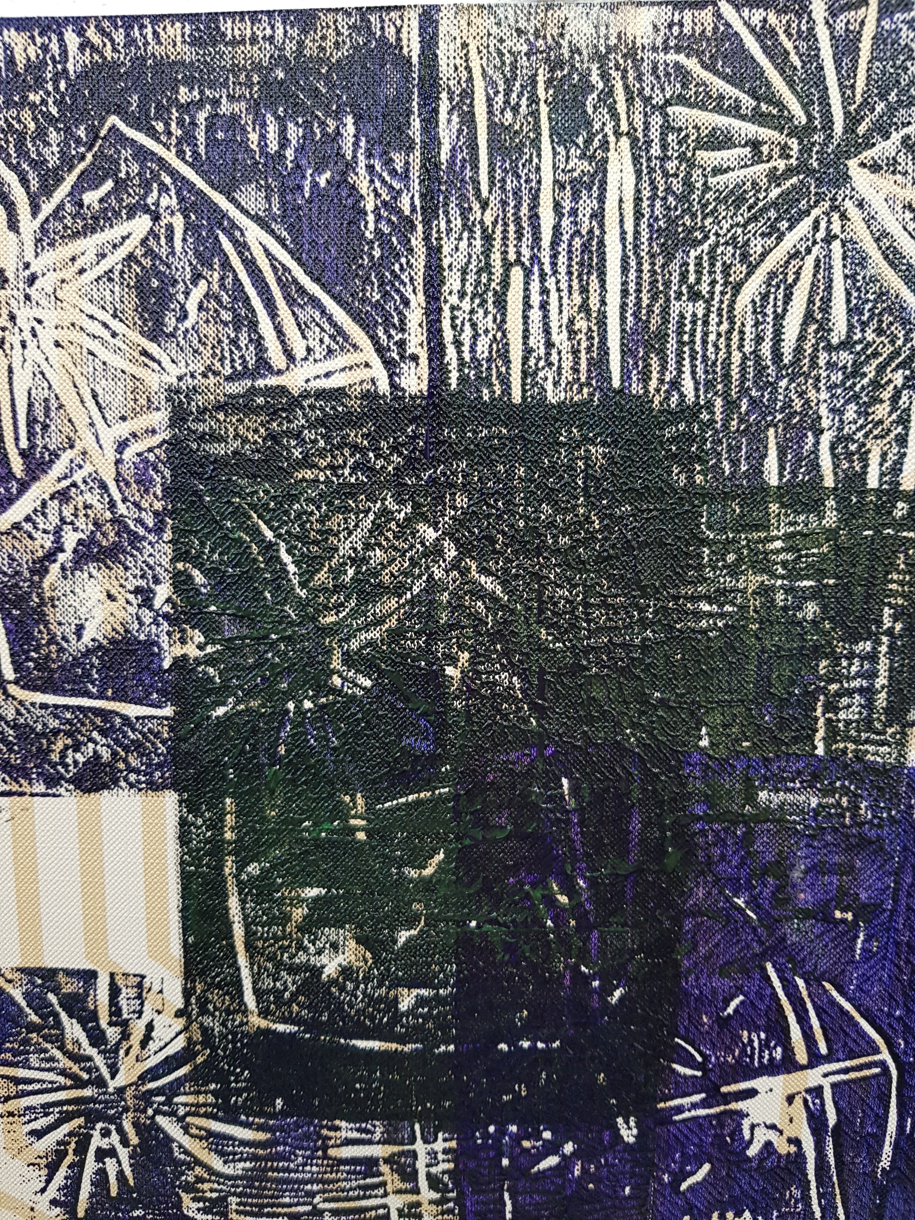
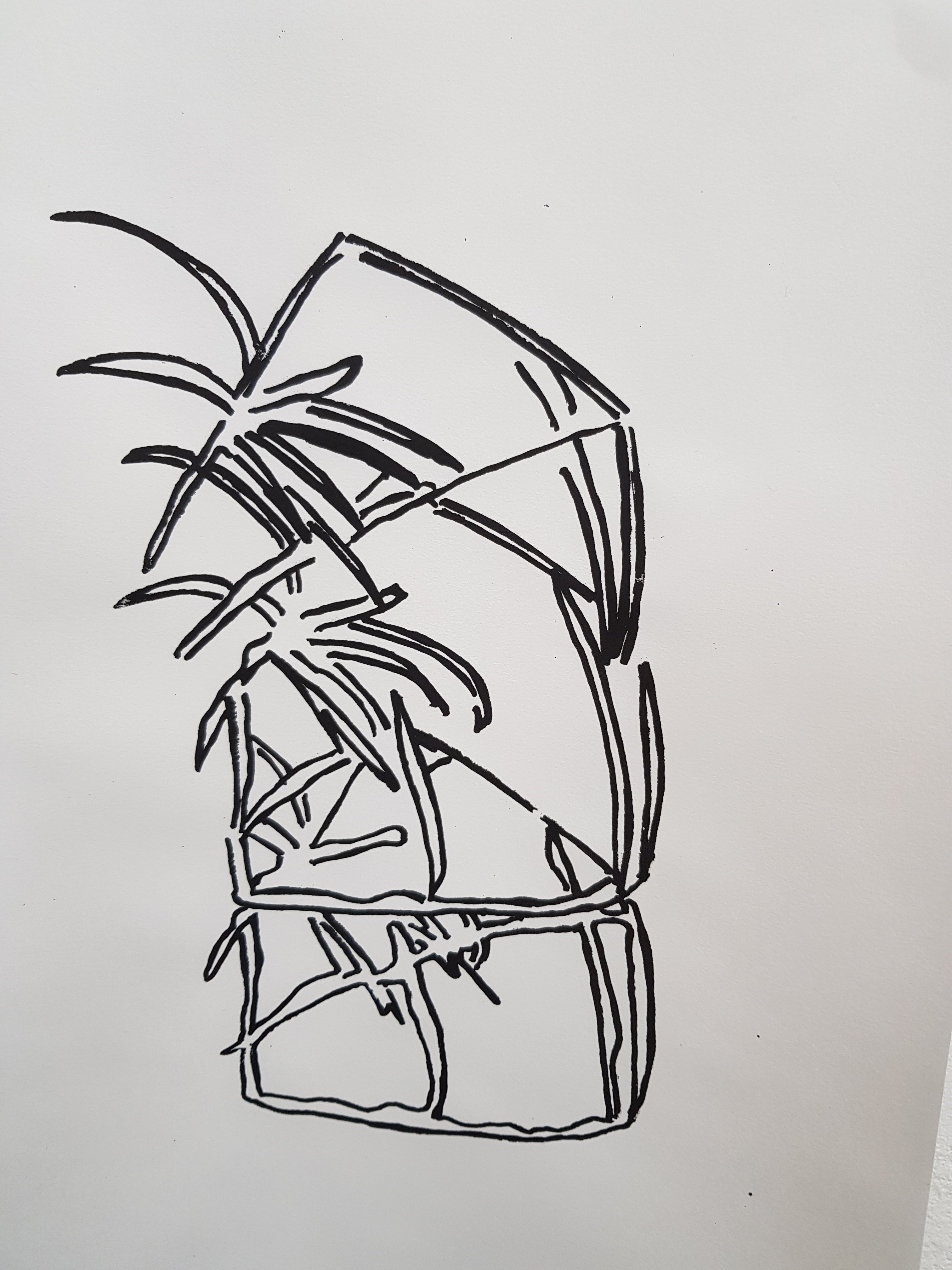
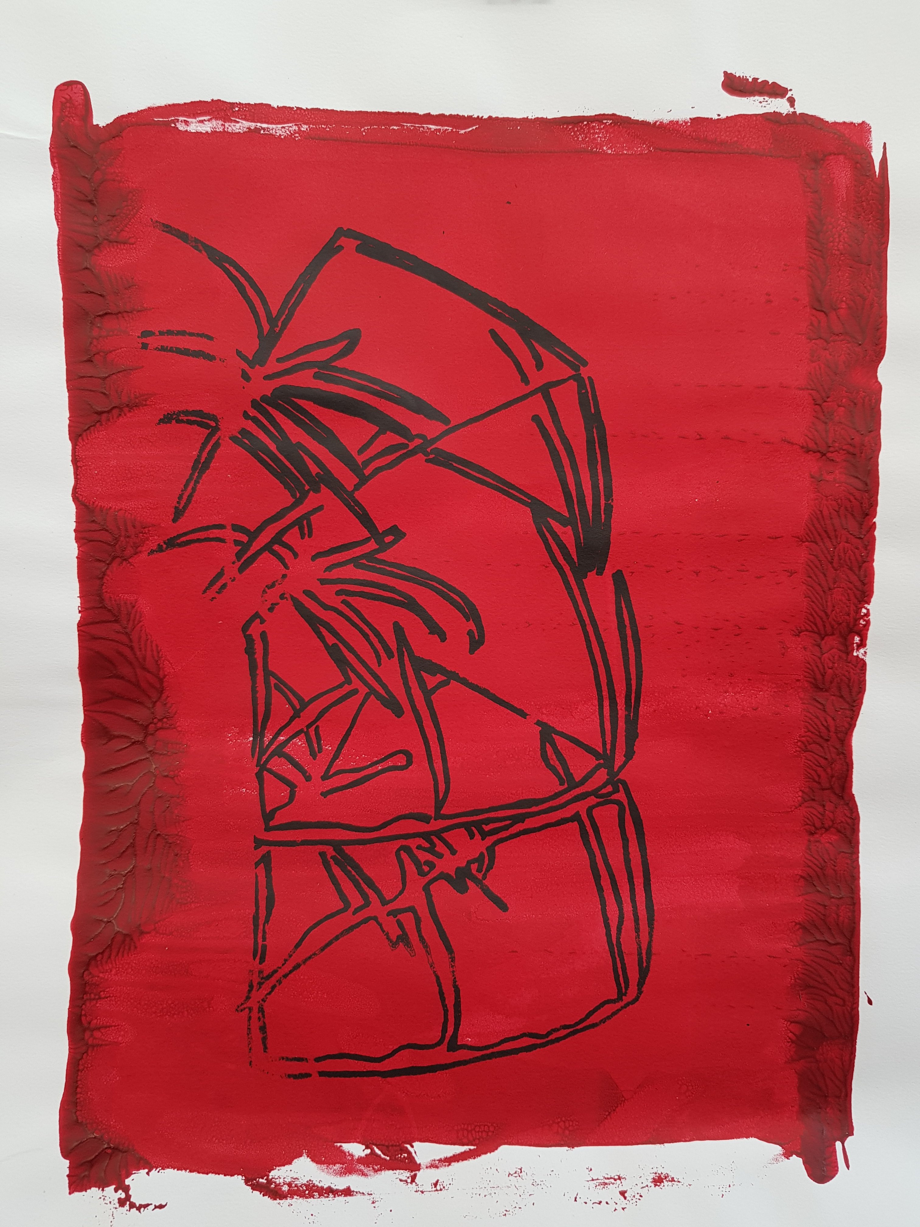
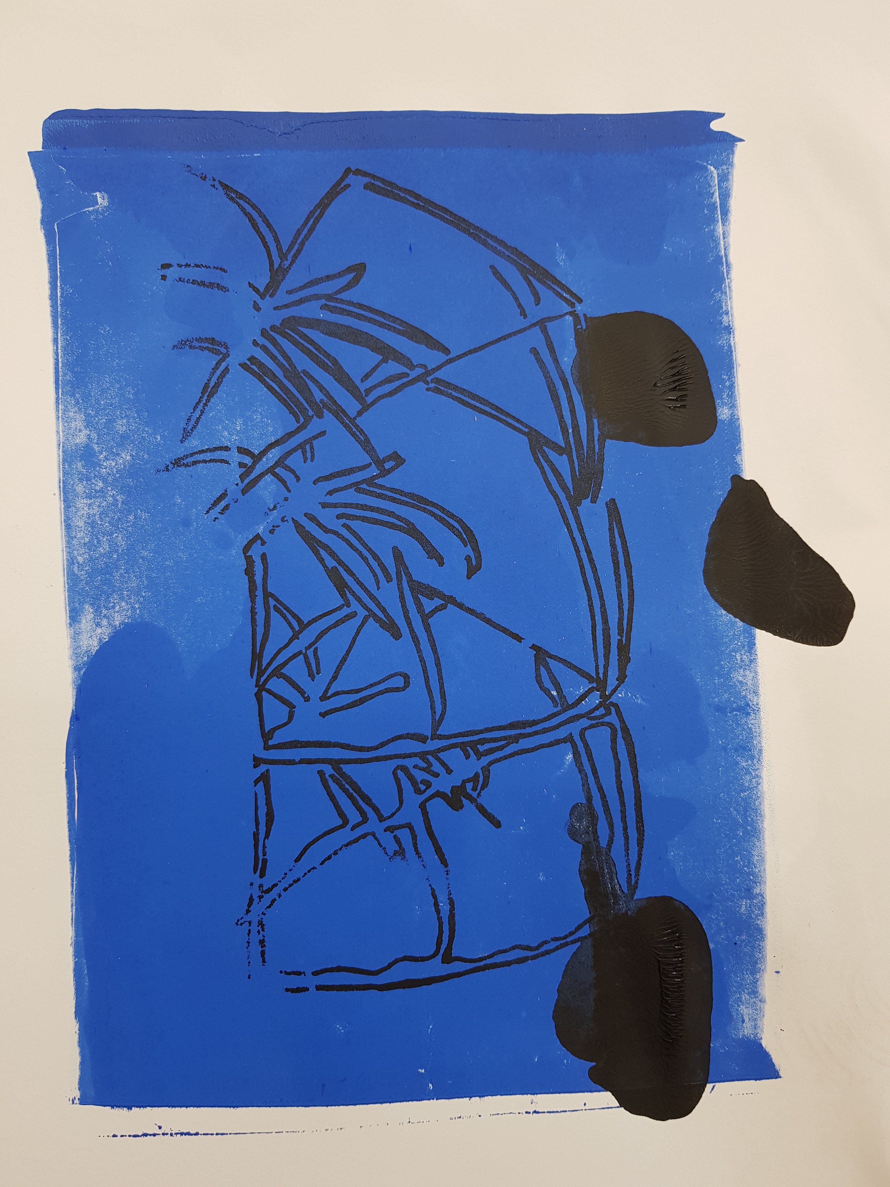
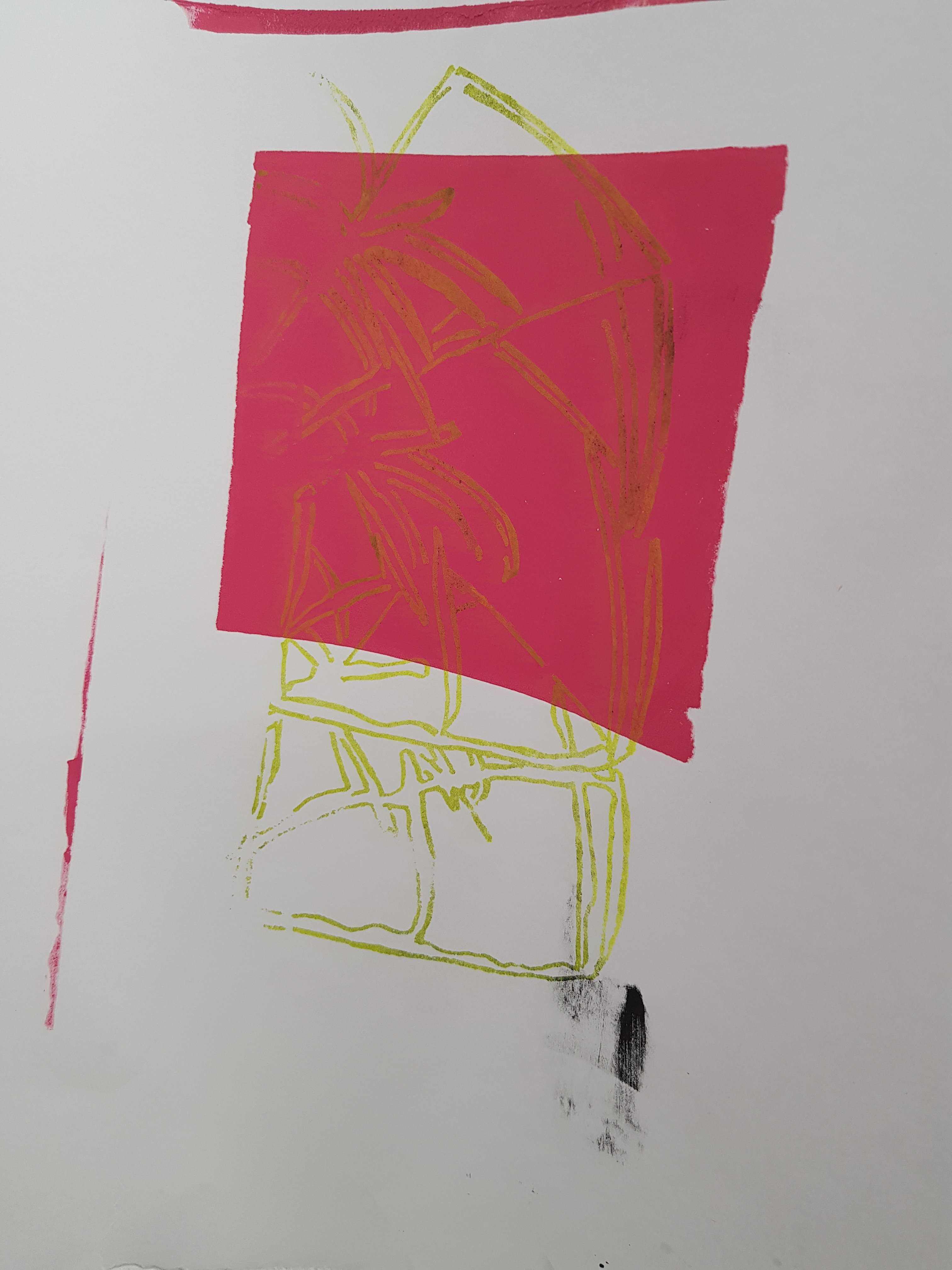
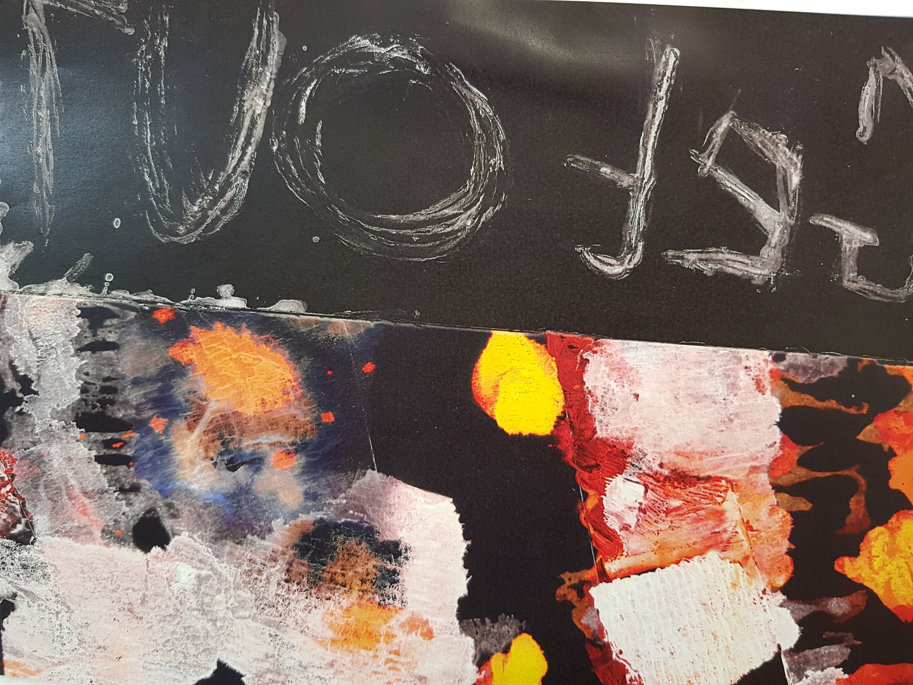
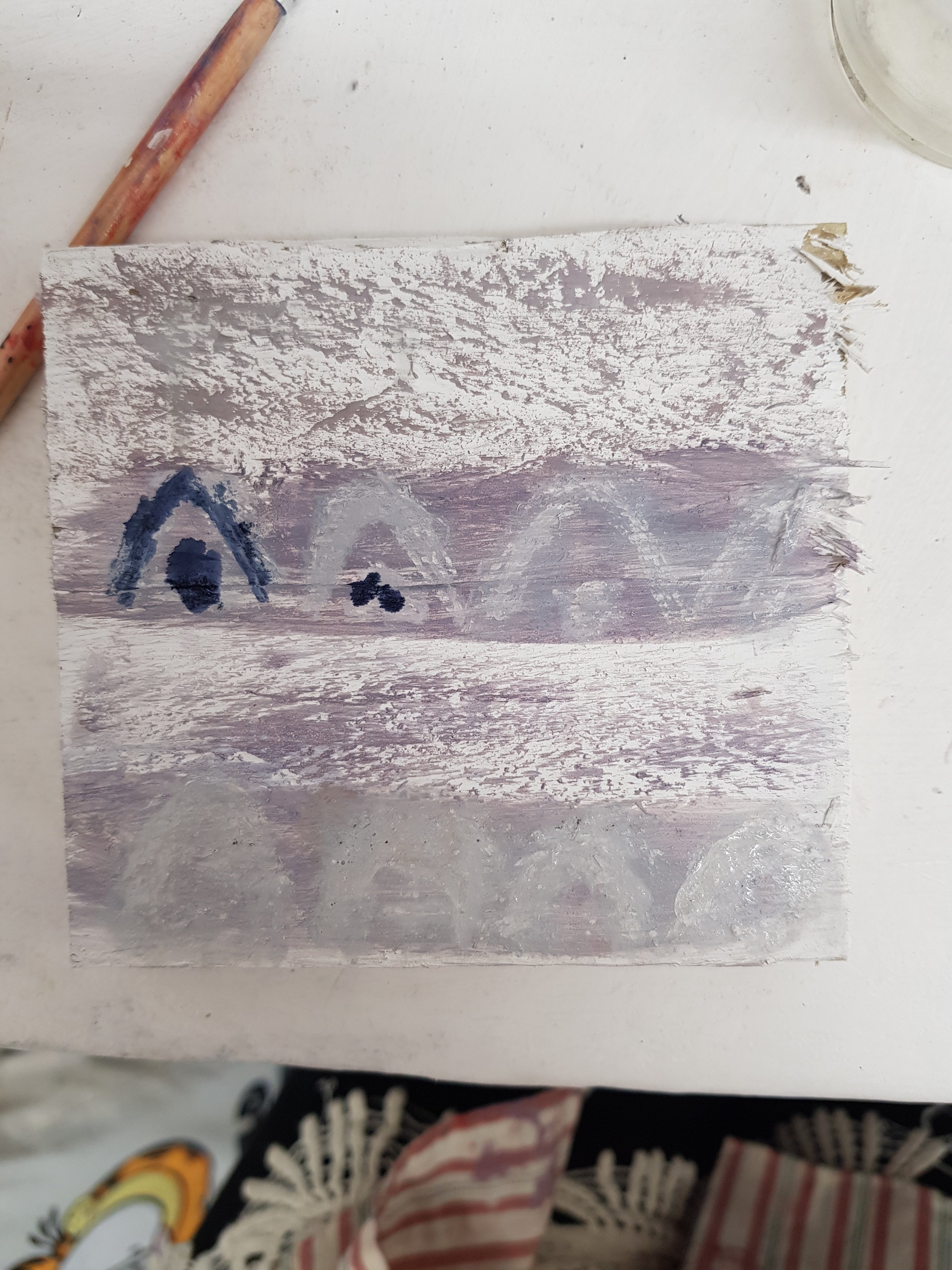
Today I took my emulsion and ink experimentations from yesterday and photocopied them using the reverse to negative effect on the photocopier.I experimented with the placement of the pieces trying to give the effect that they were floating through the void. Inspired by Kasimir Malivich’s work I decided to use abstract shapes amongst mark making
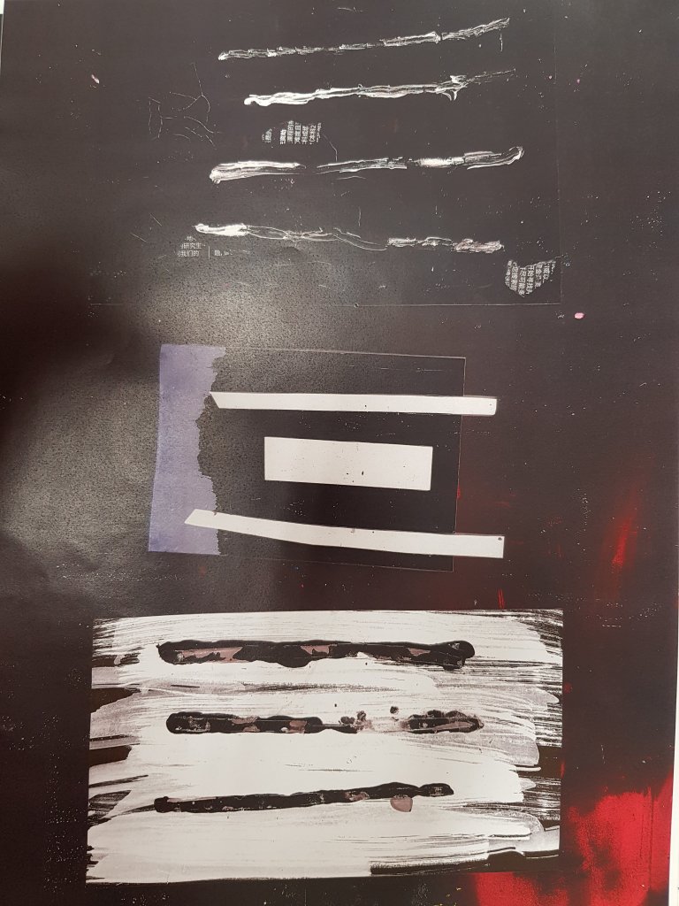
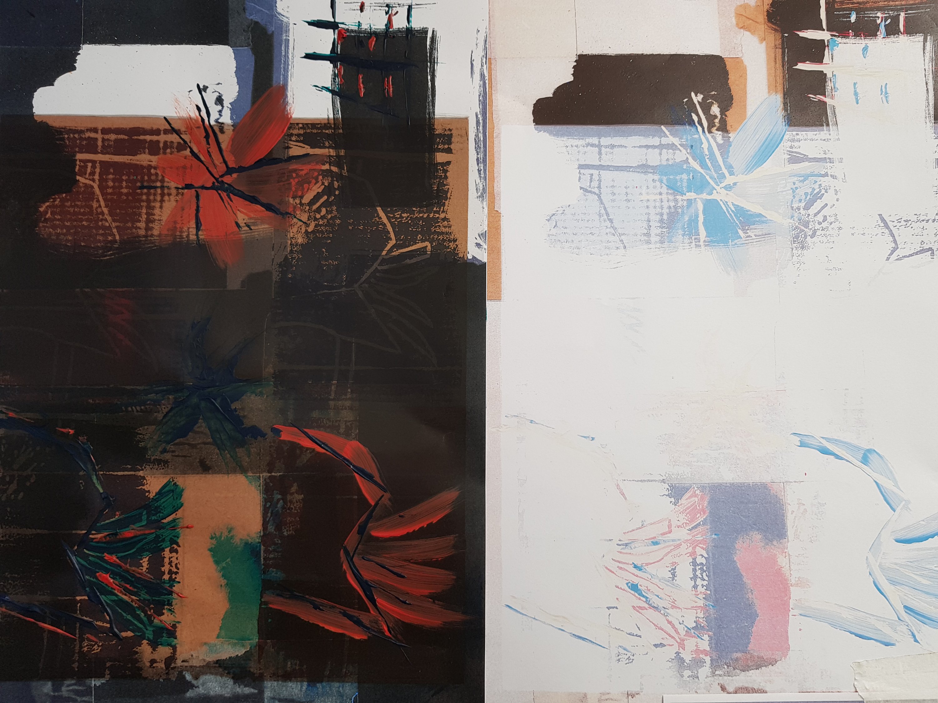
I decided to use lines in some of my experimentations to resemble claw marks/frustration at the system.A feeling of despair and hopelessness floating within an empty void being ignored by the system,public etc etc.Experimentation with Acetate.I like the way the bright colours make there way throught he dark acetate but I feel like this piece may be too ‘busy’ with colours and shapes and not the minmalistic abstract approach that I am looking for.However I really like the effect the acetate has and hope to use it when looking at more of a resolved piece
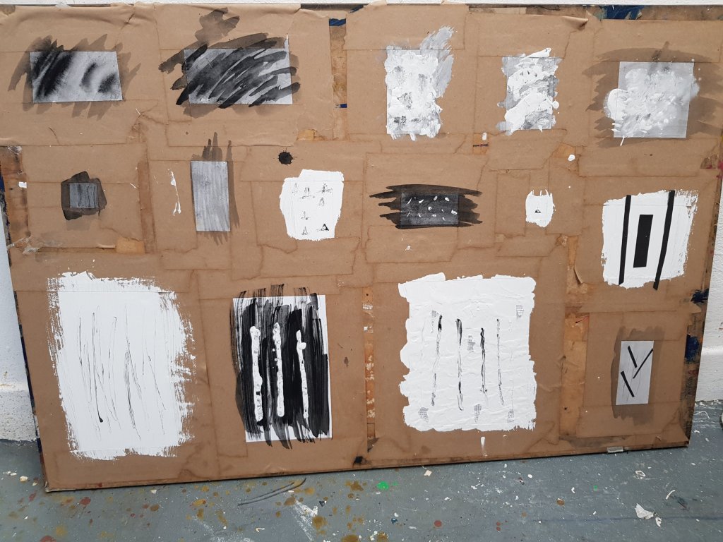
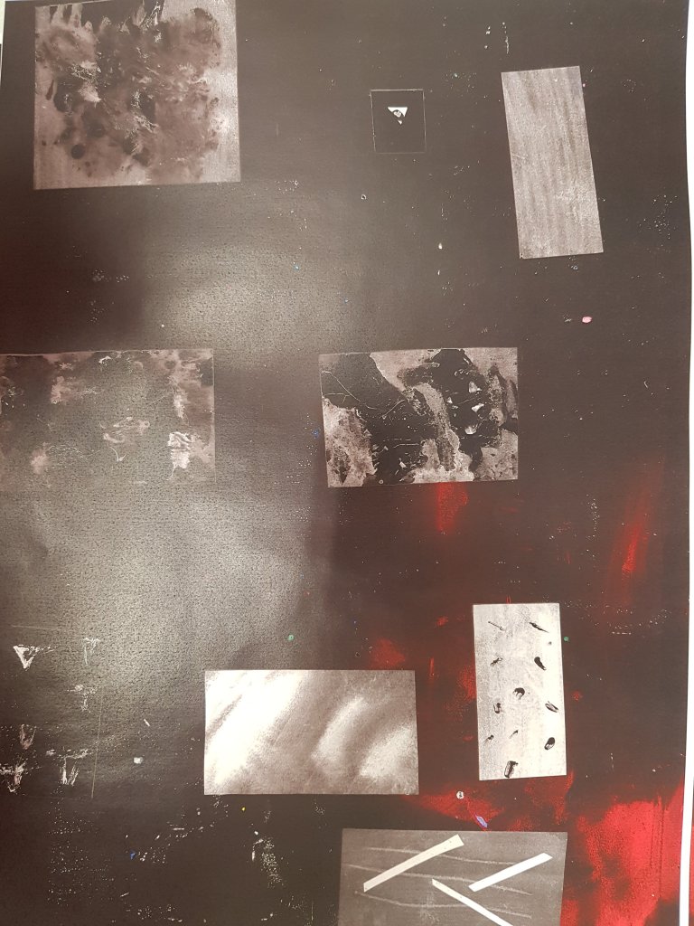
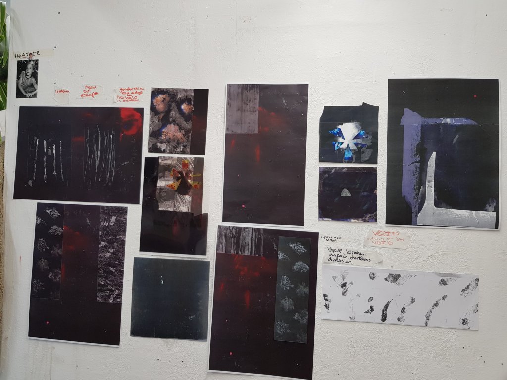
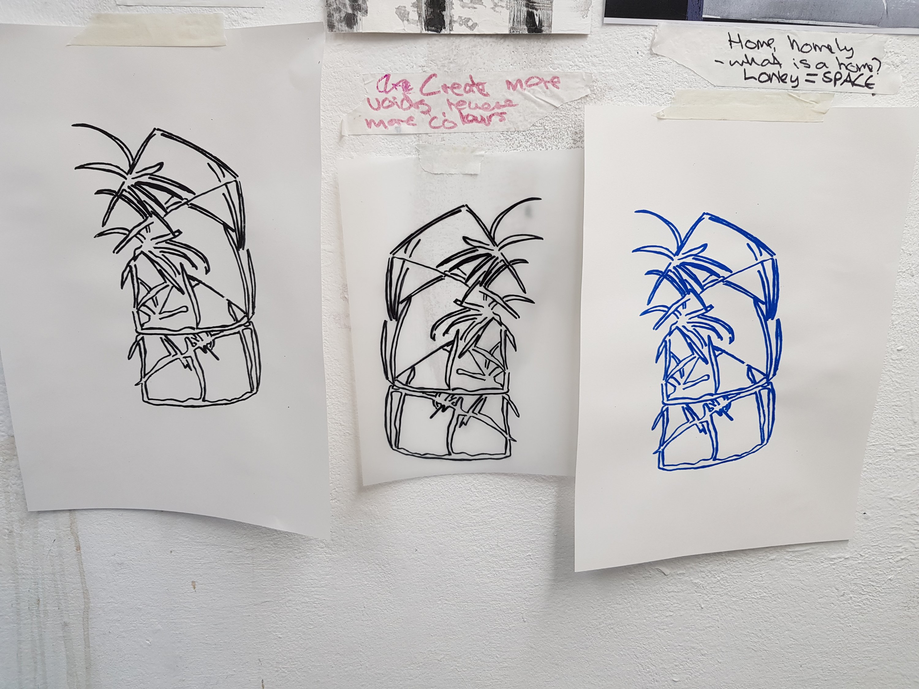
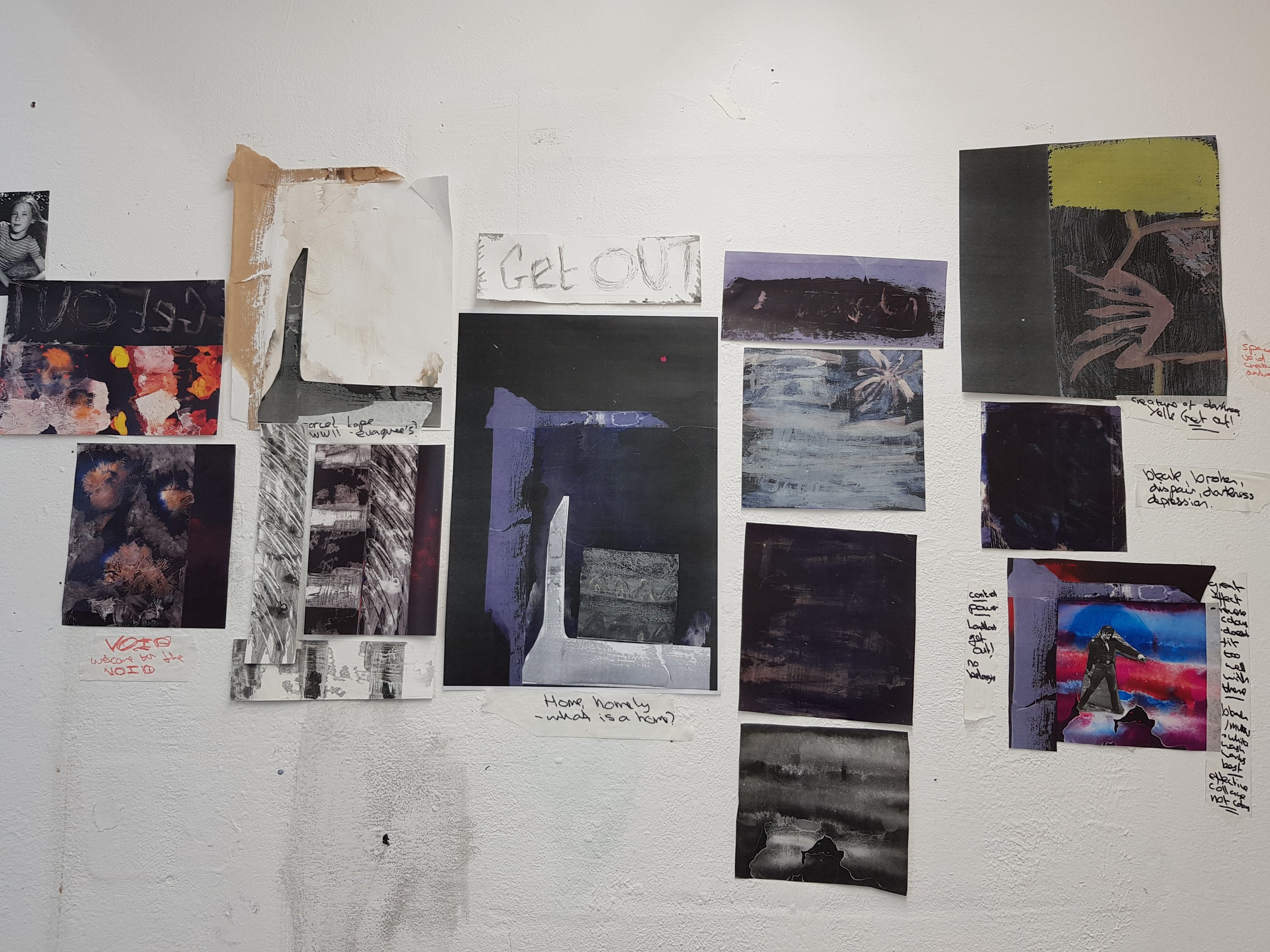
Decided to pin to my wall the more sucesssful pieces and think of how these can be brought forward into a final piece.
I think most pieces turned out how I expected them to.
After a discussion with my tutor,we tried to look at what direction my work was going in and which direction I wanted to take it in.
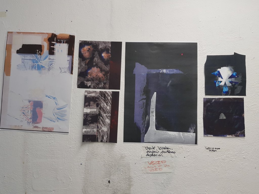
Altho aesthetically I liked my collage work I felt like it was too ‘busy’ and did not reflect the core of my subject.I decided that it was time to refocus on ‘the void’.Advised by my tutor I took down all my collage work from my studio wall and moved it to my other wall so that I could still reference it if need be.
Reflecting back on my work I also realised that the more minalmalistic work worked better and the darker tones.Since my usual style is anything but minalmalistic and full of contrasting colours I decided it would be good to challenge myself.
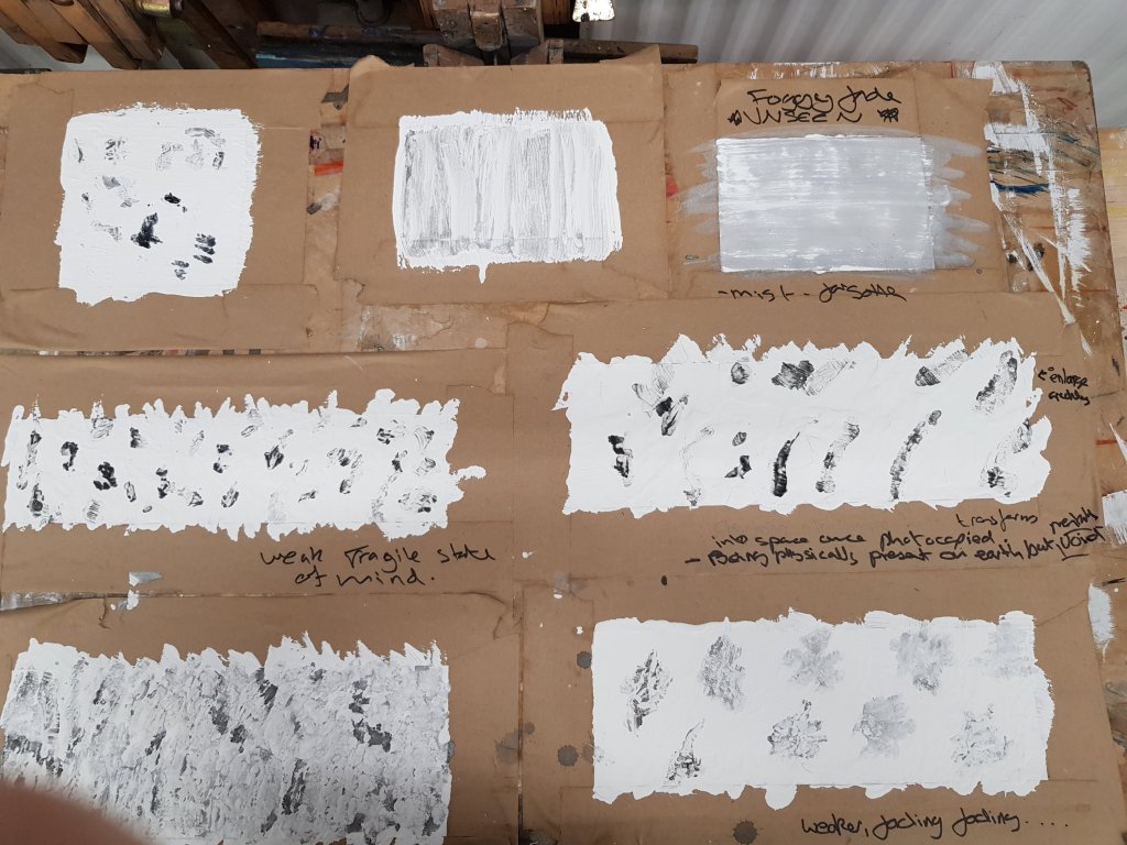
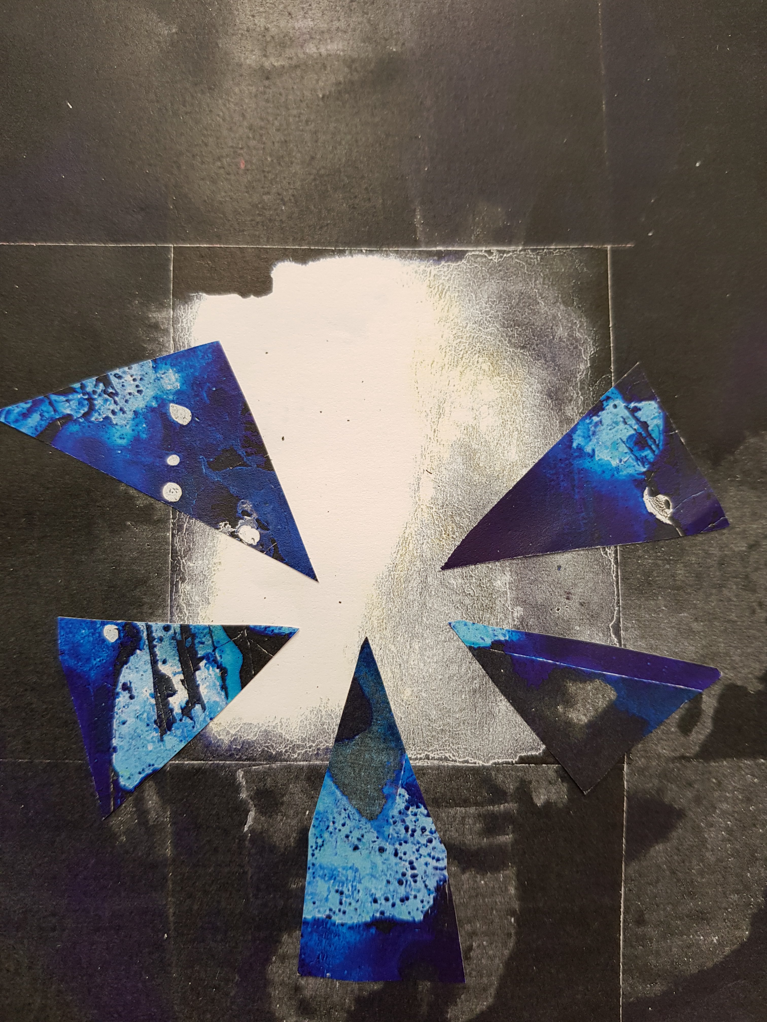
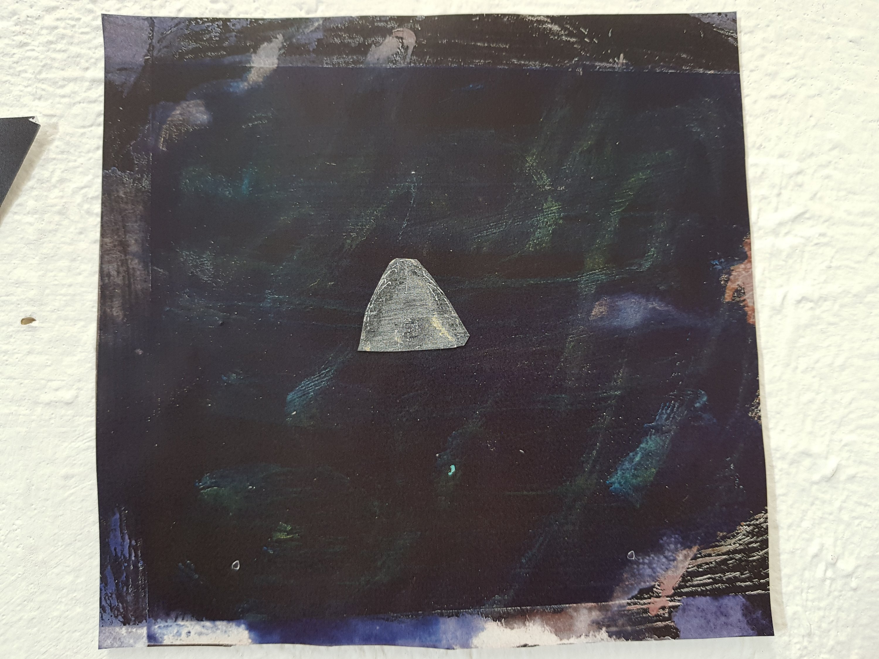
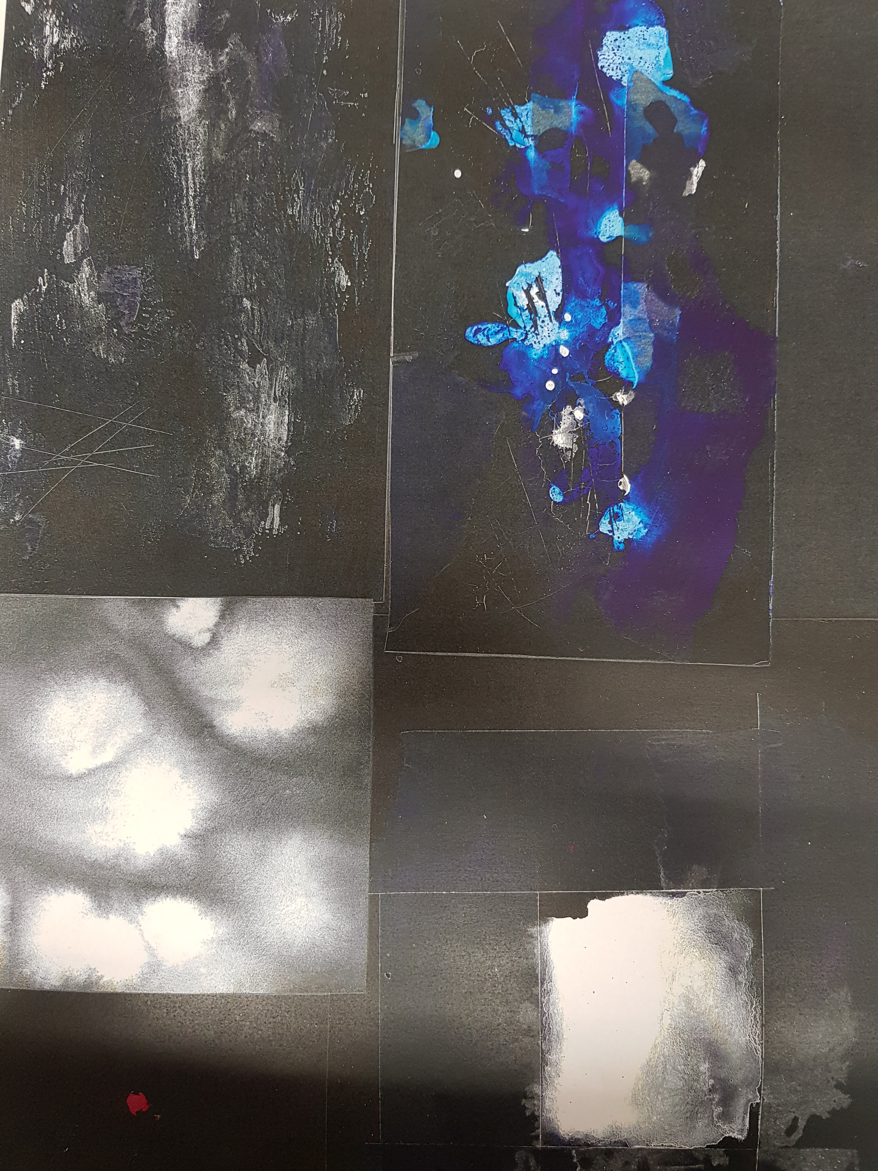
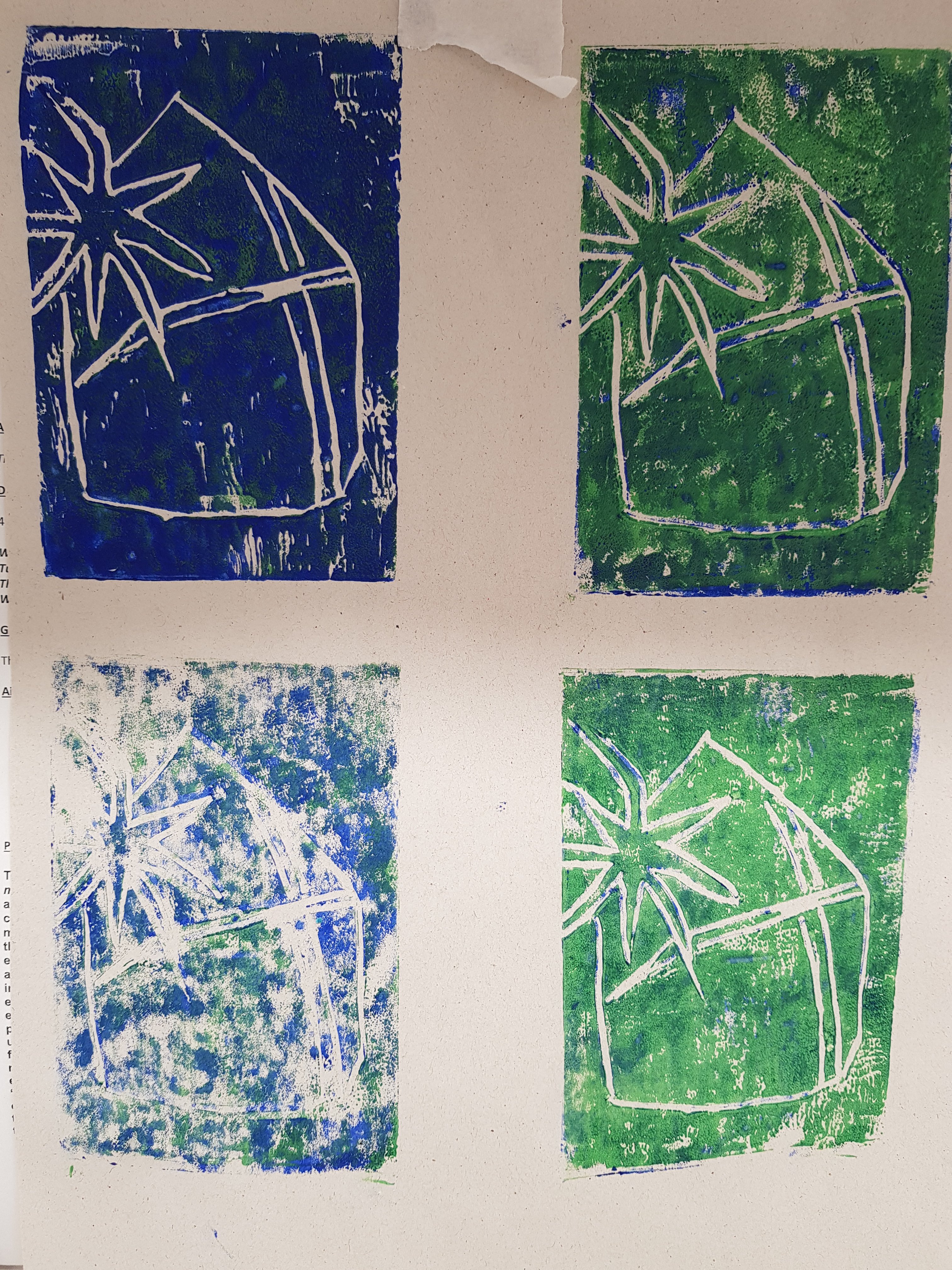
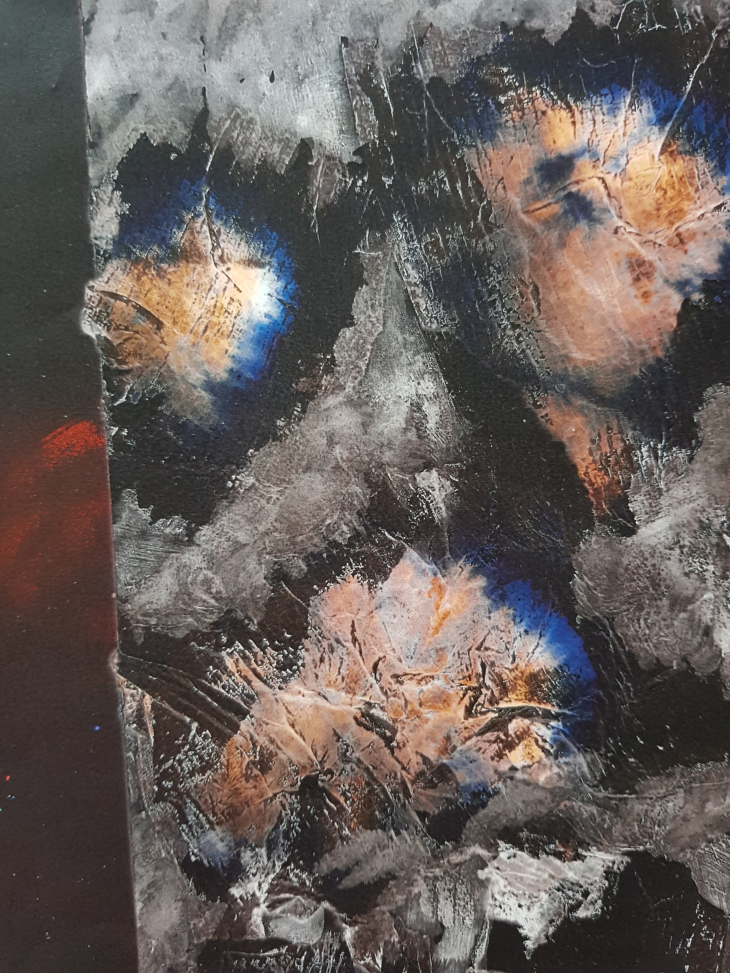
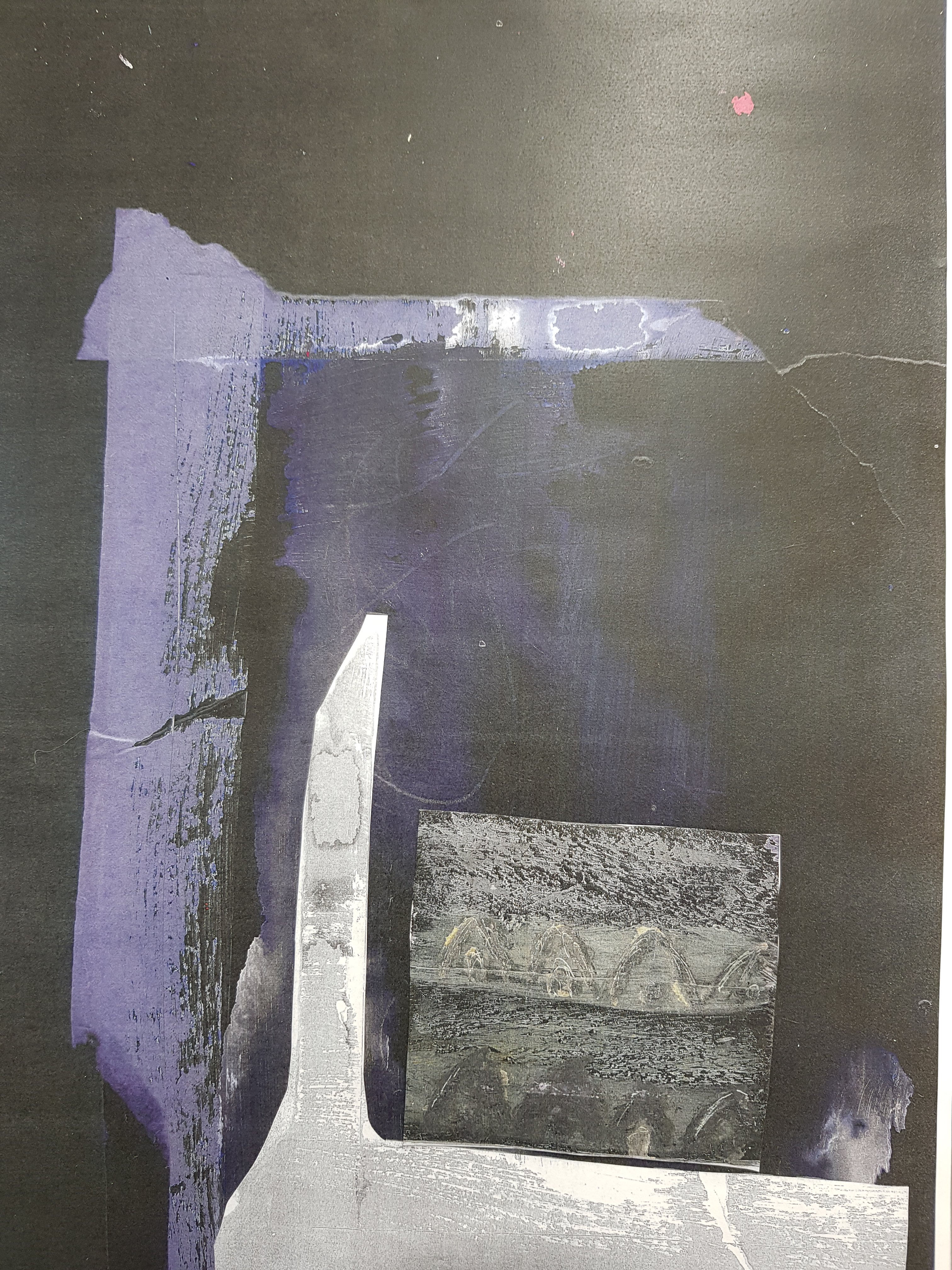
The work I decided to focus on was my mixed media photocopied work.I intend to make a series of developed works focusing on this feeling of ‘void’ but continuing to use emulsion paint and ink aswell as abstract shapes.I want to focus on different tones of dark and light and experiment with the use of it.I like the kind of ‘heavenly’ glow that appears from the darkness in my photocopied piece of the ink with blue triangles.I also aim to work on a variety of different scales.Ideally I would like to work on a very large scale but I don’t think this would be very realistic due to the timescale.And does it really need to be large in order to create a feeling of being in some kind of void?There is also the possibility that I focus all my time souly on that one piece and it doesn’t give me the desired effect in comparison to the variety of works I could produce working on smaller pieces.
A couple of minmalistic works I have looked at for inspiration are:
Black square also fits in well with the black forboding backgrounds giving the spac elike appeal.I really like the texture that black square has.
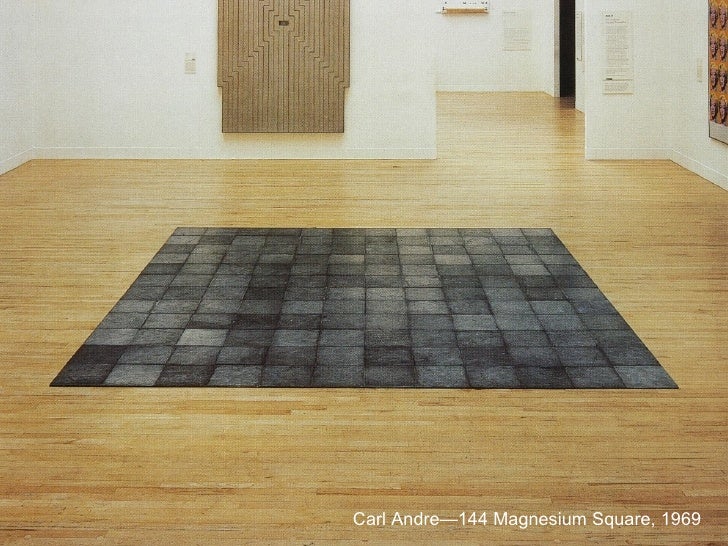
Donald Judd Unititled 1972 Altho this is a 3D piece there is still a feeling of ‘void’ about it.A kind of ‘Is it empty is it full?’ question I feel is raised when you see it in a photographic form.I want my piece to be minimal but evoke a feeling of emotion from the audience. Carl Andre-Magnesium Square. I like the different tones of the squares and the way they reflect in the light.Dan Flavin ‘Momnument’ This piece reminds me of my ink piece with the light coming through.I also like the use of the oblong shapes creating a feeling of movement within the darkness.
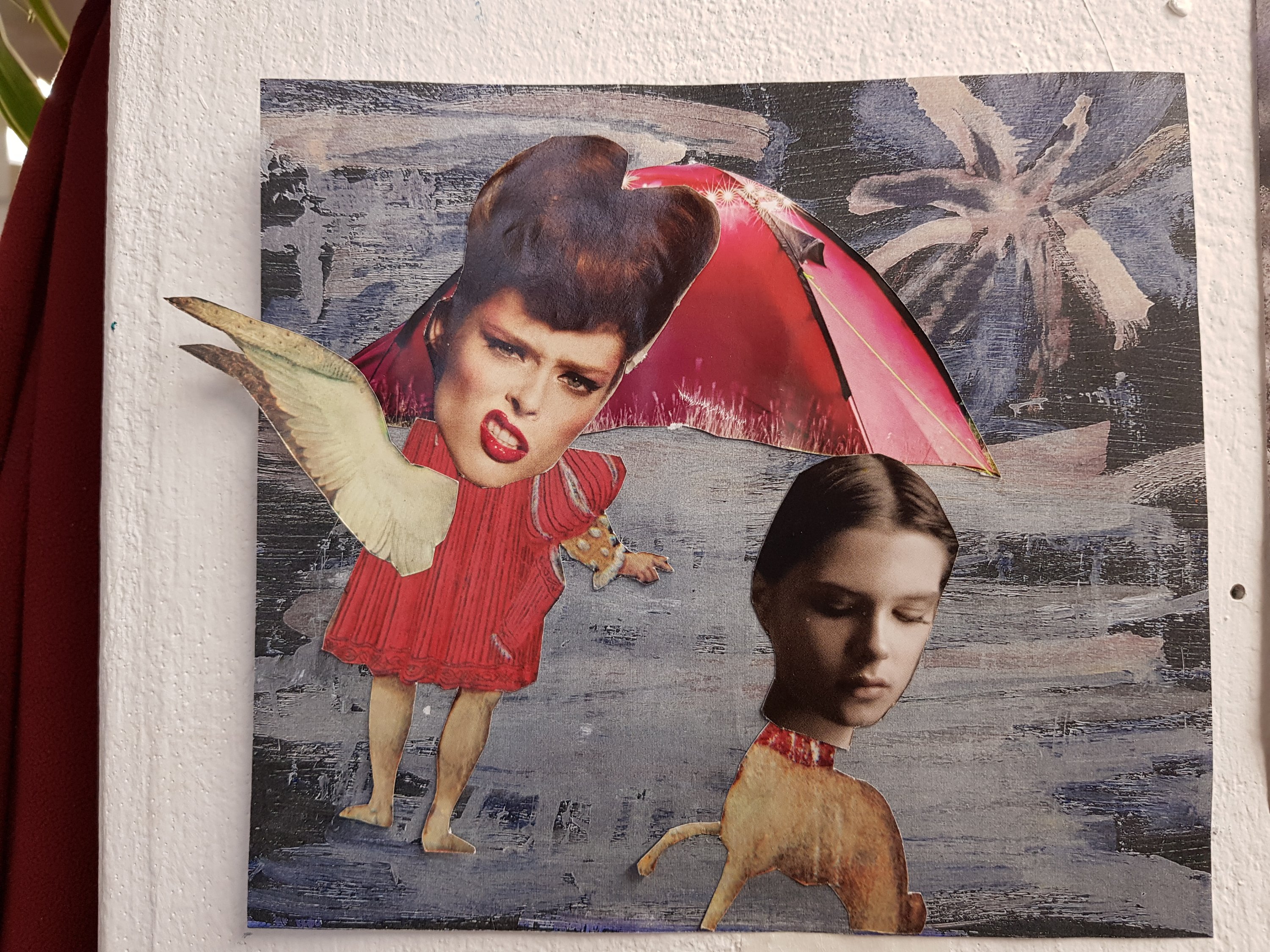
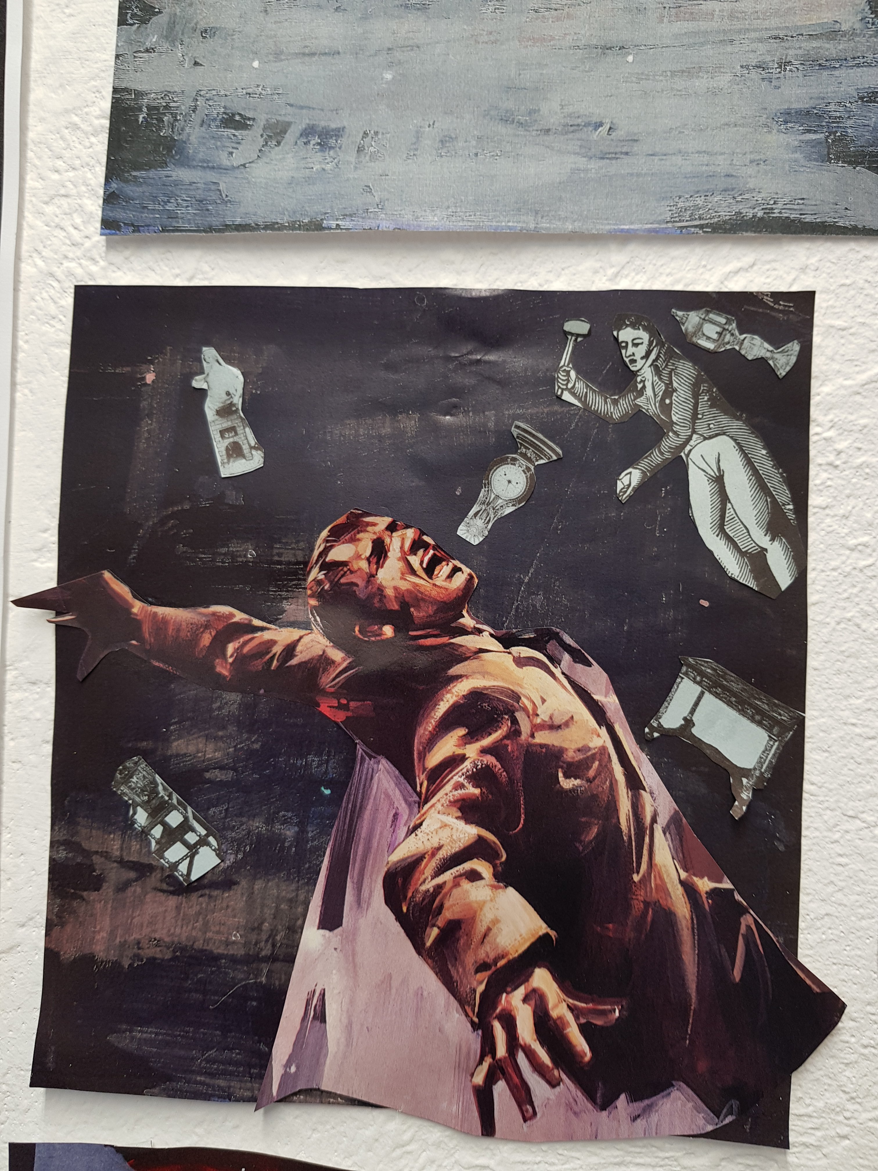
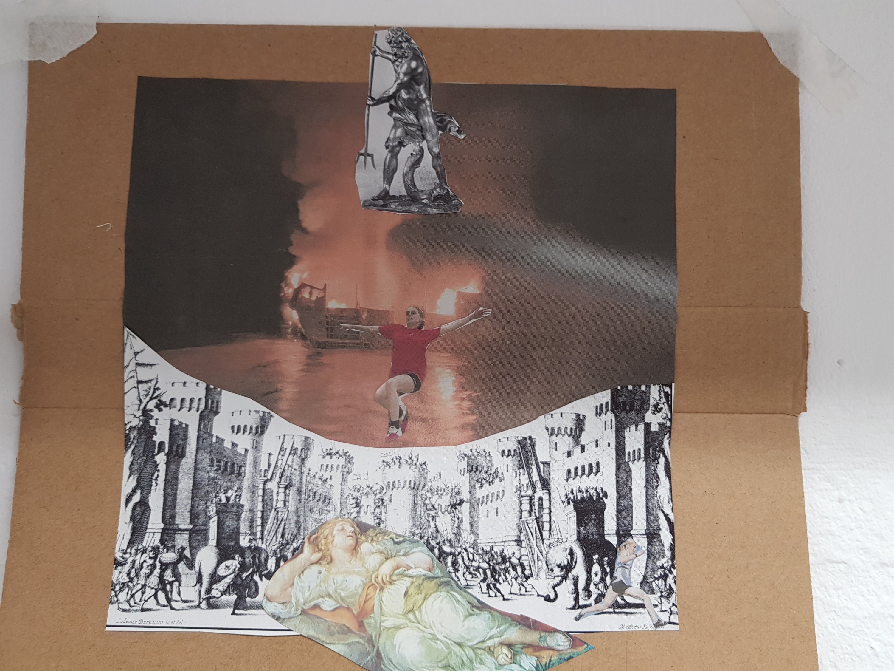
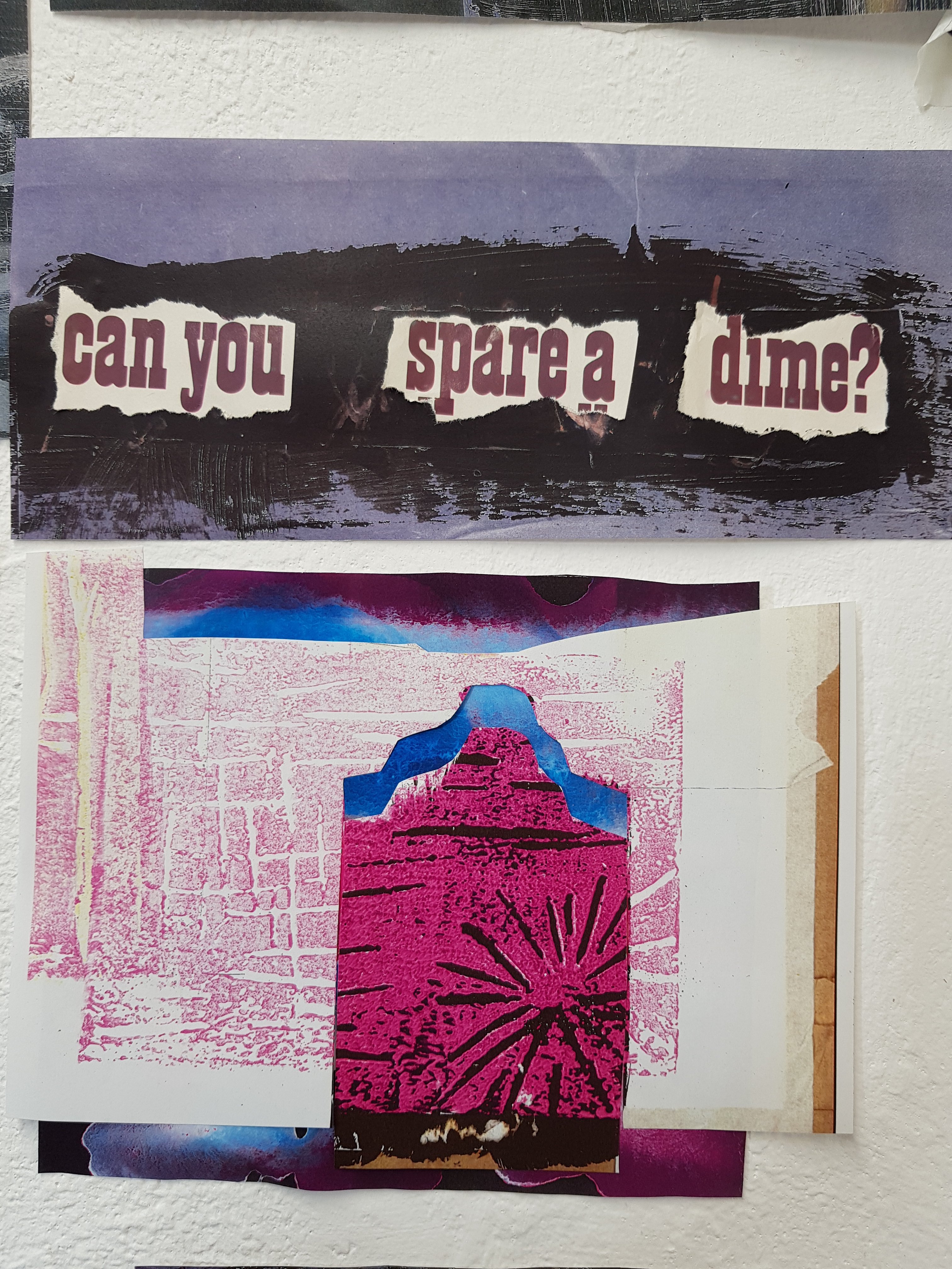
In the image of the woman and the half human/half dog I wanted to examine how a lot of homeless people aren’t allowed to have accommodation due to having a dog but are offered dogs by adoption charity’s in order to keep them company on the streets.Having a dog is often detrimental to a lot of homeless peoples physical and mental well being.
I also wanted to explore more abstract forms and continue with the void/space like theme mixed in with capitalism.
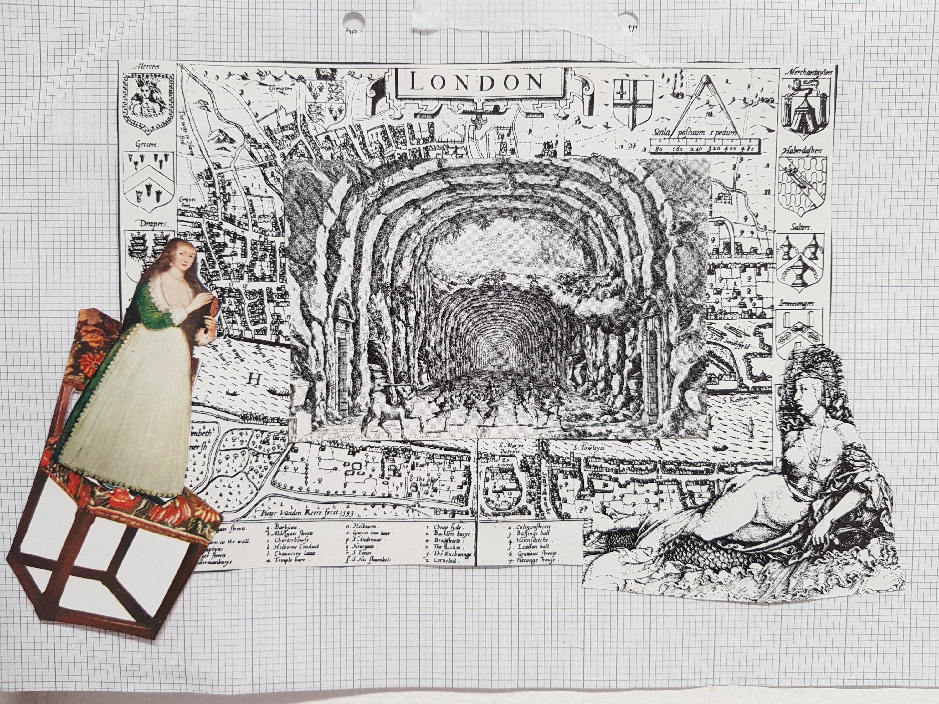
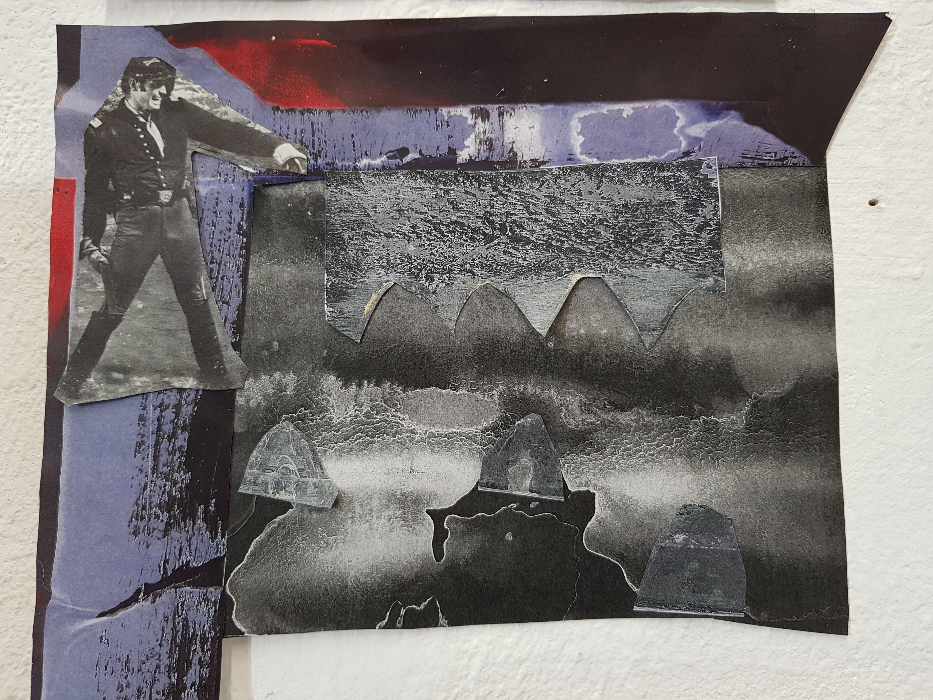
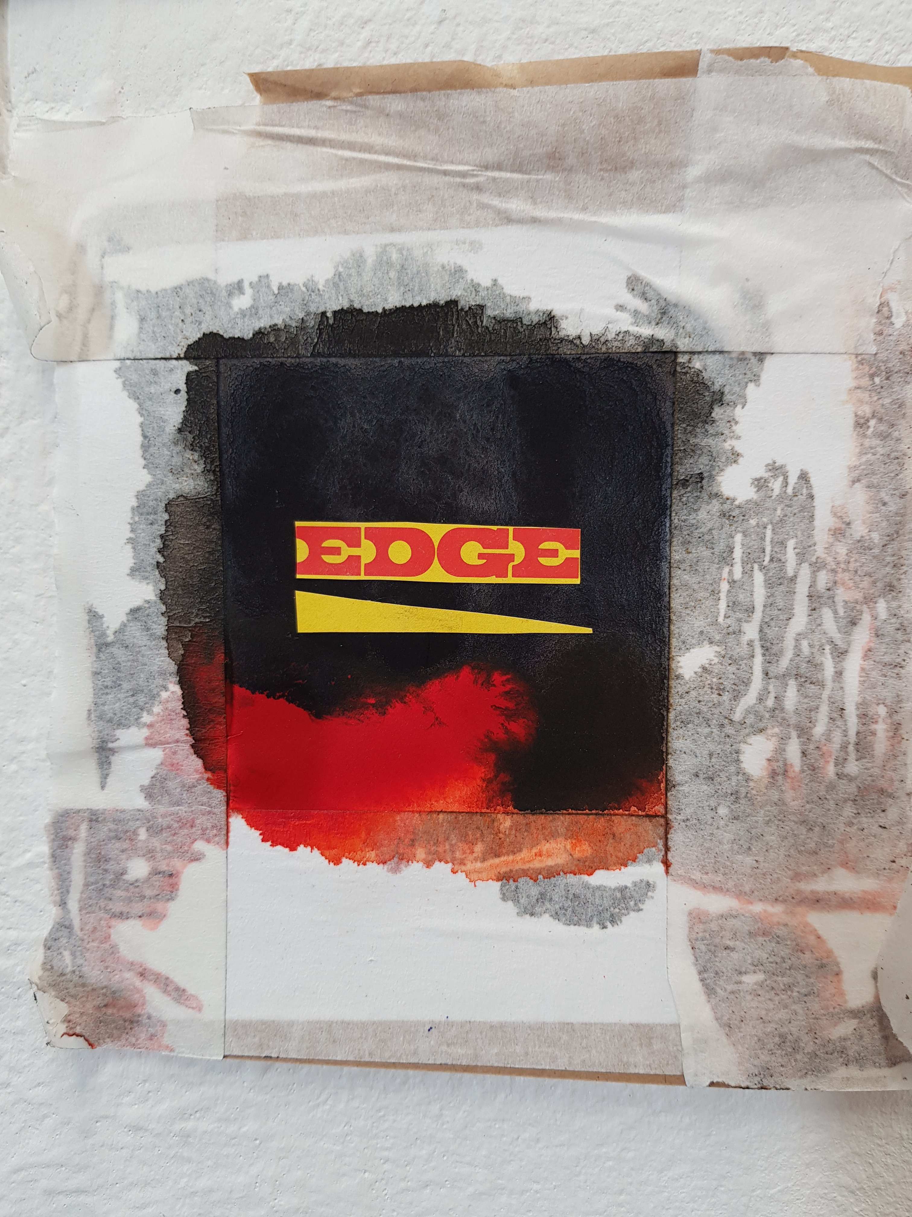
Some collages I have been working on exploring the theme of ‘eviction’ and the void that comes from that in terms of feelings/emotion and that person having a place in society.
I also explored capitalism and the effect that has on homlessness.
I was lucky enough to discover some old magazines which worked well with my project and contrasted nicely against newer images from newspapers/magazines. I used images I had photocopied from paintings and worked on top of those as it was good to see the transition and development of these particular pieces.
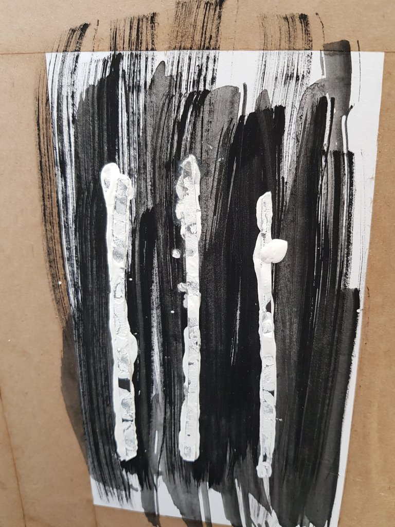
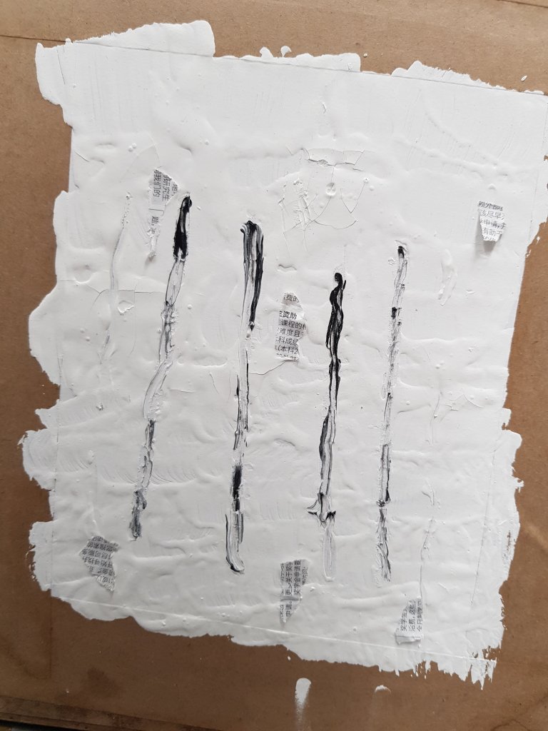
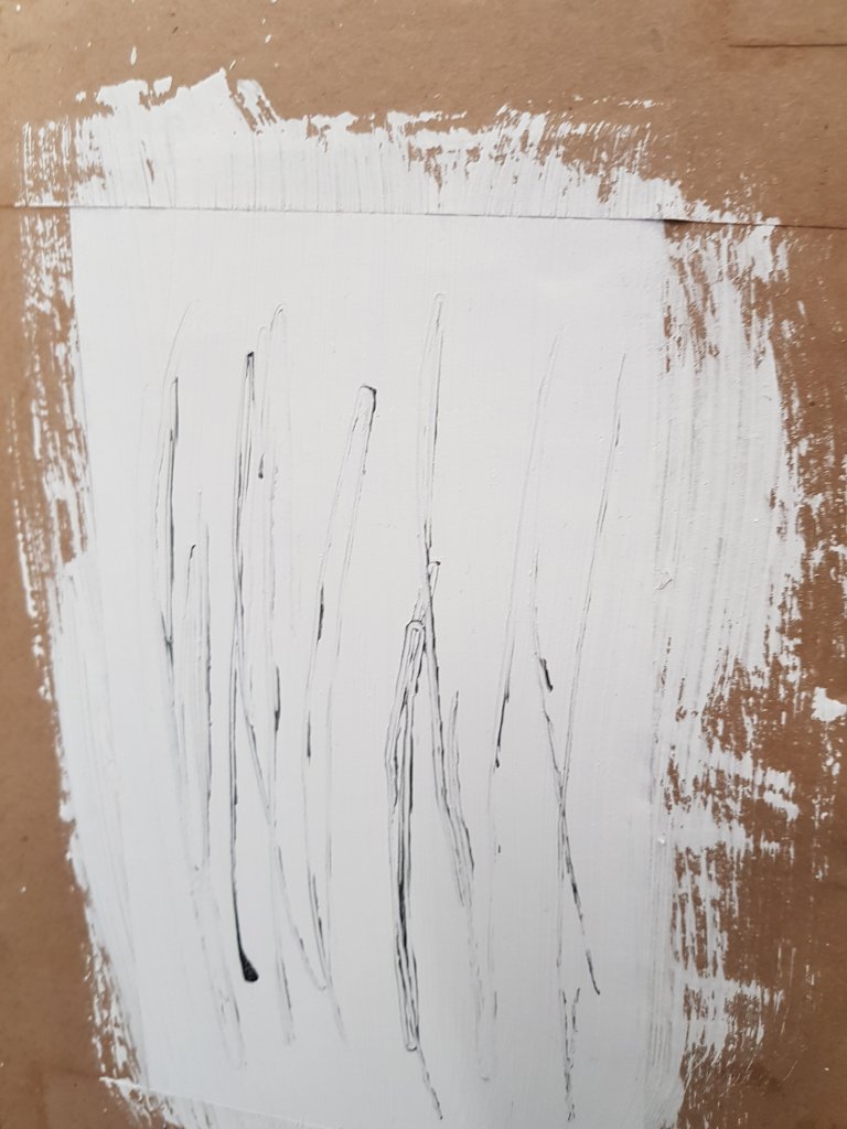
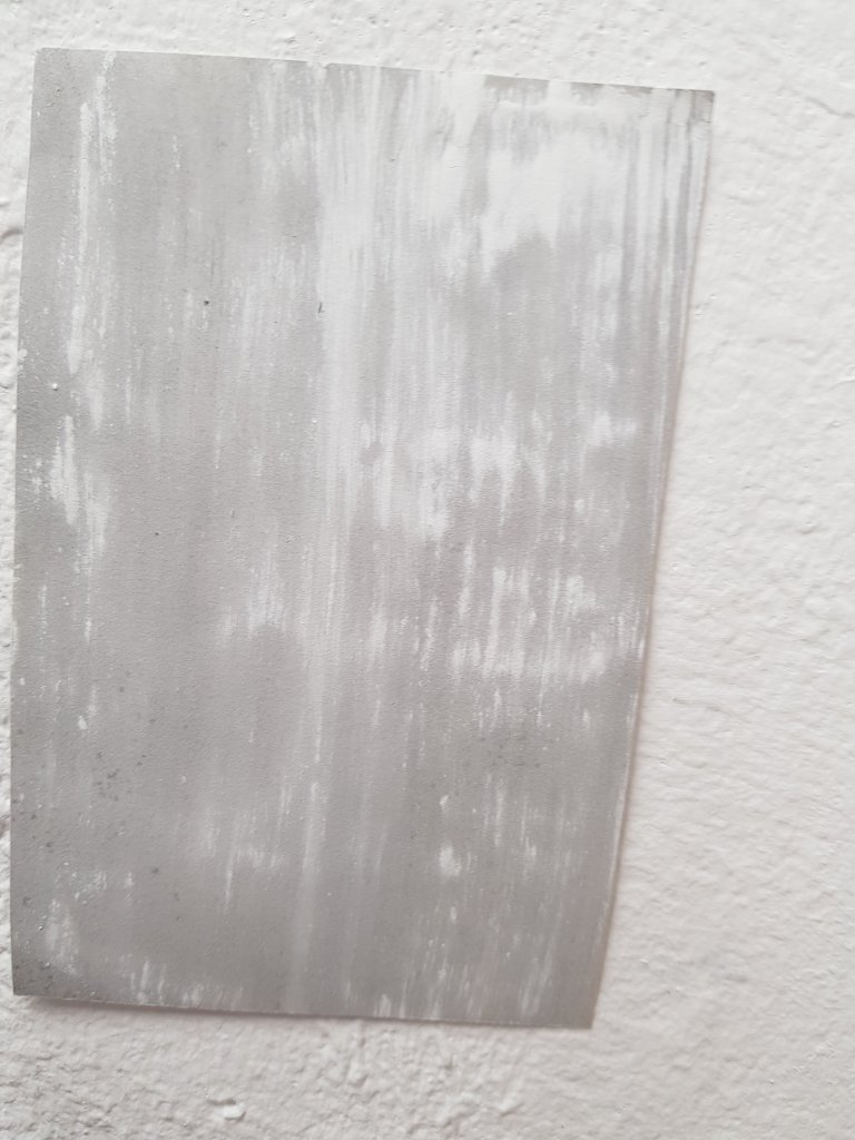
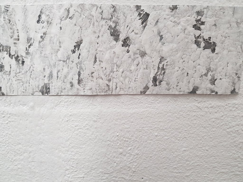
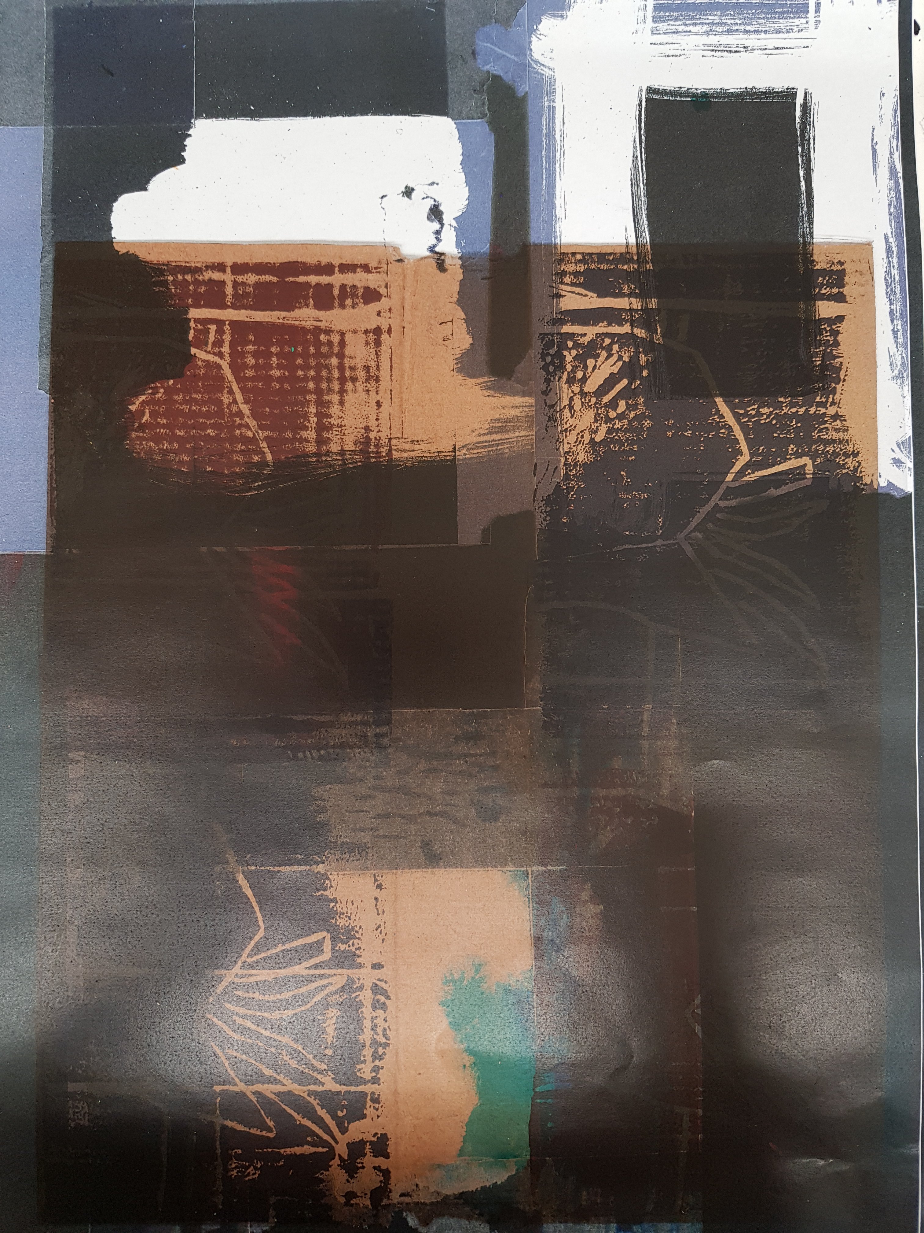
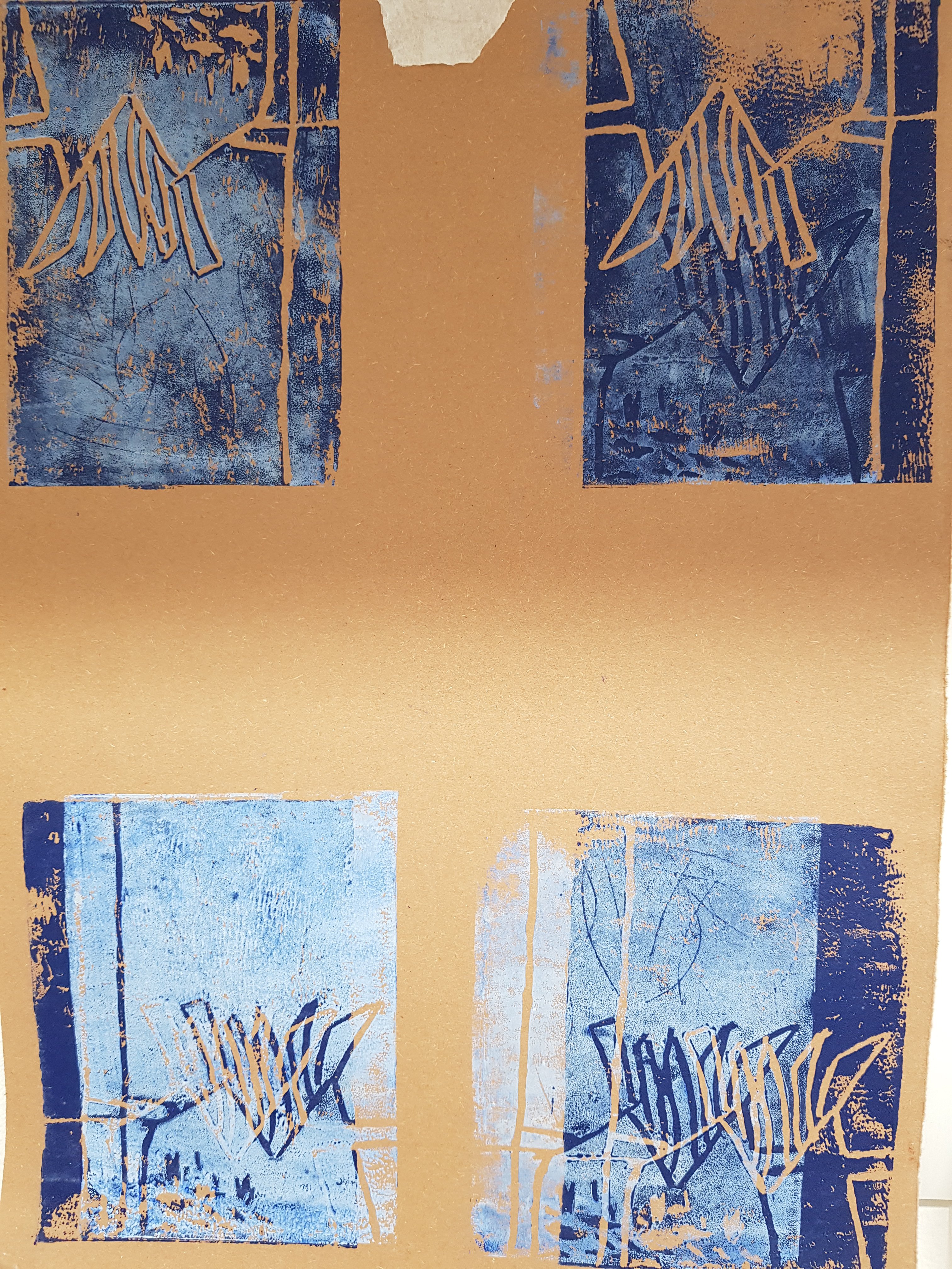
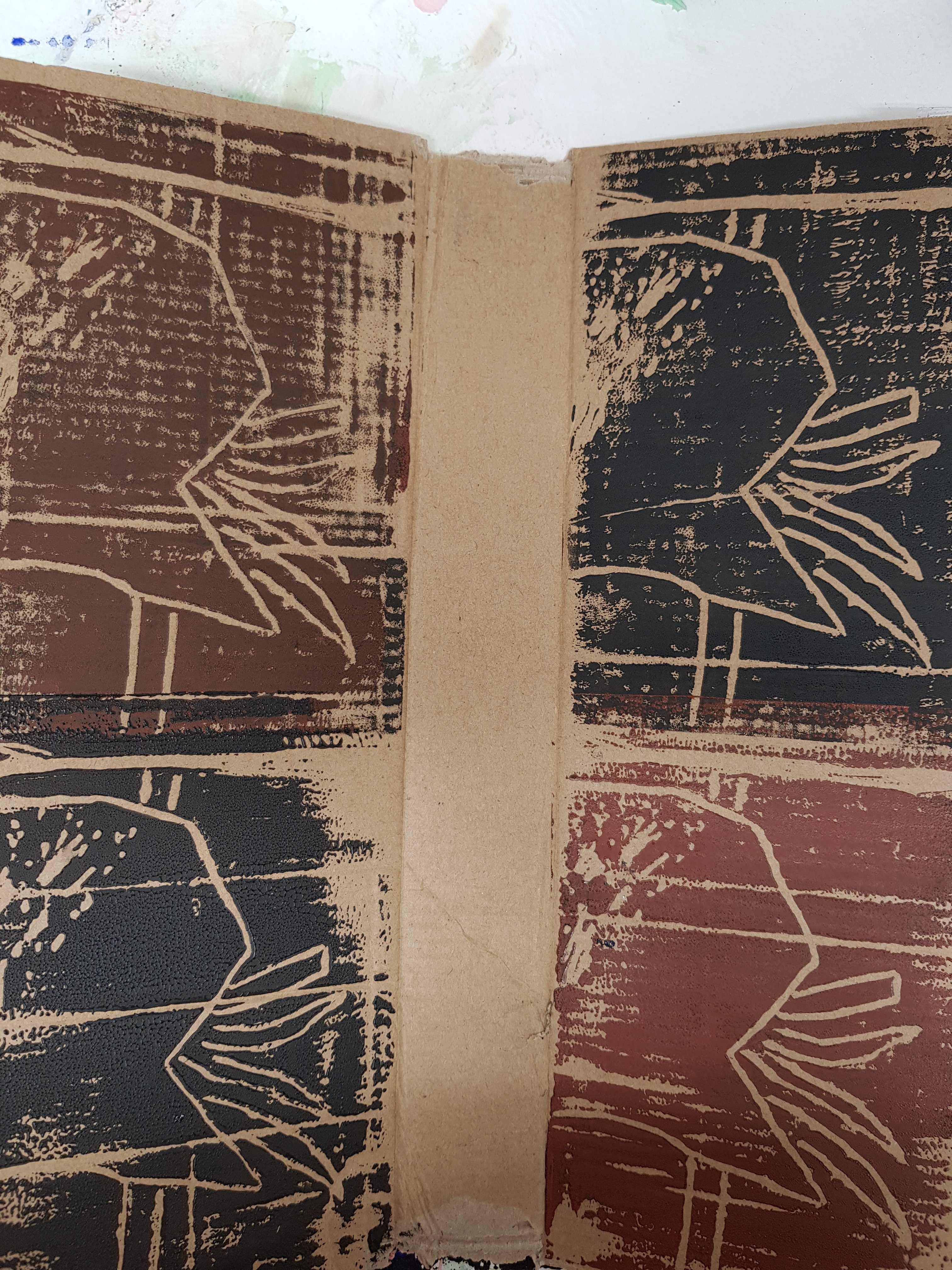
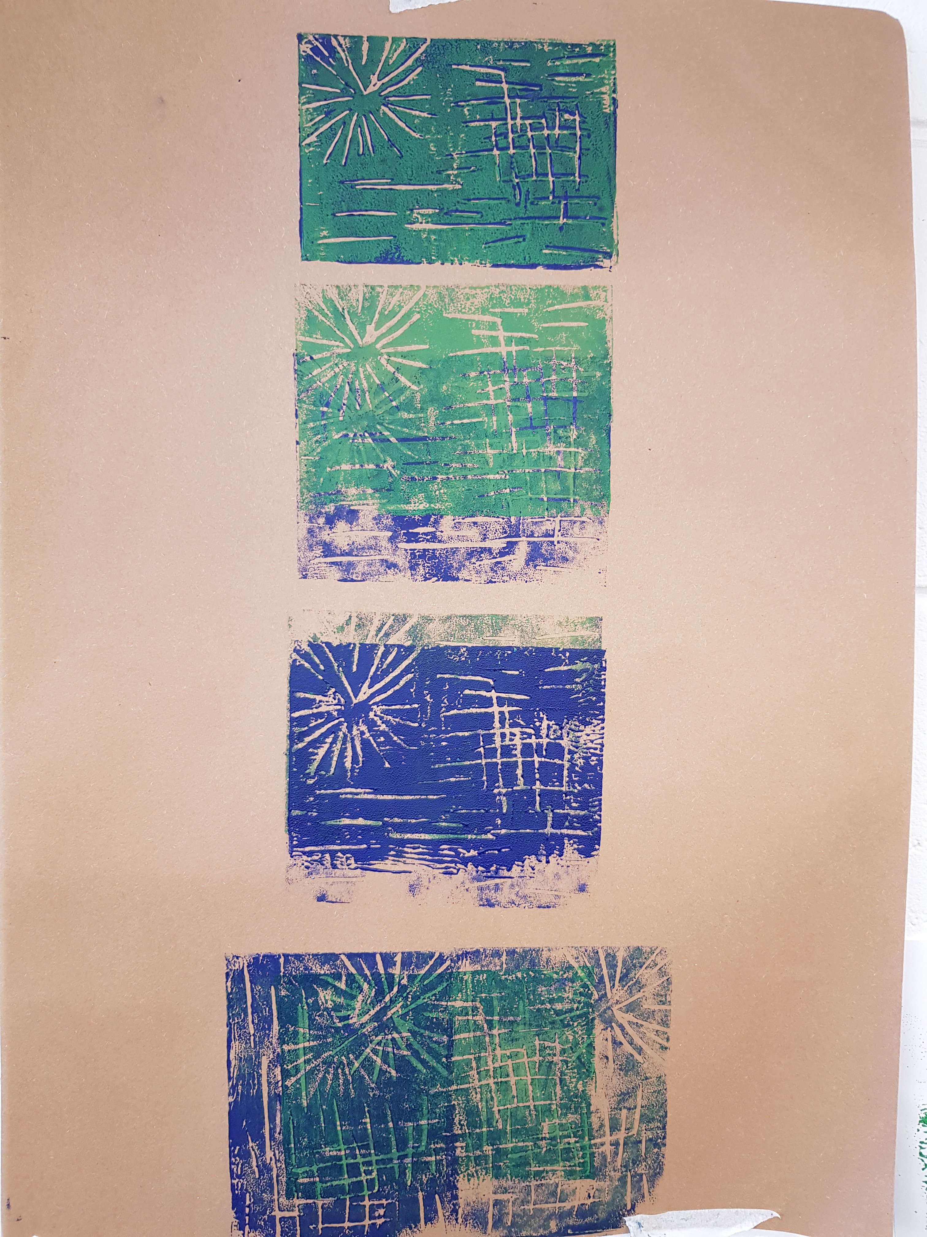
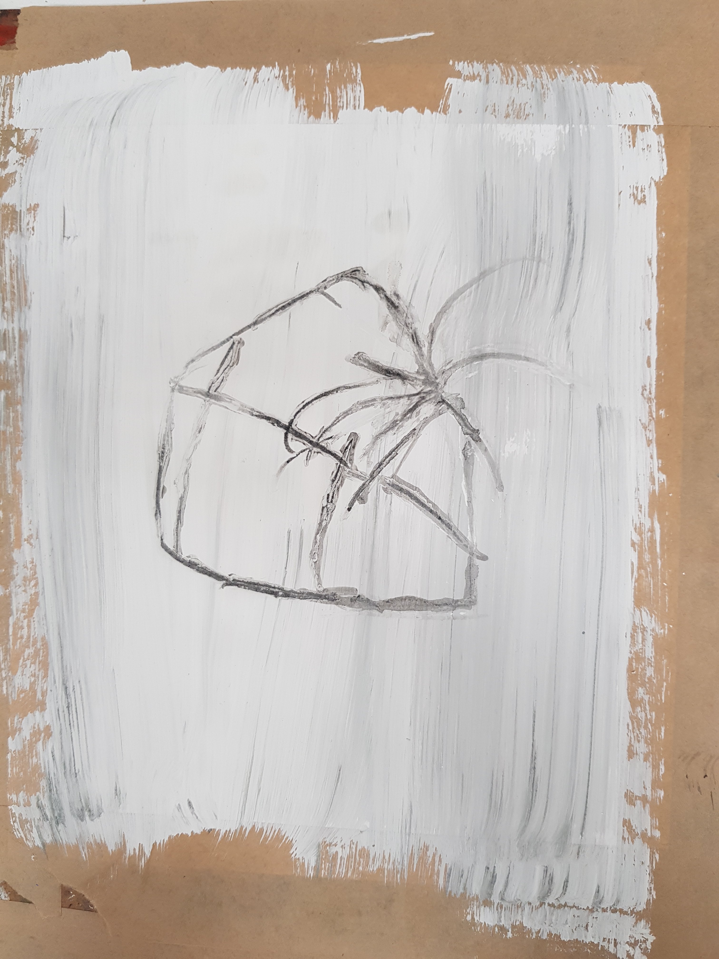
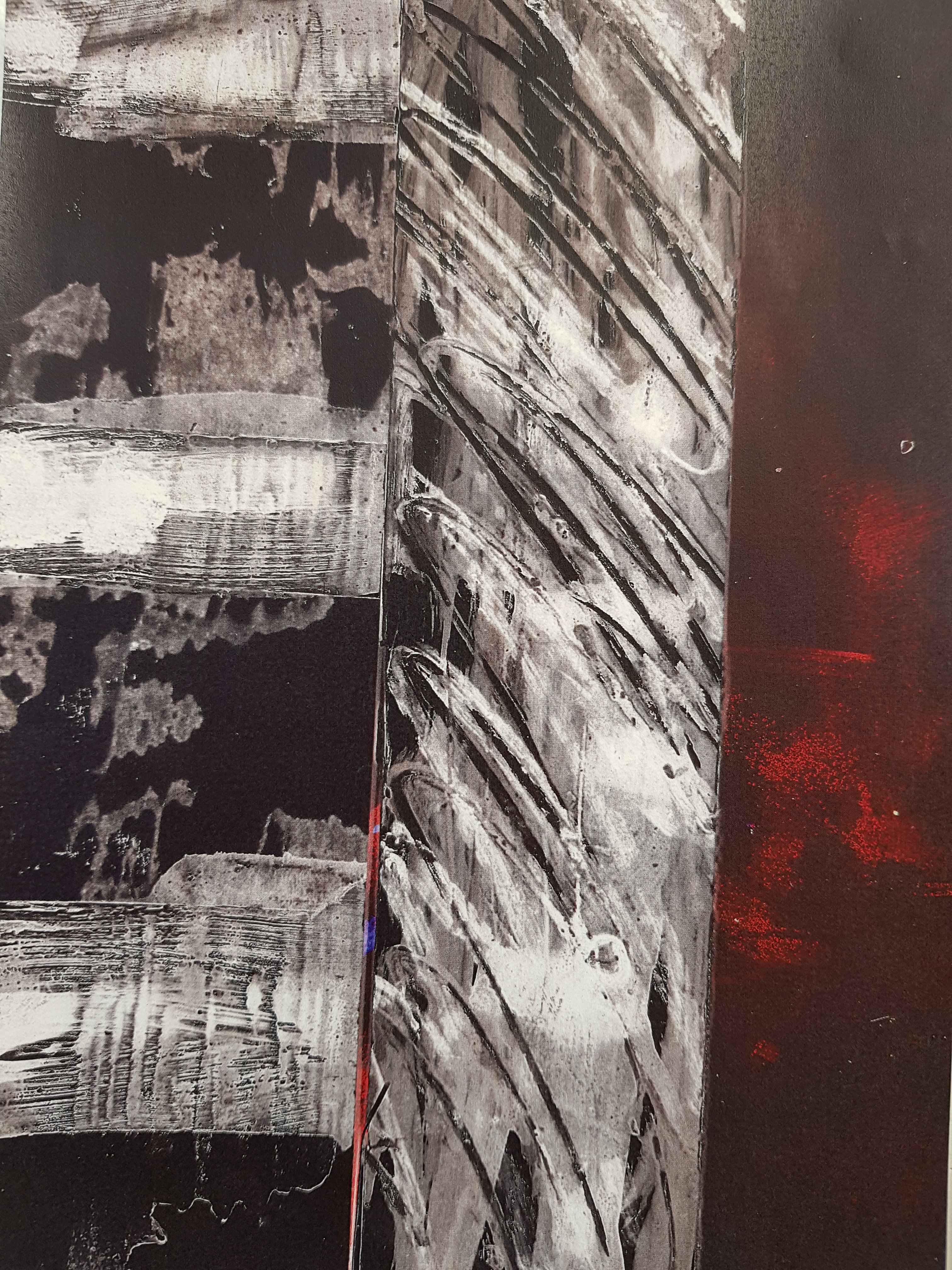
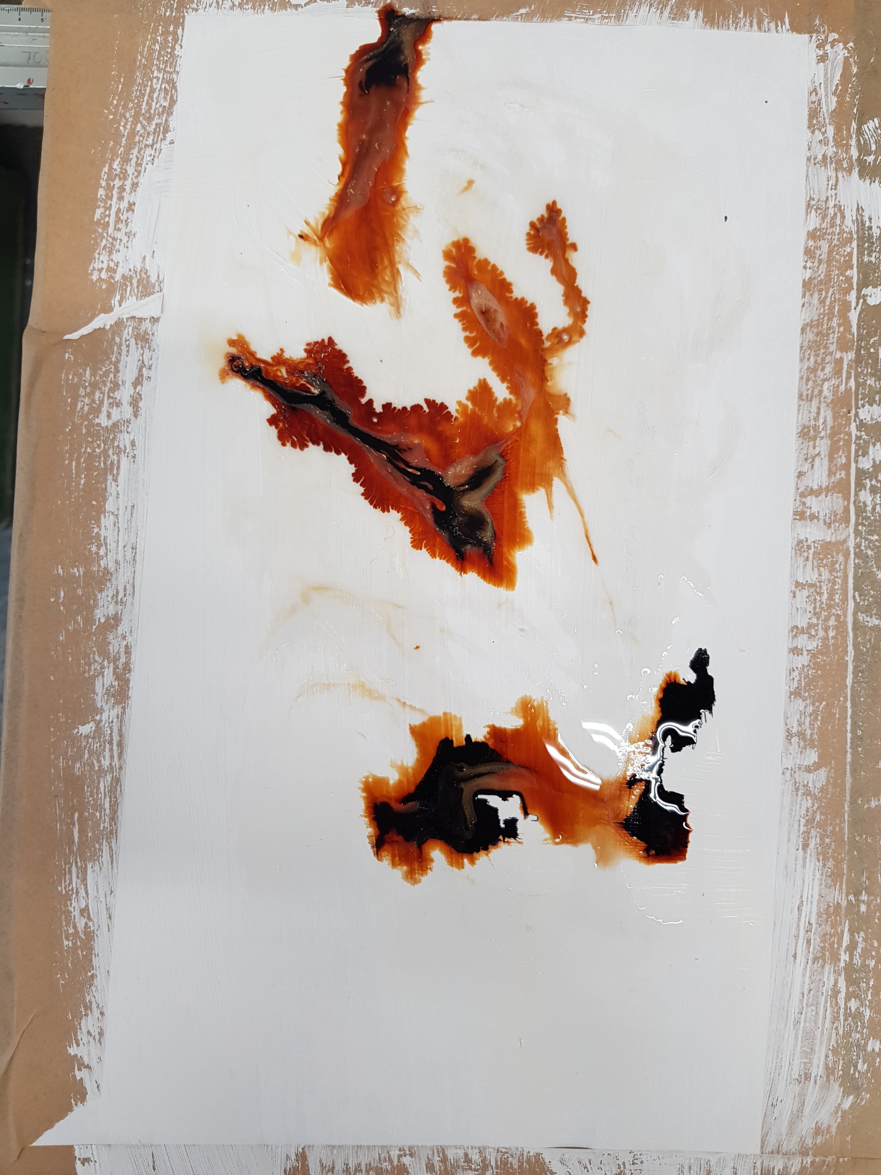
Some experimentation printing and painting onto photocopies then photocopying again to create a series of layers.I really like the way the texture of the cardboard has come through on one of the photocopies and also the unpredictable nature of reversing the colours and you can never quite predict how they will turn out.
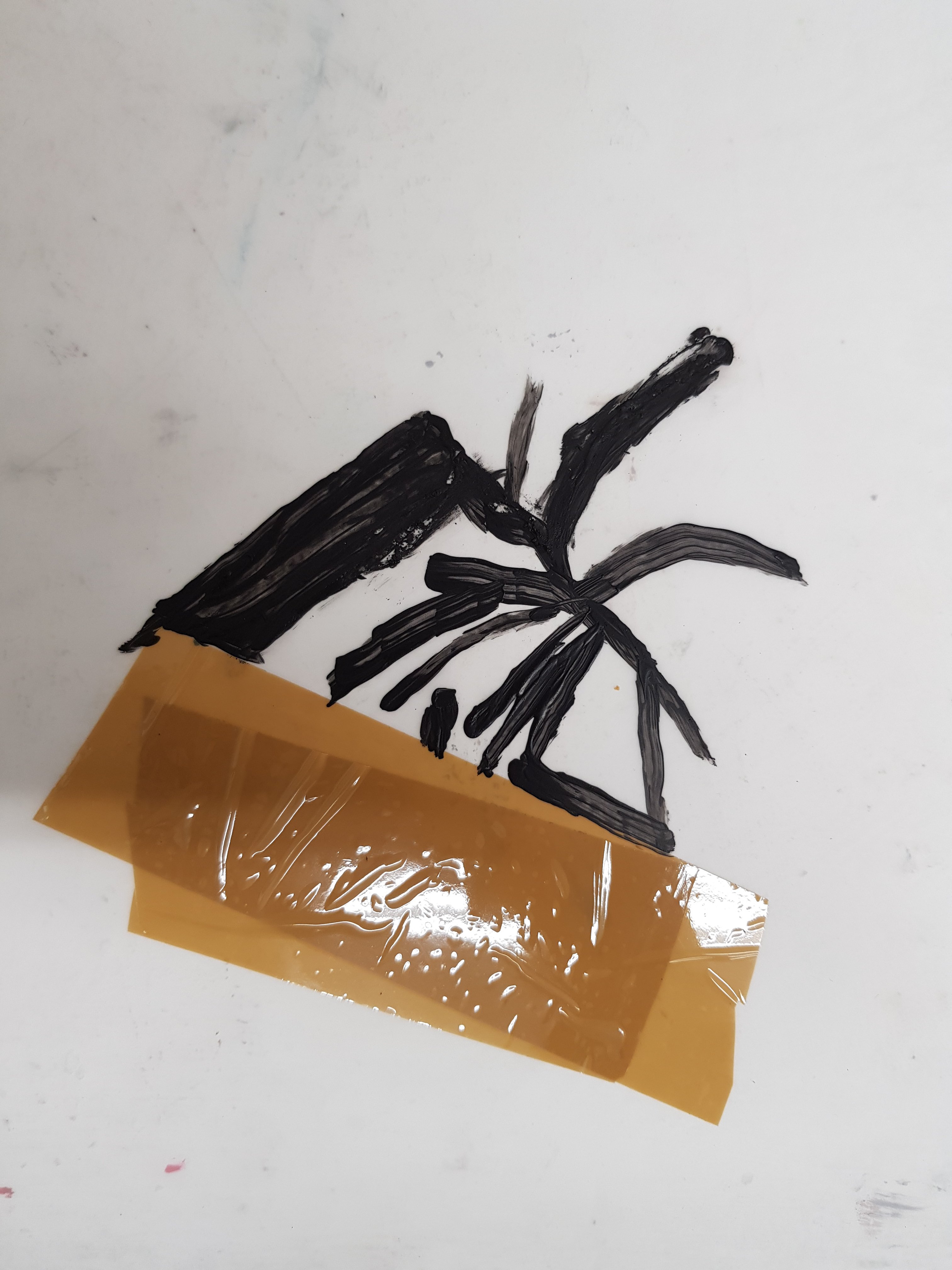
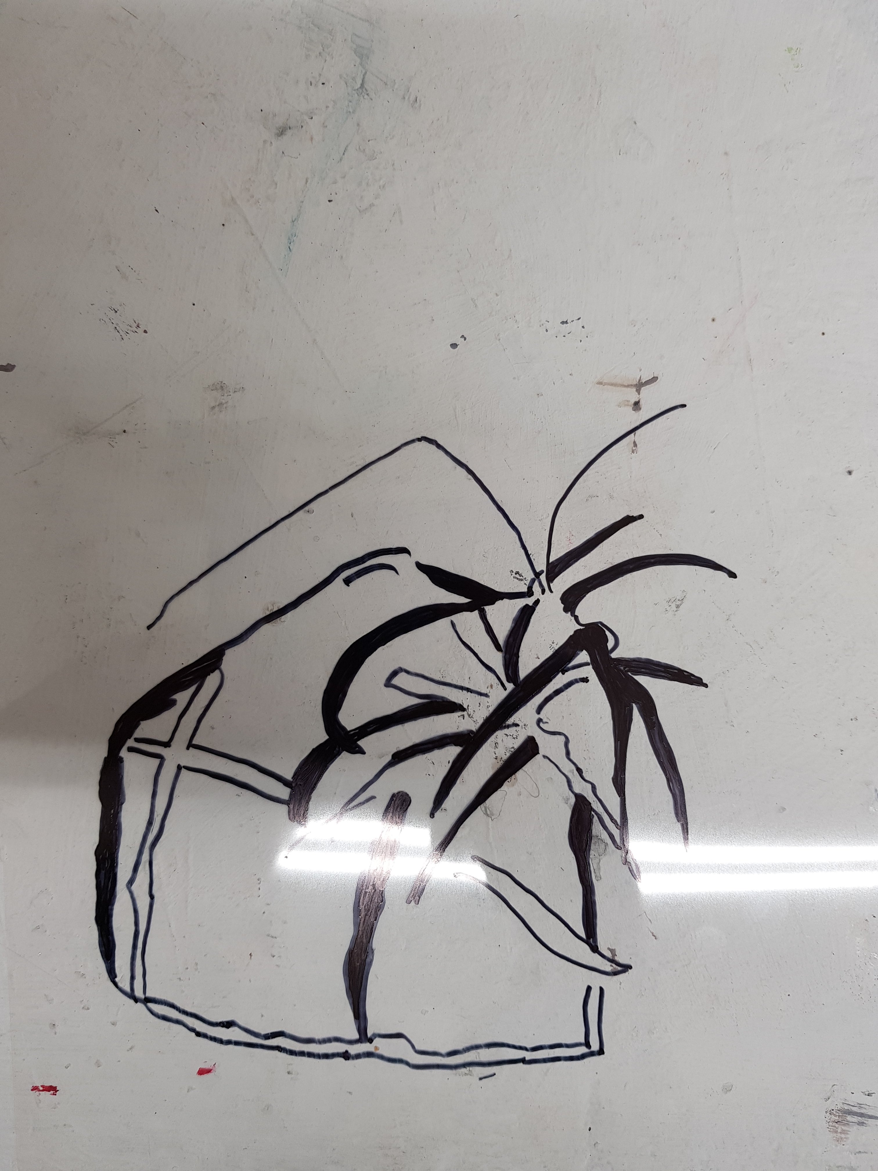
Today was mainly about experimenting with screen printing.After tracing my parcel image a few times I decided to choose one of the images on the acetape which i had overlayed.After attaching that to the screen i used the screen exposure unit for 170 seconds in order for the image on the acetate to develop onto the screen.
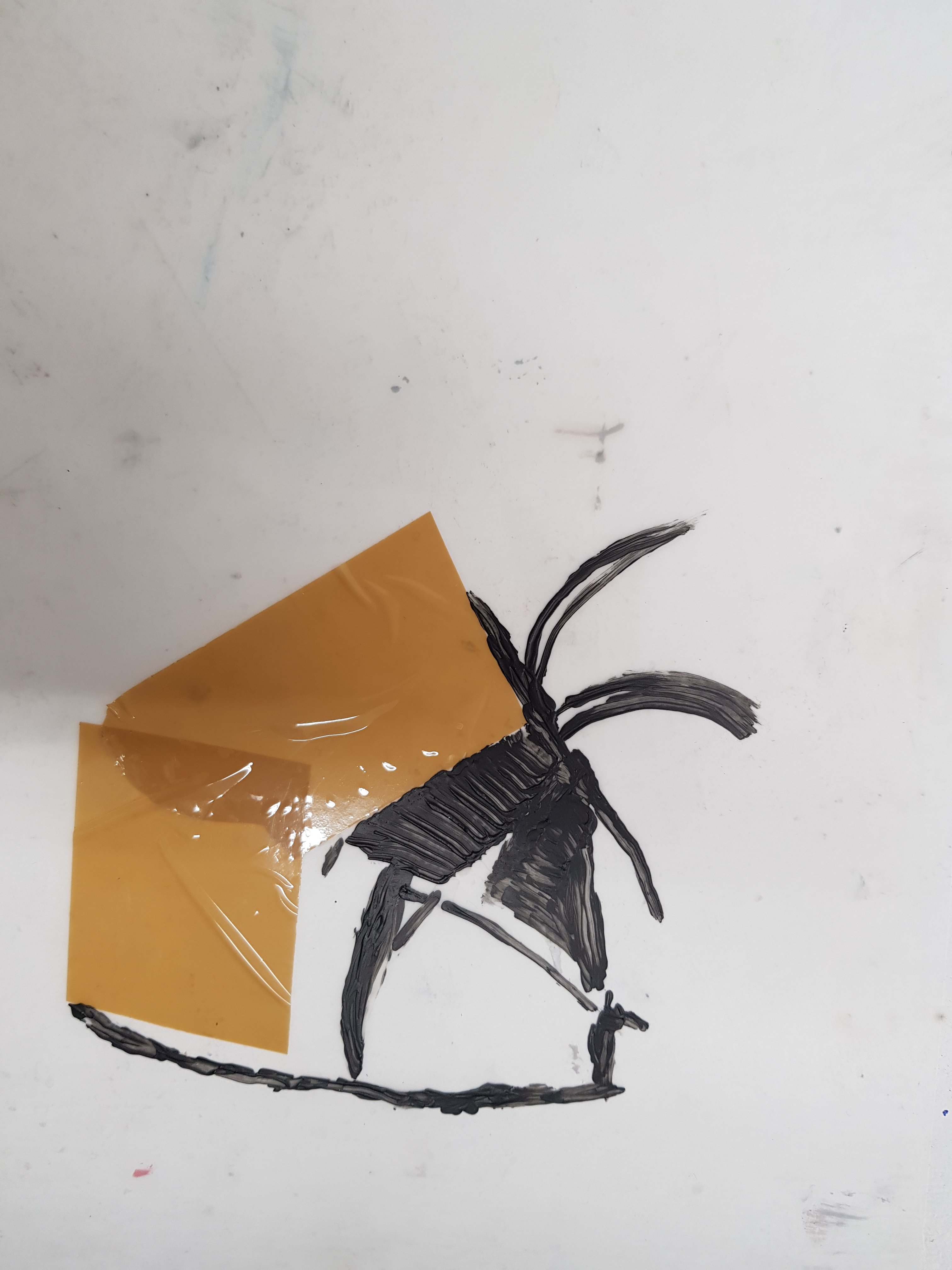
When applying the ink to the screen i struggled to get the amount right when creating a background and often ended up with too much for fear of not having enough! My favourite prints were thoose that were just printed straight onto white paper as i felt that they were more crisp and stood out better.
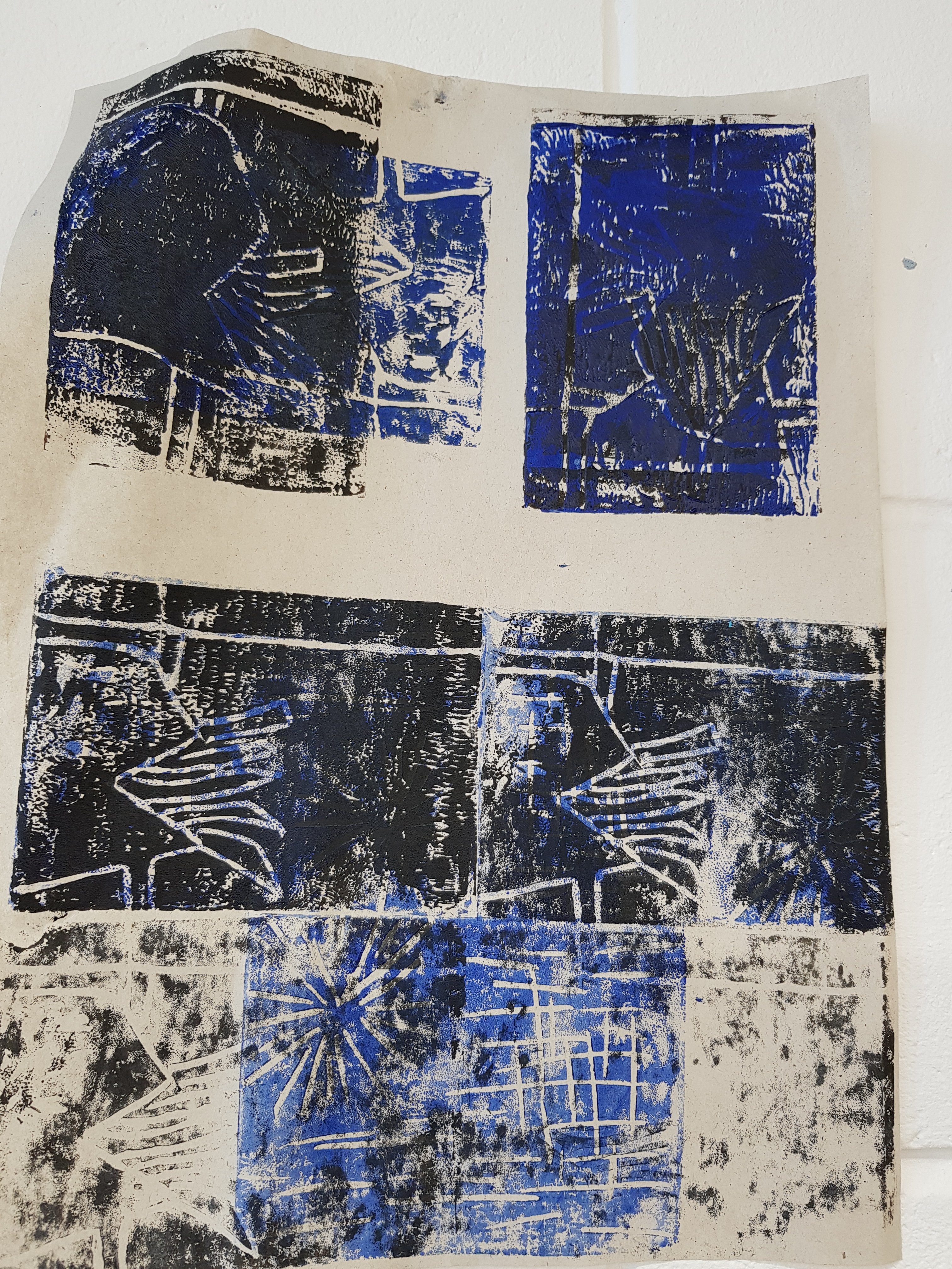
Today I photocopied some of my latest works and reversed the colours. Although I was impressed with the outcome of some of the photocopies I started to feel like I had lost my way a little and hit a bit of a wall.After having a discussion with the tutor and artist in residence they talked about how my work had developed a alot since the word ‘eviction’ and that due to the nature of the 2D work taking on almost a look of 3D work in the photocopies due to the dark background beside the swirl of galaxy like colours there was a feeling of a ‘void’ which could link with the emotions brought by homelessness. Tomorrow i hope to create further pieces inspired by this aspect and take it further forward.
Encouraged by my tutor i stripped work off my wall that wasn’t working and kept up those that were which really helped my vision in moving forward.
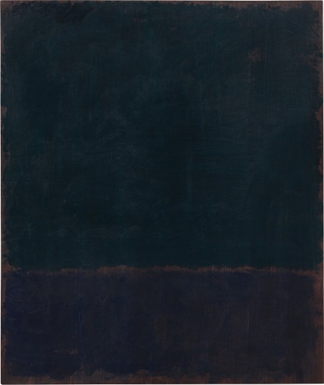
Mark Rothko-‘Black blue painting’ I Felt like this work related to some of my pieces where I had photocopied the emulsion with ink on it and reversed the colours.Rothko’s abstract work also has a feeling of a kind of ‘void’ about it which is very prominent in his darker painitng’s such as this one.I feel that some of my 2D work such as the tissue paper on ink and the emulsion piece have a feeling of being 3D even tho they are 2D which echoes alot of what Rothko’s pieces do.
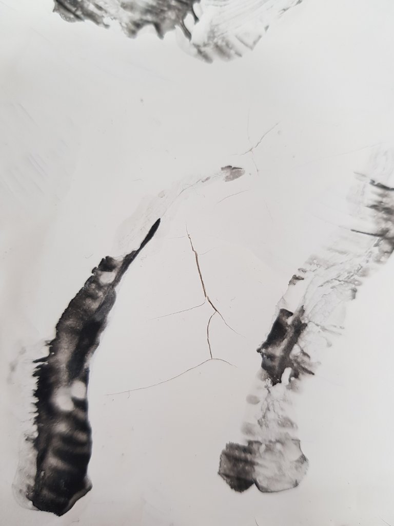
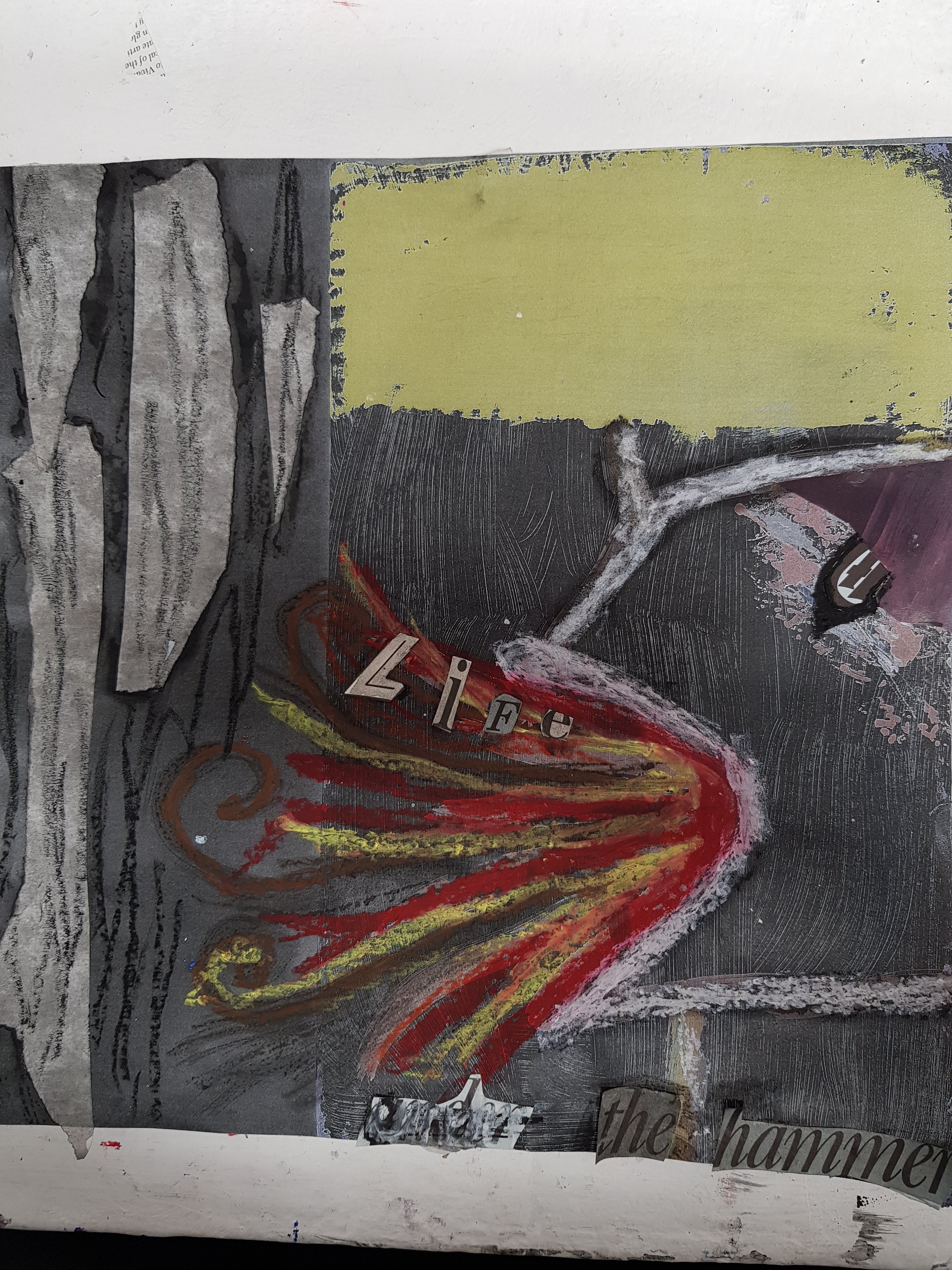
Today i stretched my paper then primed it with Emulsion paint before exploring a variety of mark making in reference to the theme of ‘eviction’ which I had taken from one of my day today projects in the first week.I felt like there was alot of emotions that can be explored through this word which relate to certain colours.I mainly used ink and bleach today along with some coloured ink.I particulary enjoyed how varied the final result could be whilst using ink and bleach and unpredictable.I also primed wood and cardboard and used the image of a fading tent on one piece which came from one of the newspaper clippings linked about eviction.I wanted it to represent how people that are evicted are seen as invisable by landlords as they don’t really consider them as humans with feelings or how this may effect them.Along with the image of one of the parcels i had created.As i feel like families are sometimes treated like parcels when evicted and sent to a different area with no consideration to how fragile this may make them feel on the inside.Especially children.