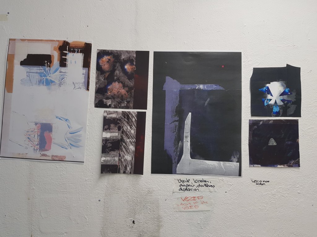
We decided to use the new gallery space within the college in which to feature our work.I had alot of resolved pieces that i was torn between but didn’t want to hang them all up.Looking back I realise that i should maybe of asked members of the class which were my strongest pieces before hanging them.For some reason I also thought that only your more recent pieces could/should be hung.The tutor reminded me that this is not the case.As alot of the class believed my earlier abstract shapes within space worked better and were alot stronger and had more potential to move forward into other medias such as digital animation.This is an idea I have allready considered and plan to use noise with it such as the scraping noise of a brick against concrete with it. It was recomended that prehaps I look at some Russian animation by the tutor.
Workshops : Working with collage,I felt that it allowed me to process a lot of ideas in a short space of time and alltho collage did not end up being a part of my final piece i felt that the development helped my thought process.Working with mixed media has always been a strength of mine but using the photocopier to produce different versions of the images I had created definitely added strength to my work as a whole and helped towards more of a resolved piece.
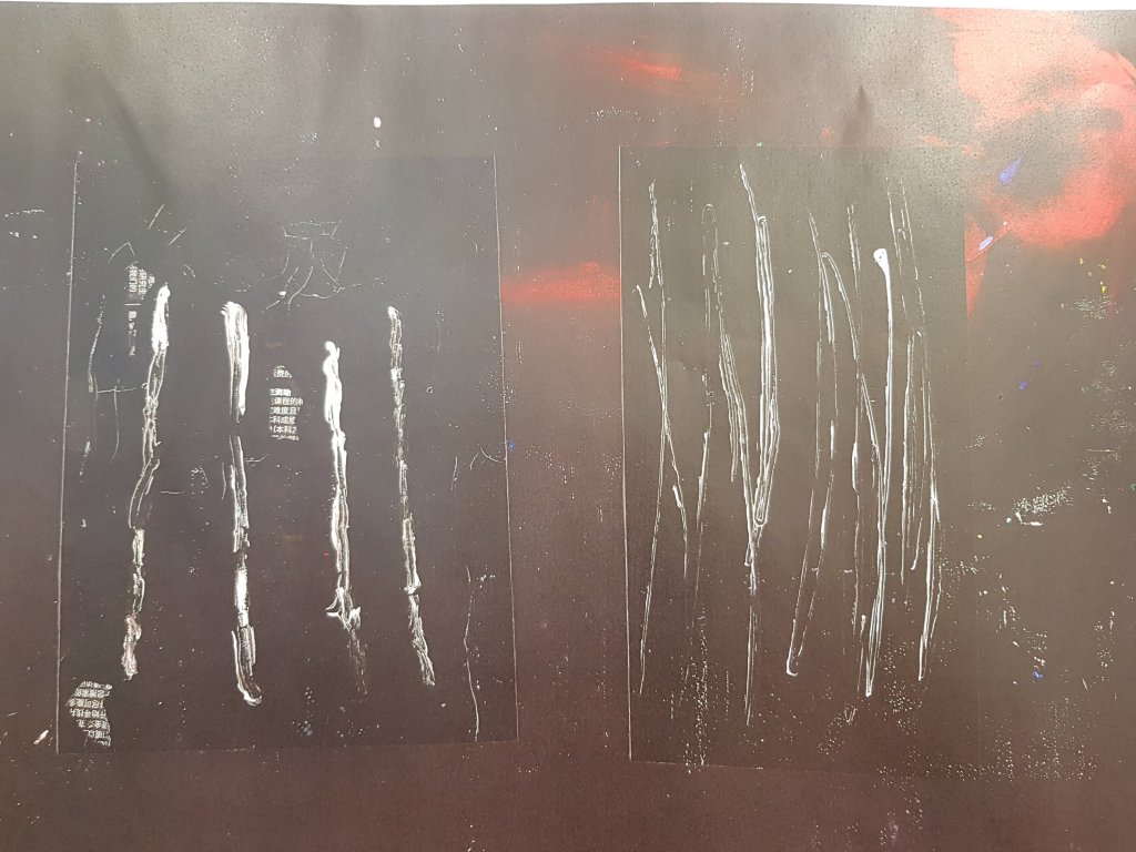
Altho my screenprint was strong I tended to apply too much paint when working on lino/mono prints so the image wasn’t particularly crisp but there was a couple of ‘happy accidents’ where the paint had created marks which looked intended.Emulsion on wood/paper I found effective but I struggle to stick to just paint without involving other media.
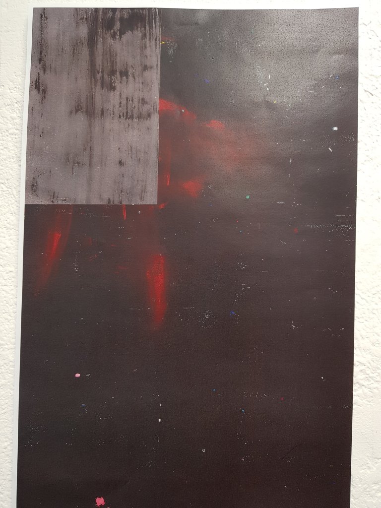
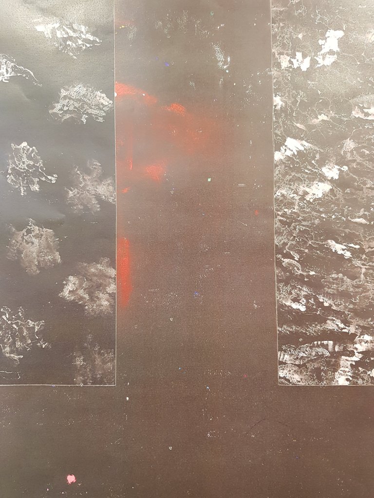
Development I found that the best way to develop and refine my ideas was to look at what had been working and what wasn’t. Collage was successful in producing ideas but it was straying too far away from my theme and did not have the minimalist ‘void’ approach I was looking for.My minimalistic mixed media/experimental paint approaches seemed to work the best so I decided to create as many different experiments as possible before photocopying the images and reversing the colours.I think finding out what works best and creating many paint/mixed media experiments worked to my advantage.
Outcomes My best outcomes came from the most minimalistic and perhaps less considered (to a certain extent) approaches.Such as my paint experiments/mixed media photocopied pieces. Worst outcomes was definitely working with lino/mono print but I think this comes with refining the technique.
Time Management: I felt that my time was managed effectively throughout each workshop and when working towards my final pieces.But I felt that I should have spent more time editing and selecting my final piece and perhaps should of asked my peers opinion in order to help develop my own.I think this has been a learning curb and will remind me in the 3D project to take a more considered approach when it comes to the final selection process
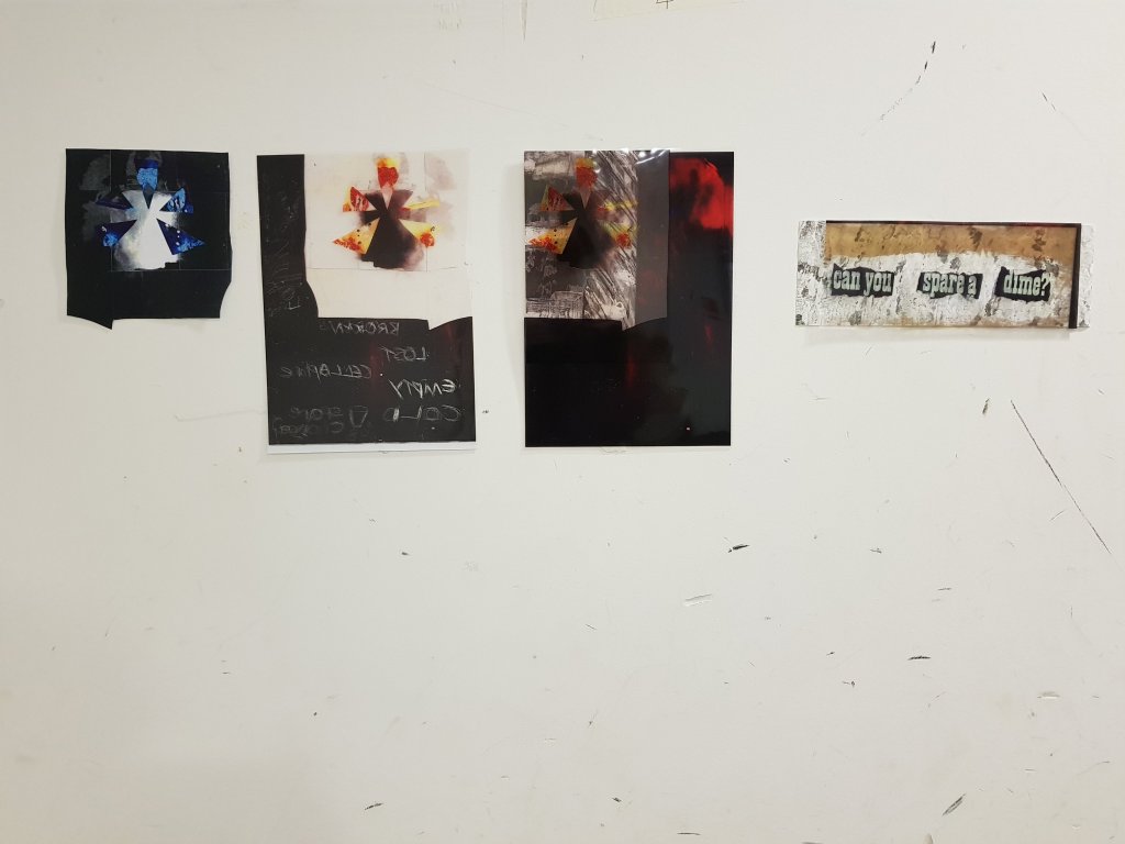
Questions that were brought up during the crit was whether I would think about furthering the typography as it seems to of worked well.I agreed with this and also the fact that the backwards writing worked well with the acetate and that maybe I should think about taking it further later on in the project.
Was asked about whether I had used printmaking and whether I had considered prehaps using this more.My reply was that I didn’t like the texture of printmaking because it didn’t photocopy very well and looked quite grainy.I was looking for a smoother effect in order to keep the illusion of ‘the void’.
Alot of people agreed that using the acetate was a good idea as it greated nice shapes and that it was evident that I had looked at early work and progressed it.
Reflecting back I feel that the group crit was pretty sucessful as I was able to identify how the project should move forward.I think i need to think alot more about the strengths and weaknesses within my work so that I am better enabled to identify which pieces are the strongest when it comes to the editing process when hanging final pieces.