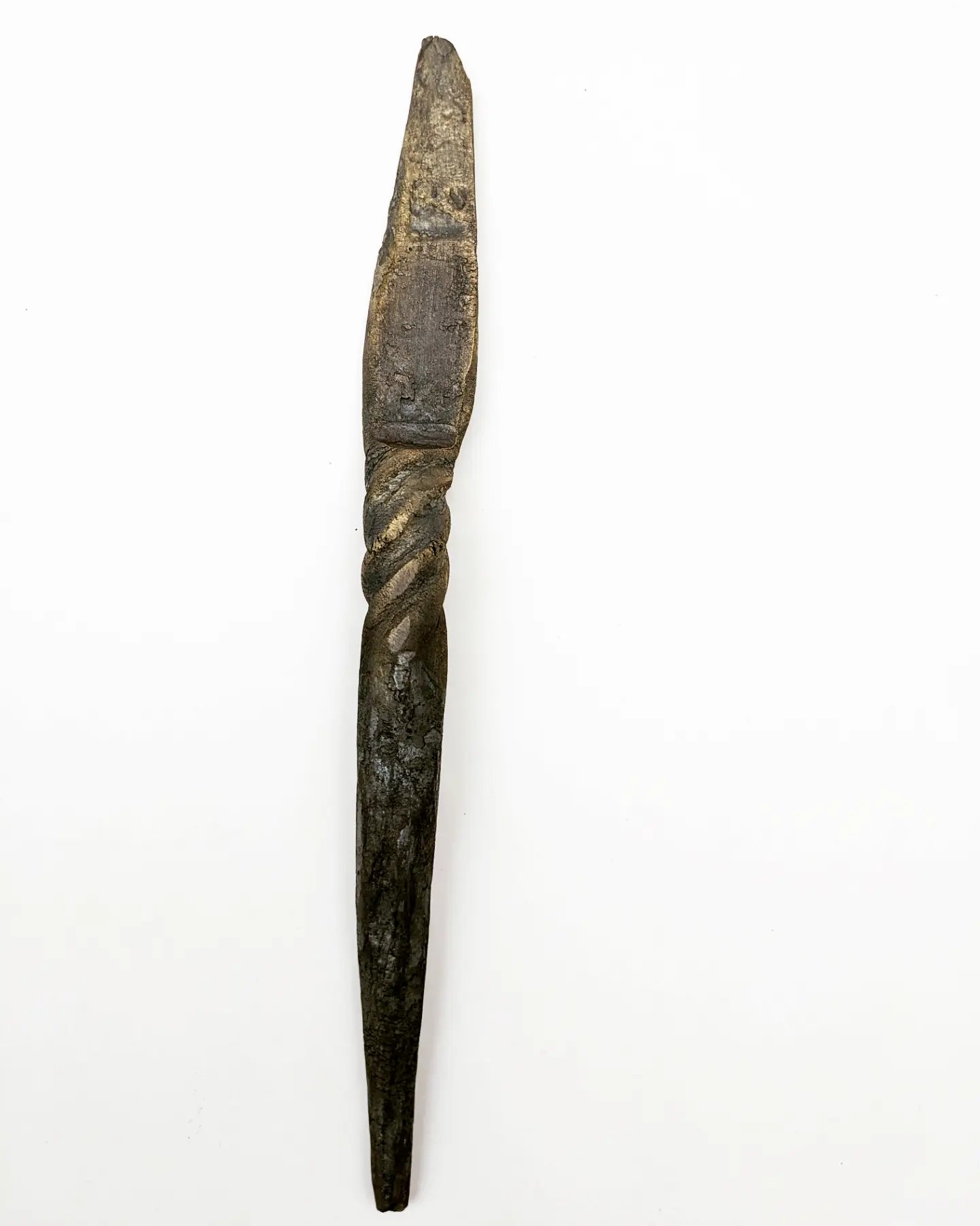
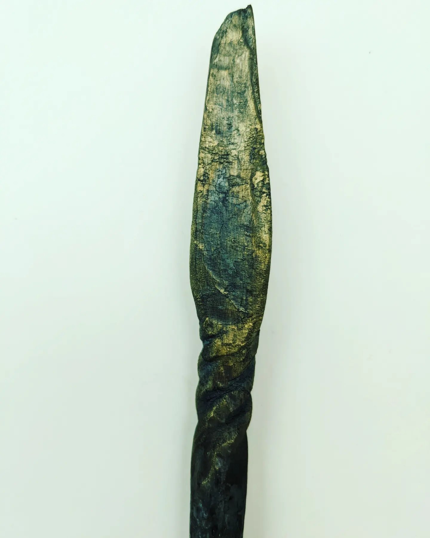
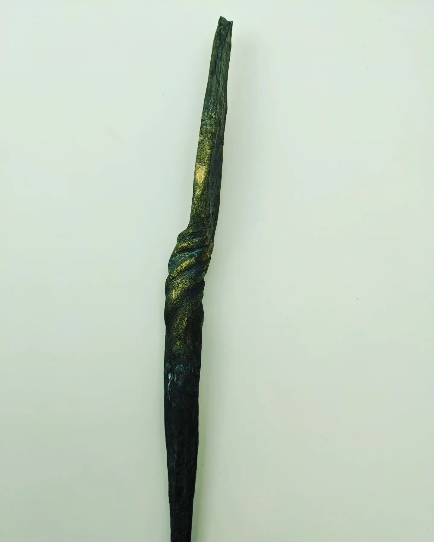
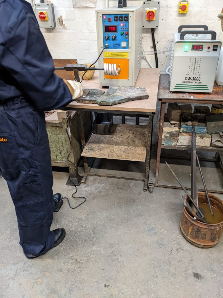
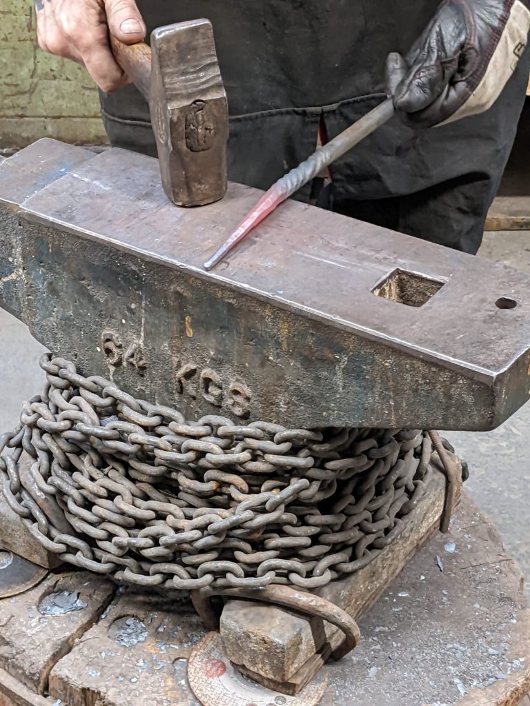
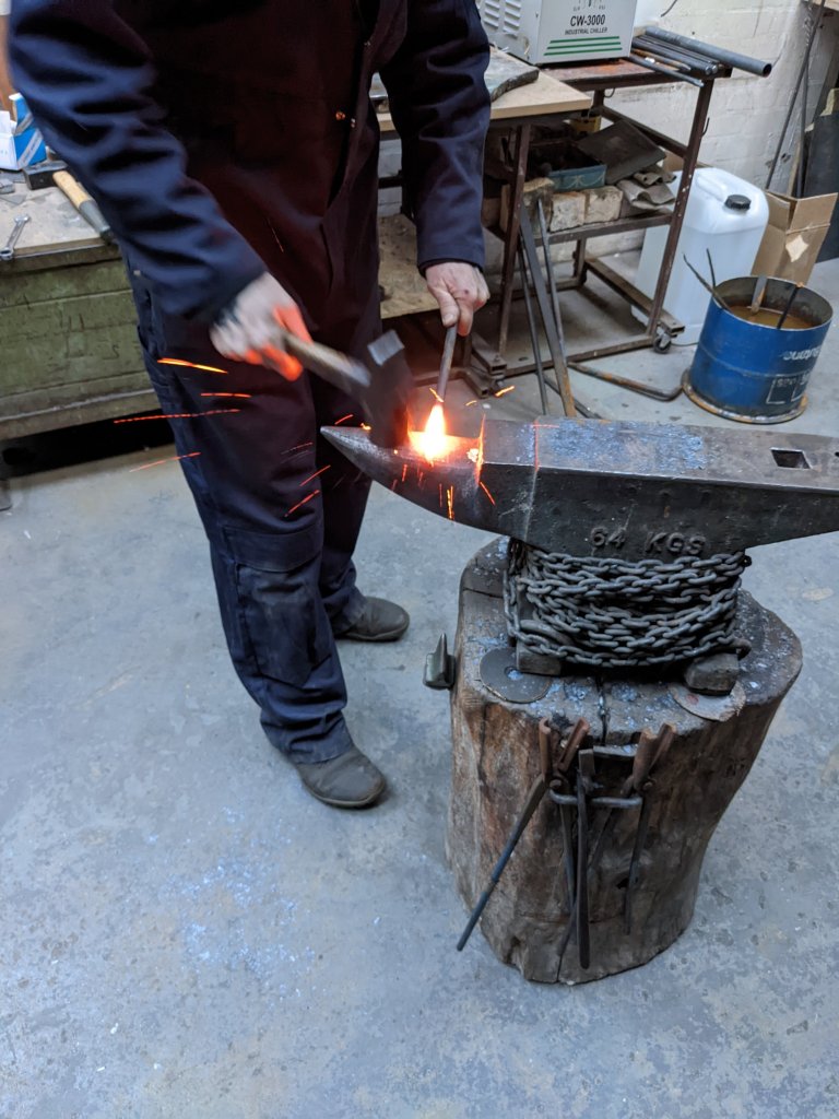
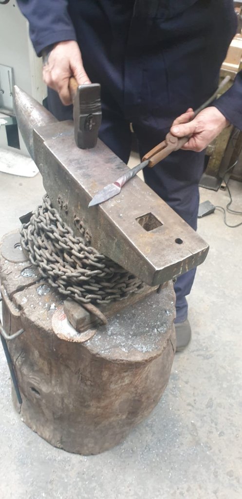
This week I was working between a mixture of disaplines (my favourite thing to do) I started off the week by learning another skill in forging which was to ‘draw out the metal’ in order to make a small spade like tool.I felt that it worked well with my theme and provided another ‘artifact’
In order to make the flat end the metal had to be ‘drawn out’ by heating then hitting the metal from the top to the bottom of the heated section.The metal then had to be hit hard on the edge of the axel in order to create the ridge. The bottom half was also made by drawing out the metal and tapping the metal whilst rotating it on the axel and the twist (which is allways my favourite part) was made by simply heating the metal and twisting with a vice before brushing it over with a golden bristled brush for added effect.
For some reason my wrist and fingers were really hurting with the hitting that day.I blamed it on not using my favourite hammer but the technician told me this wasn’t true.I also prefer to use a lighter hammer as otherwise it puts too much strain on my wrist and I only have tiny wrists.The technician said that not everyone is built for forging and that if it hurts too much it’s ok to stop.But as they say ‘Mumma didn’t make no quitter’ haha
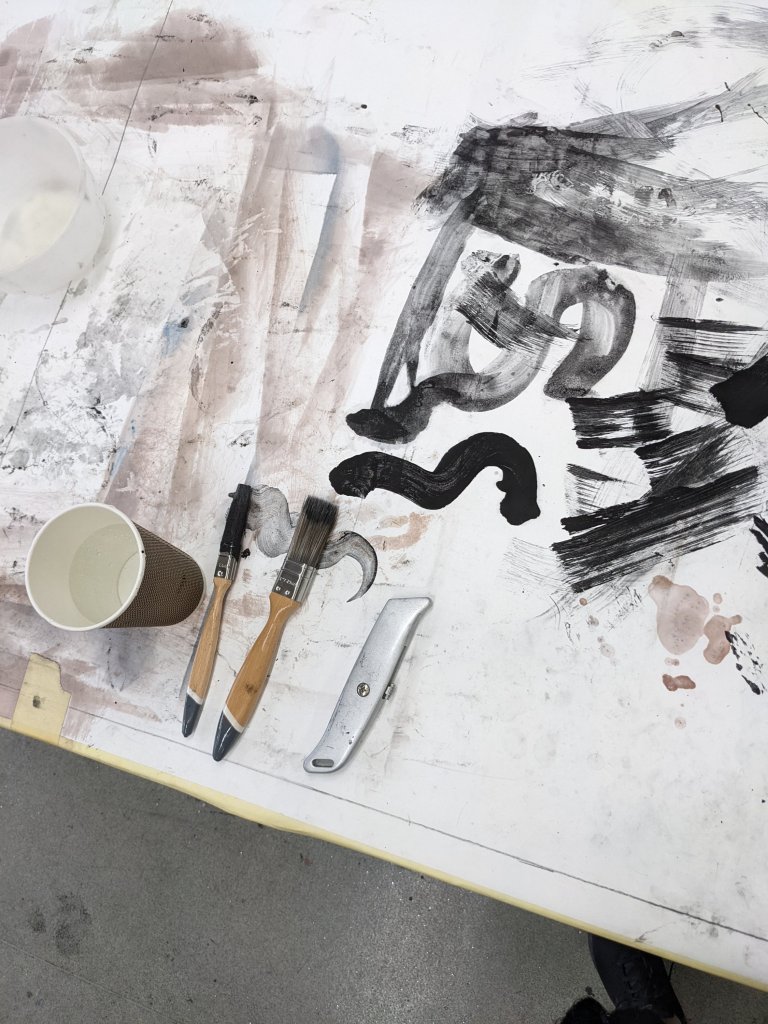
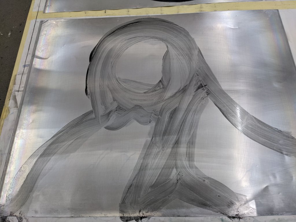
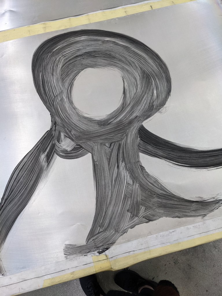
I decided to start the waterless lithography process for making a flag with the symbol on it. The process was deffinatley alot more then I expected and very meticulous.The process deffinately wasn’t as long as the foundry one tho.First the plates had to be cleaned with acetone,then scrubbed twice (with a liquid i think had silicon in it),rinsed and then a liquid applied which had a mixture of wheel cleaner and silicon in it before being dried off with newsprint before the design got painted on.I decided to use light washed down toner on one sheet and undiluted toner on another and a layer of silone with white spirits applied.The sheets then had to be left to dry over night before booking another session.I then had to use a heat gun on the design so that it would set into the aluminum sheet.To start with I didn’t have the heat gun close enough so the design hadn’t set and then i had it too close and the heat had travelled back up the gun causing smoke to billow out! (apparently this has never happened before) the gun had to be left at an open window to cool down!
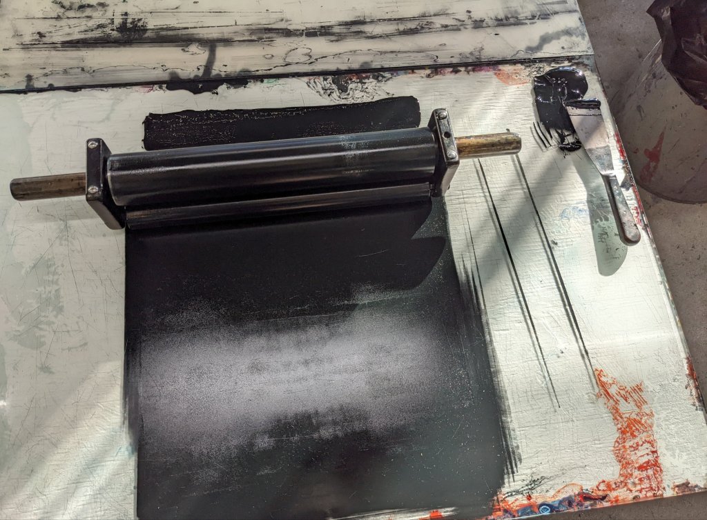
Once the ink was rolled up I then applied the ink by rolling it on I then put the design under the electric roller.It was interesting experimenting with more and less ink just to see how the final design would turn out.It was also hard sometimes to apply enough pressure so the ink would mark the plate showing up on the paper.I did lots of practice prints on newsprint.I was advised by the teacher to maybe go smaller on the design next time as it was too big for the paper and mounting board and would mark the sheet. There seemed to be a small part of the print missing on sheet i liked the most which may of been due to missing that section with the heatgun.The technician advised that waterless lithography would never be perfect and at some stage you just have to come to terms with what you have.But I find that really hard to do unless it is a ‘happy accident’ and i like the end result. Luckily as a back up I painted with acrylic onto some transfer paper the design but due to time limitations I have had to book another session next to do that in.
Image painted with acyrilic onto transfer paper.
Next week I aim to try printing with the transfer paper and maybe try printing onto cloth and seeing how it goes.I can feel my impatience kicking in as I feel deperate to see the design as a flag allready but printing requires alot of patience which hopefully I will slowly learn that patience can pay off and results aren’t allways going to be instant but something that can slowly be worked on in time.
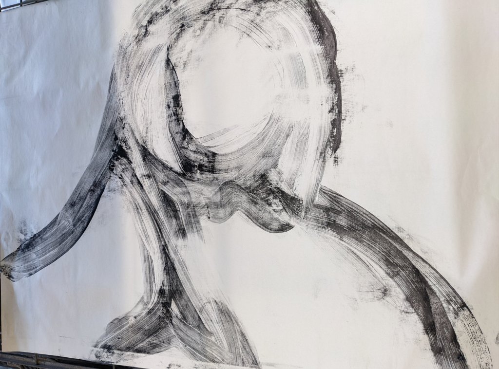
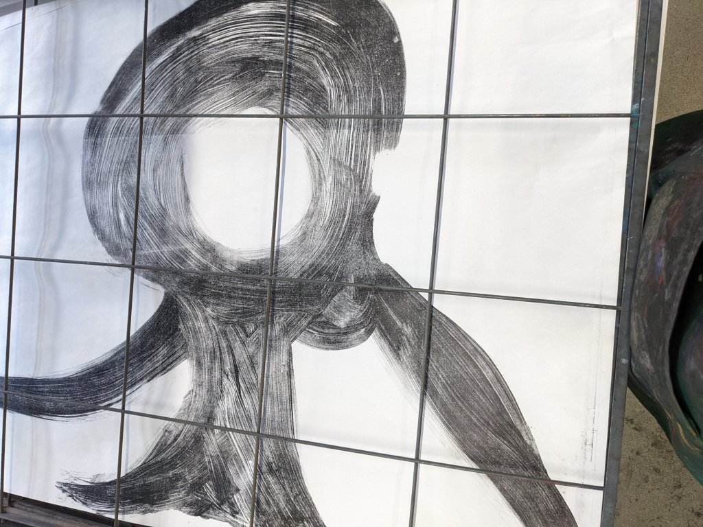
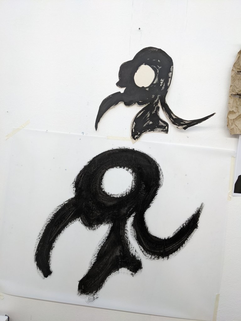
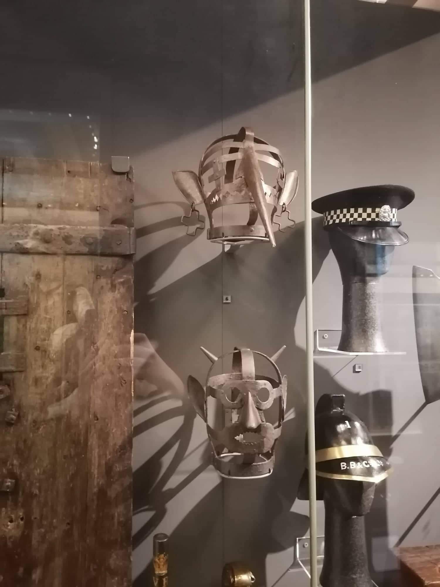
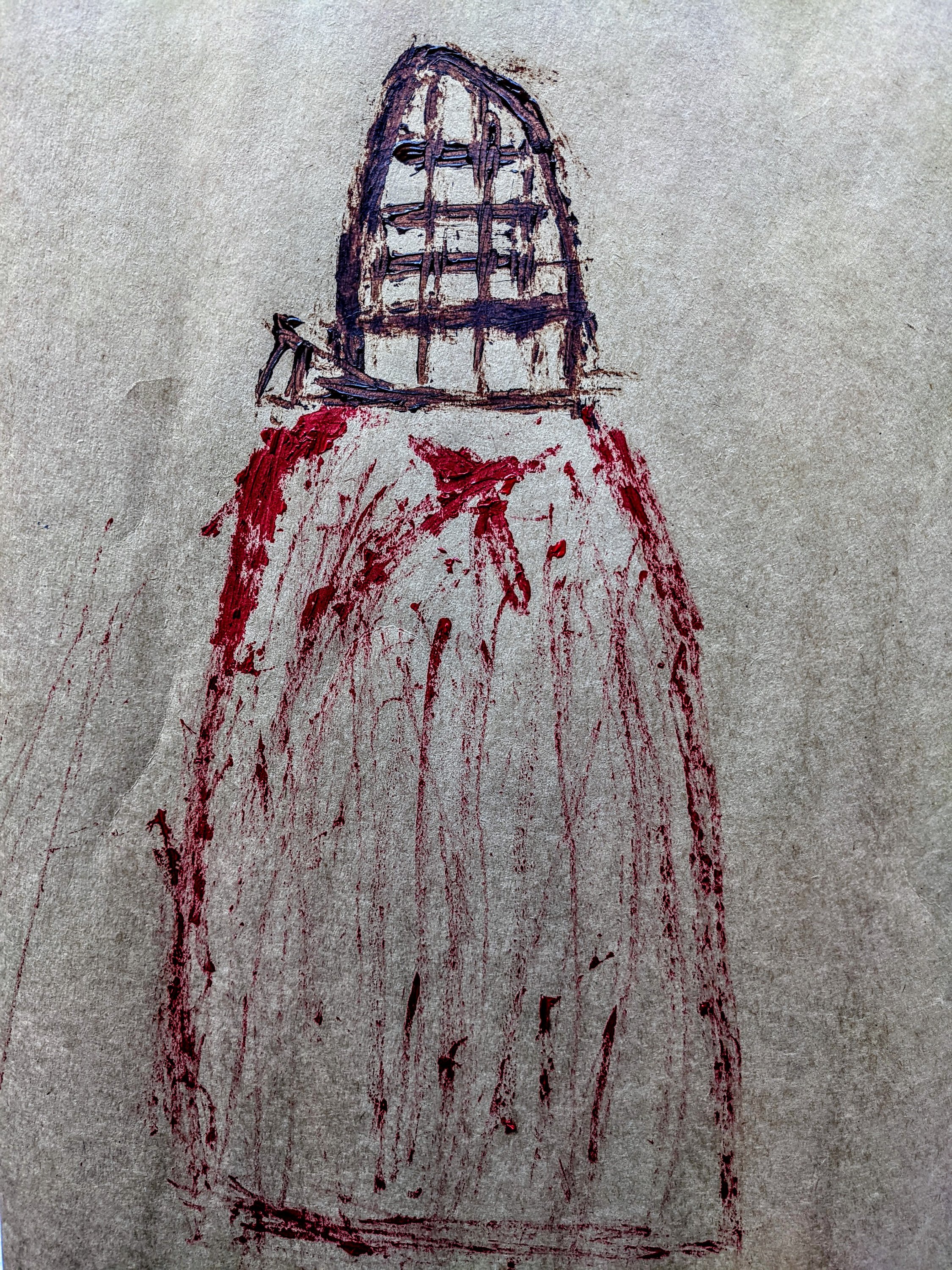
Scold’s Bridle which I viewed in the Mcmanus Gallery.A drawing made with sticks of the head cage derived from the Scold’s bridle.I wanted the painting to look almost primative and that it had prehaps been etched onto a wall or painted into a story book I used brown paper to help heighten this effect.I think I may use this effect to story tell with images.
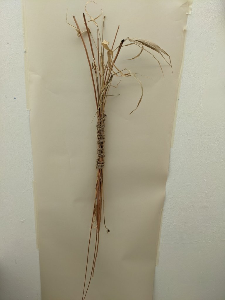
I bound together the straw and willow branch with plaited twine.I felt like this was almost ritualistic and needed to be done as part of the process.The object was bound together which is a popular practice within witchcraft in order to protect someone or something.The object had ambiguity in working wel not only as a sculpure but also as a prop and painting tool.
I felt that the action of binding with the straw fit in quite well with a couple of the reasons witches may do binding. Particulary ‘controling a person’s behaviour,thoughts or emotions’
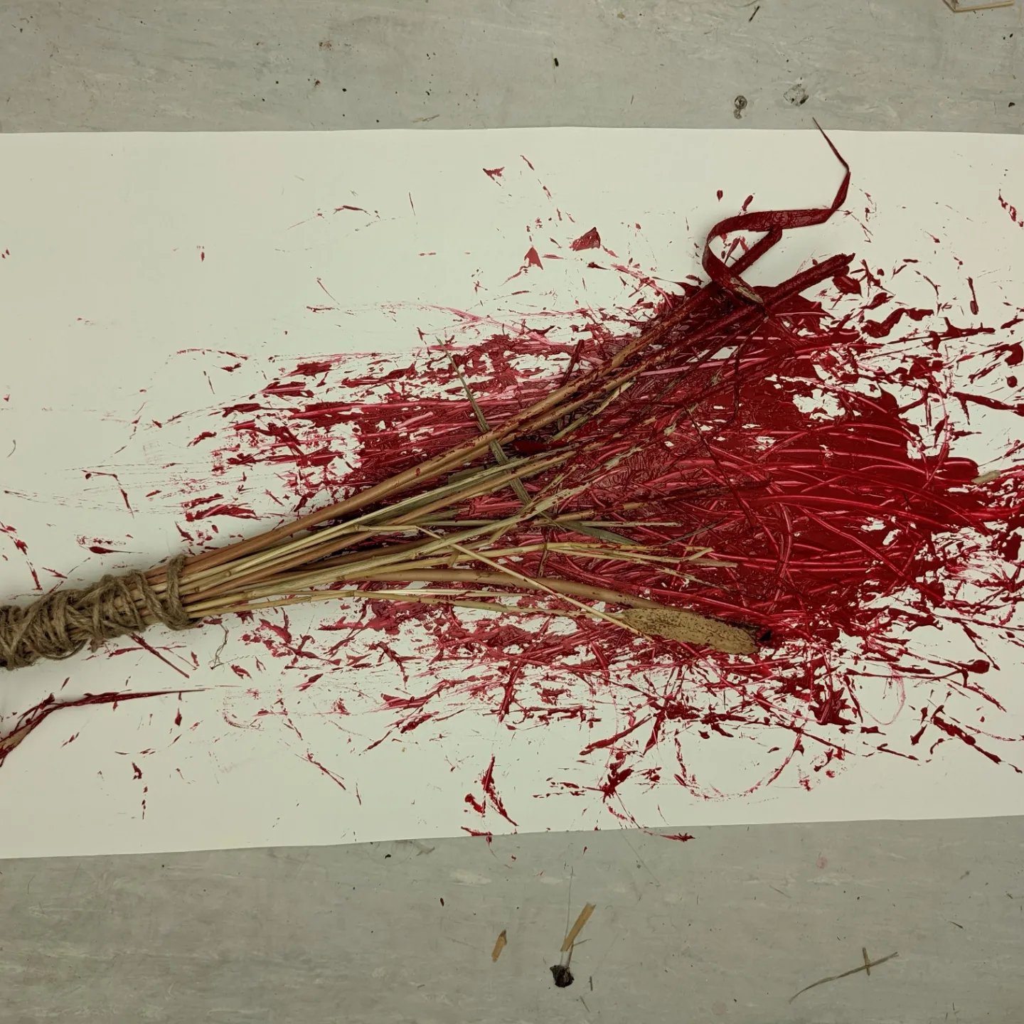
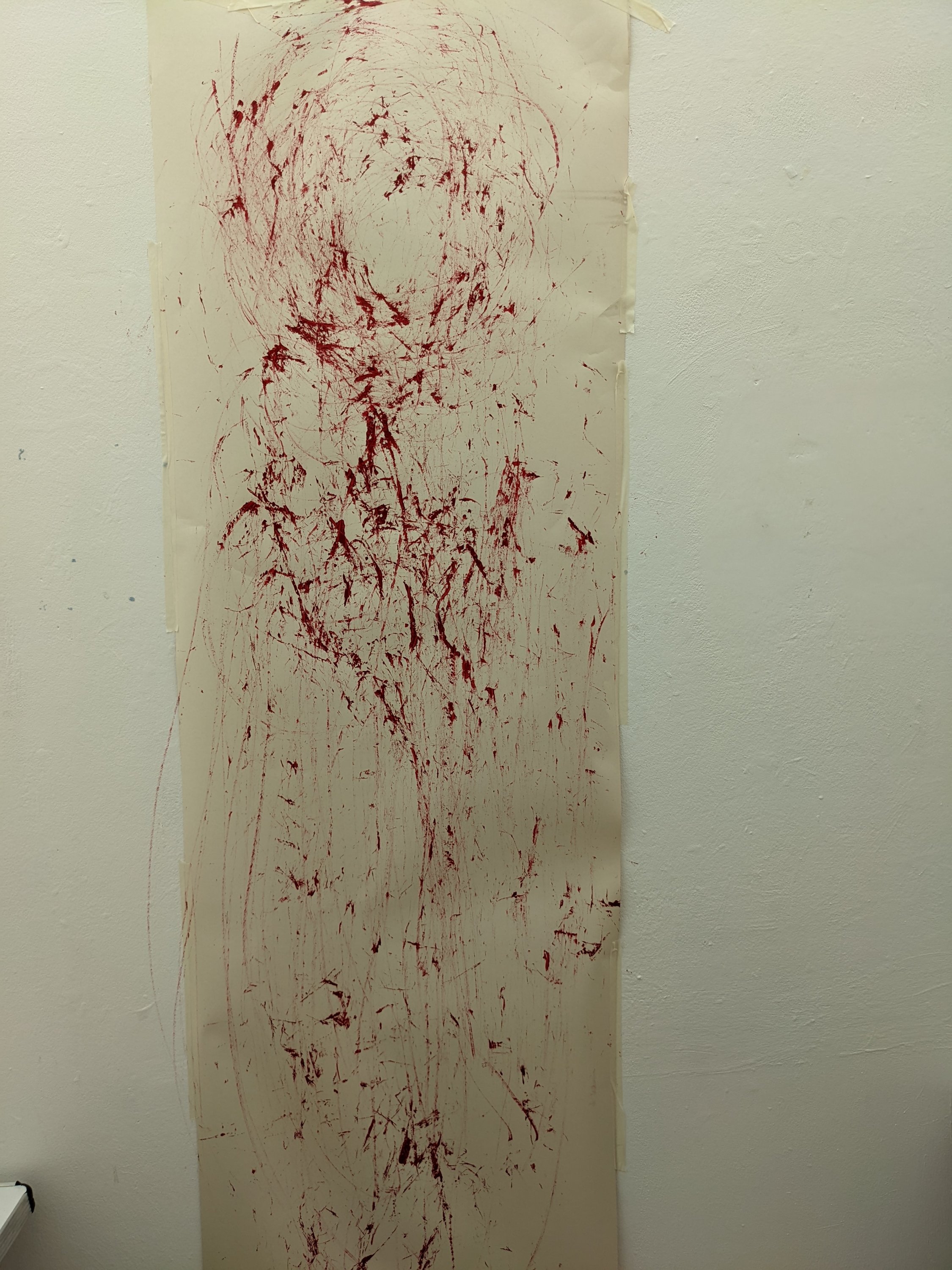
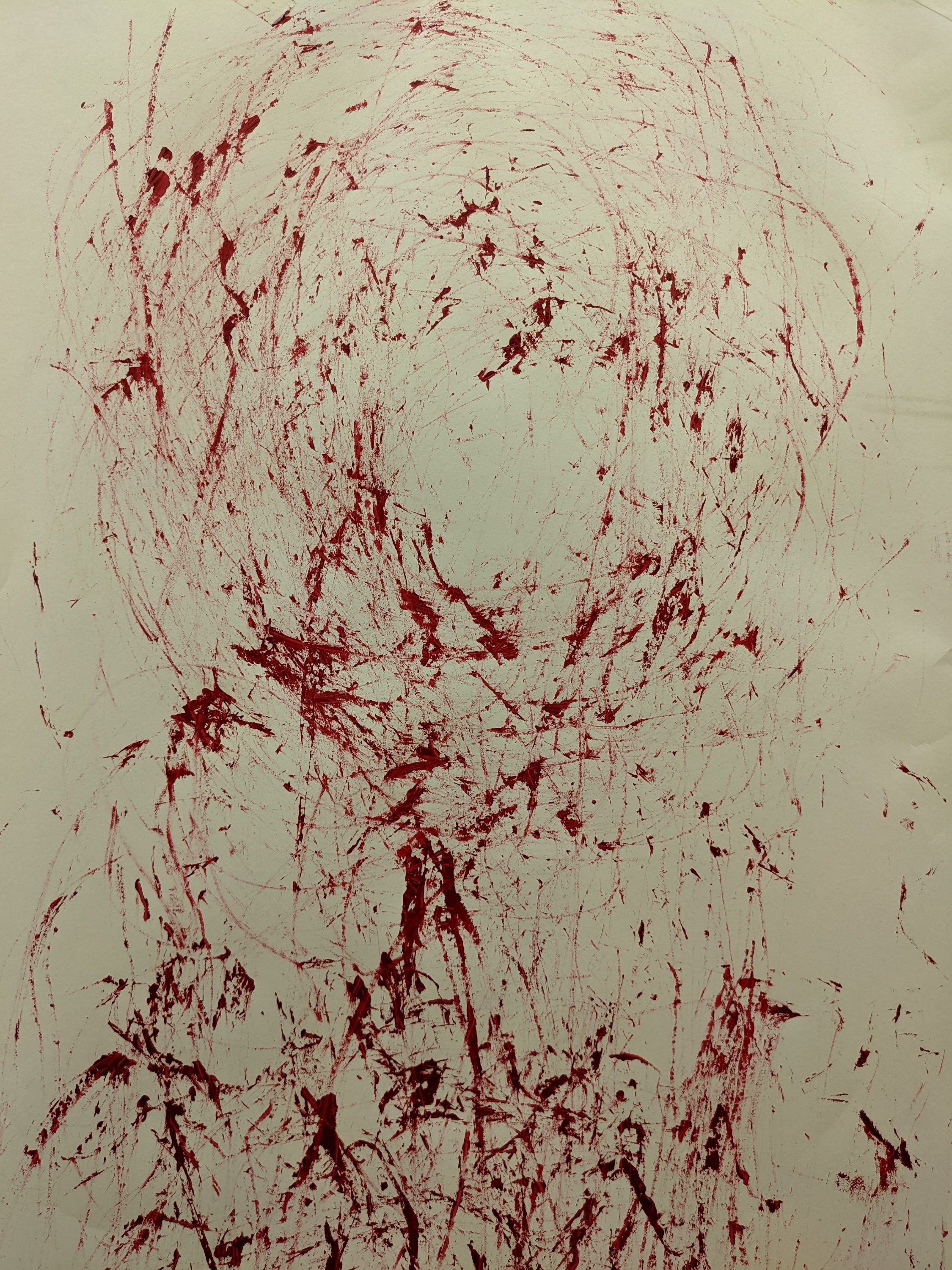
I then flicked the branch up and down in the paint before using it to paint the image of the red lady on the wall.The image looked as if it had been drawn with bloody nails and even the red paint that the straw lay in had a gory looking after effect to it.
I felt that this image worked well to represent the ghostly yet ghouly image of the red lady that would of been etched into every child and women’s head.‘Forever watching,forever waiting’
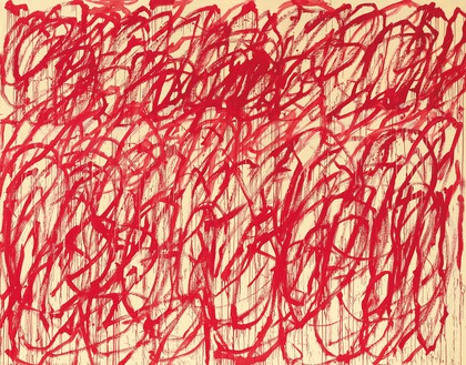
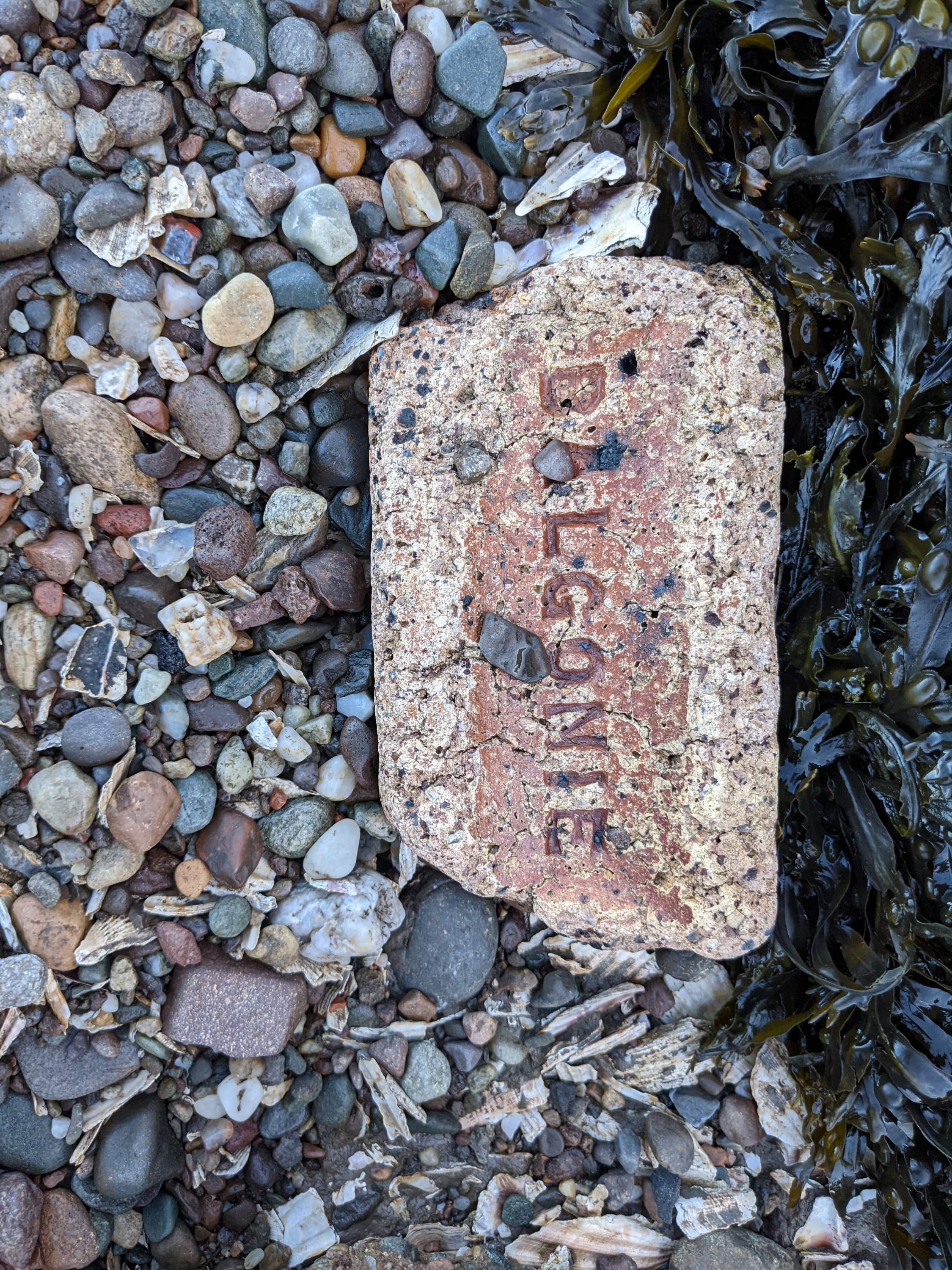
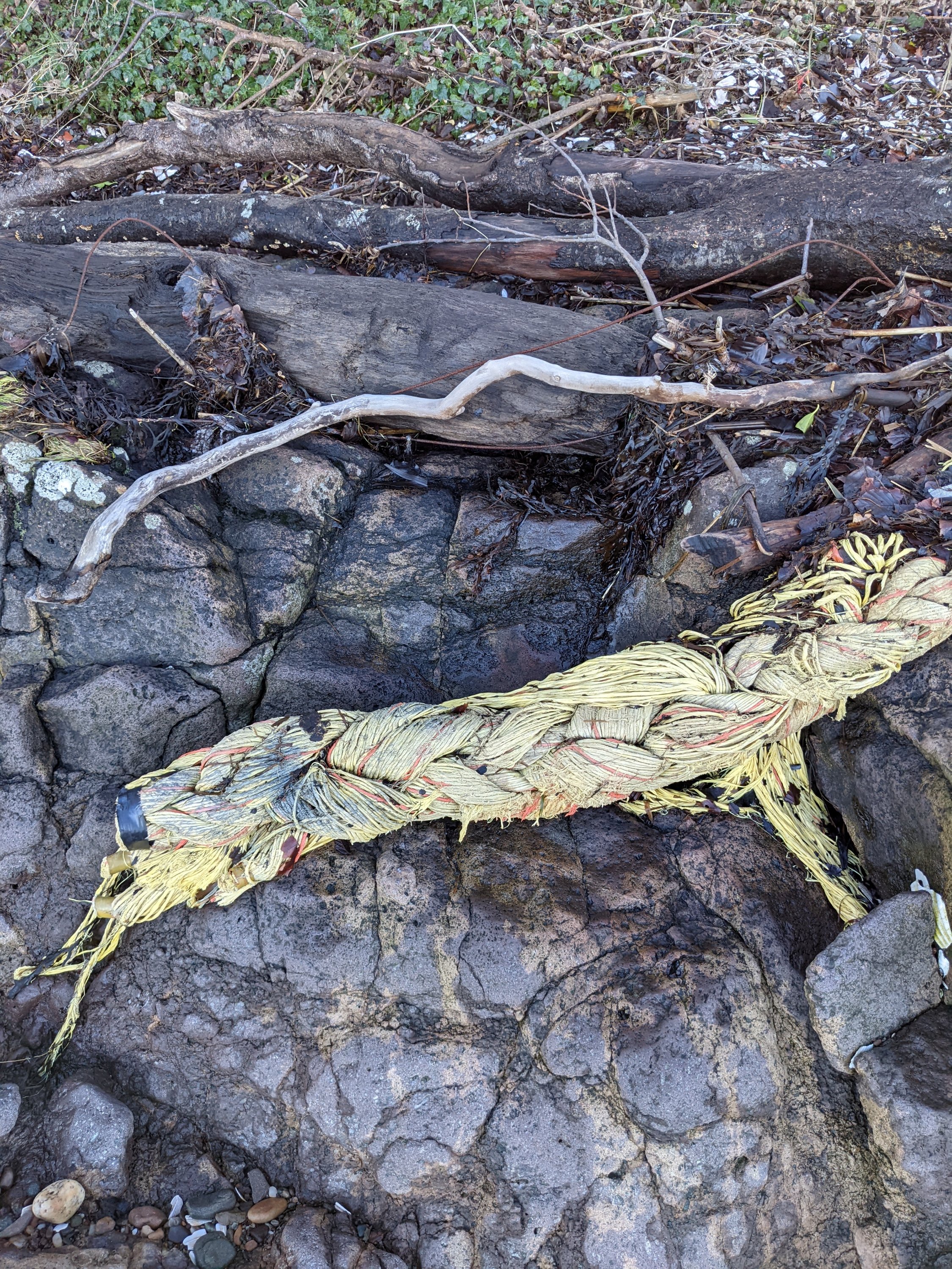
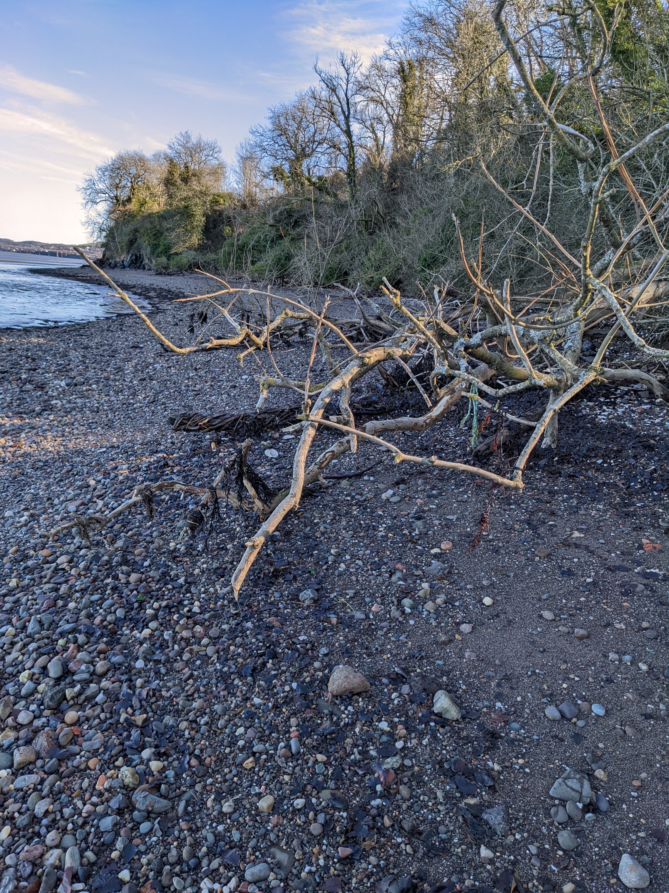
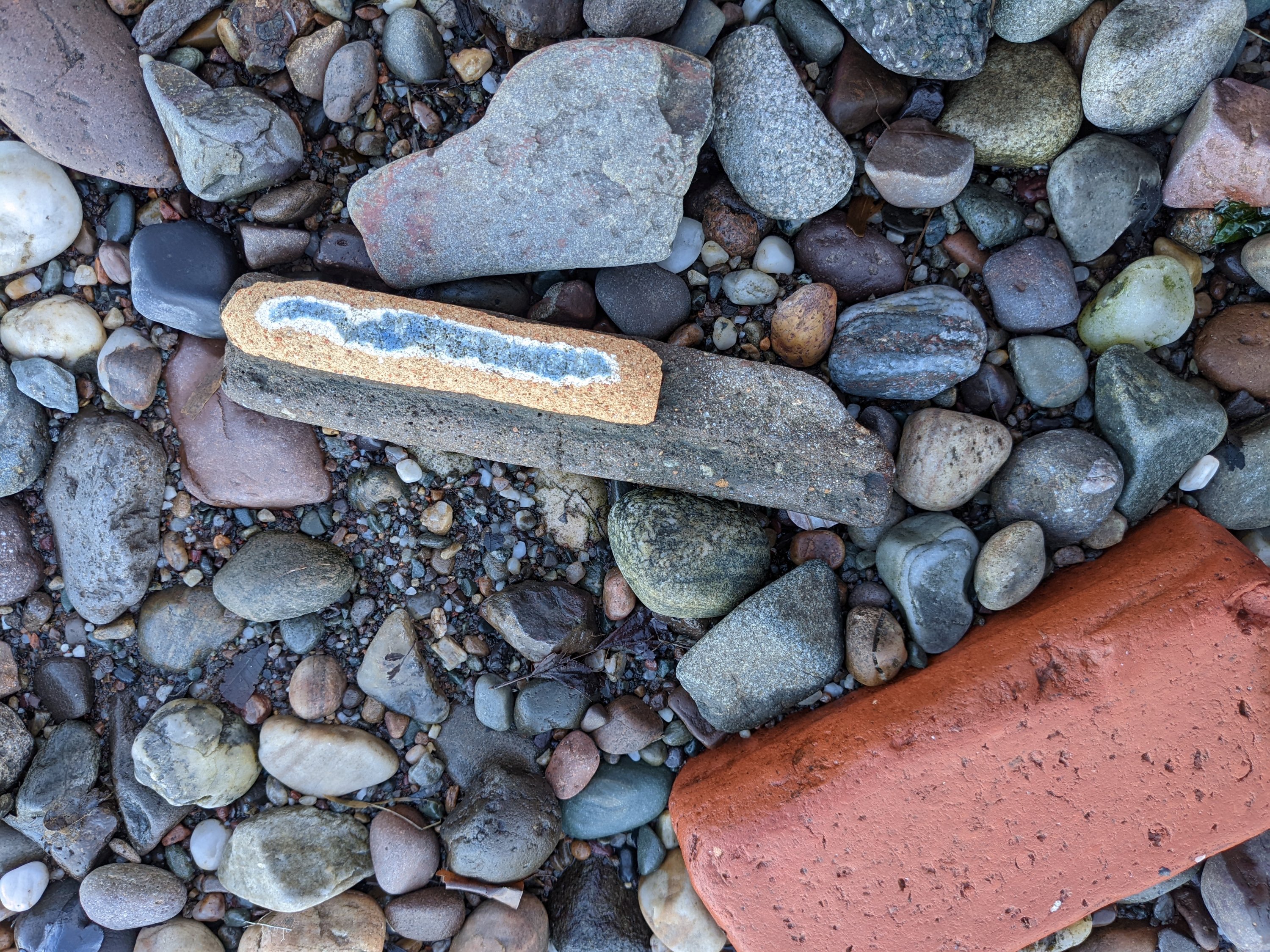
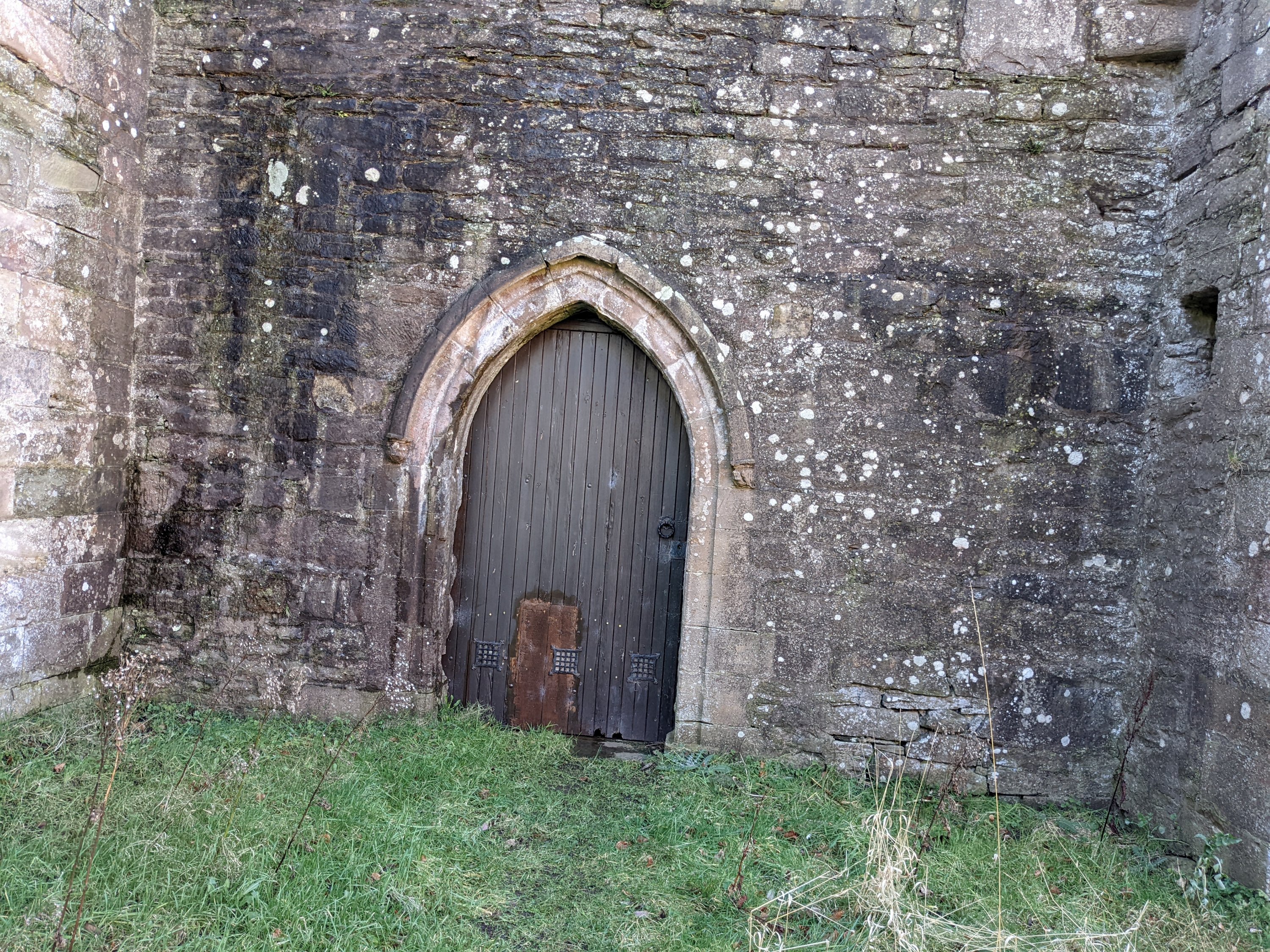
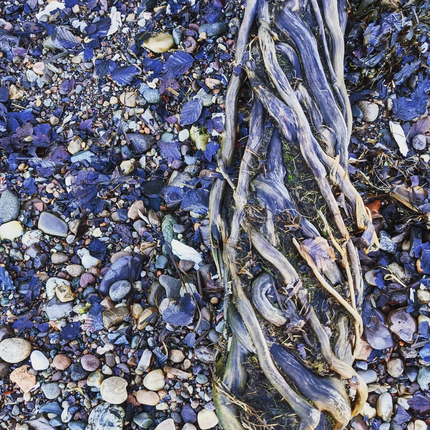
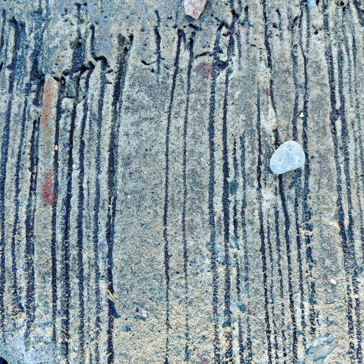
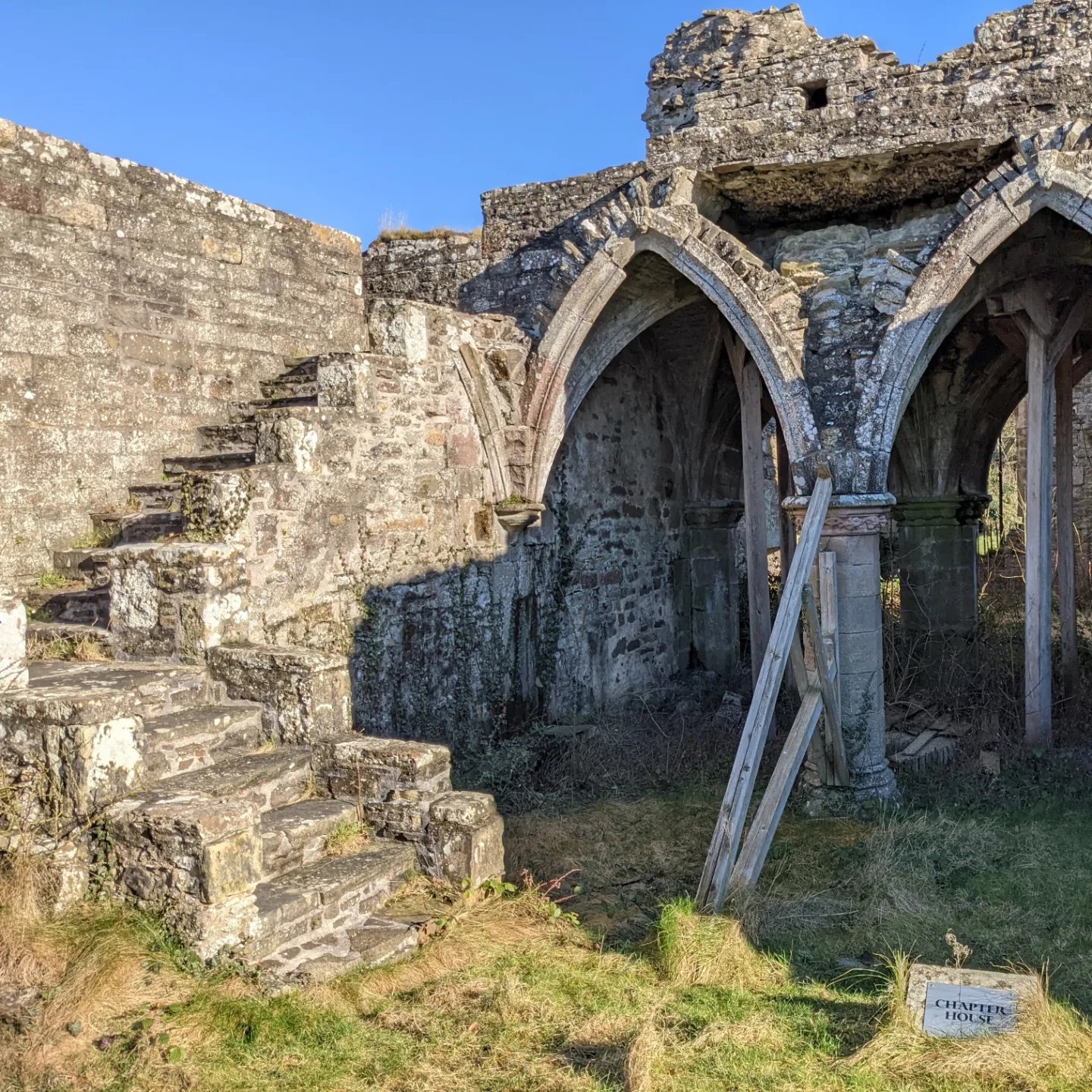
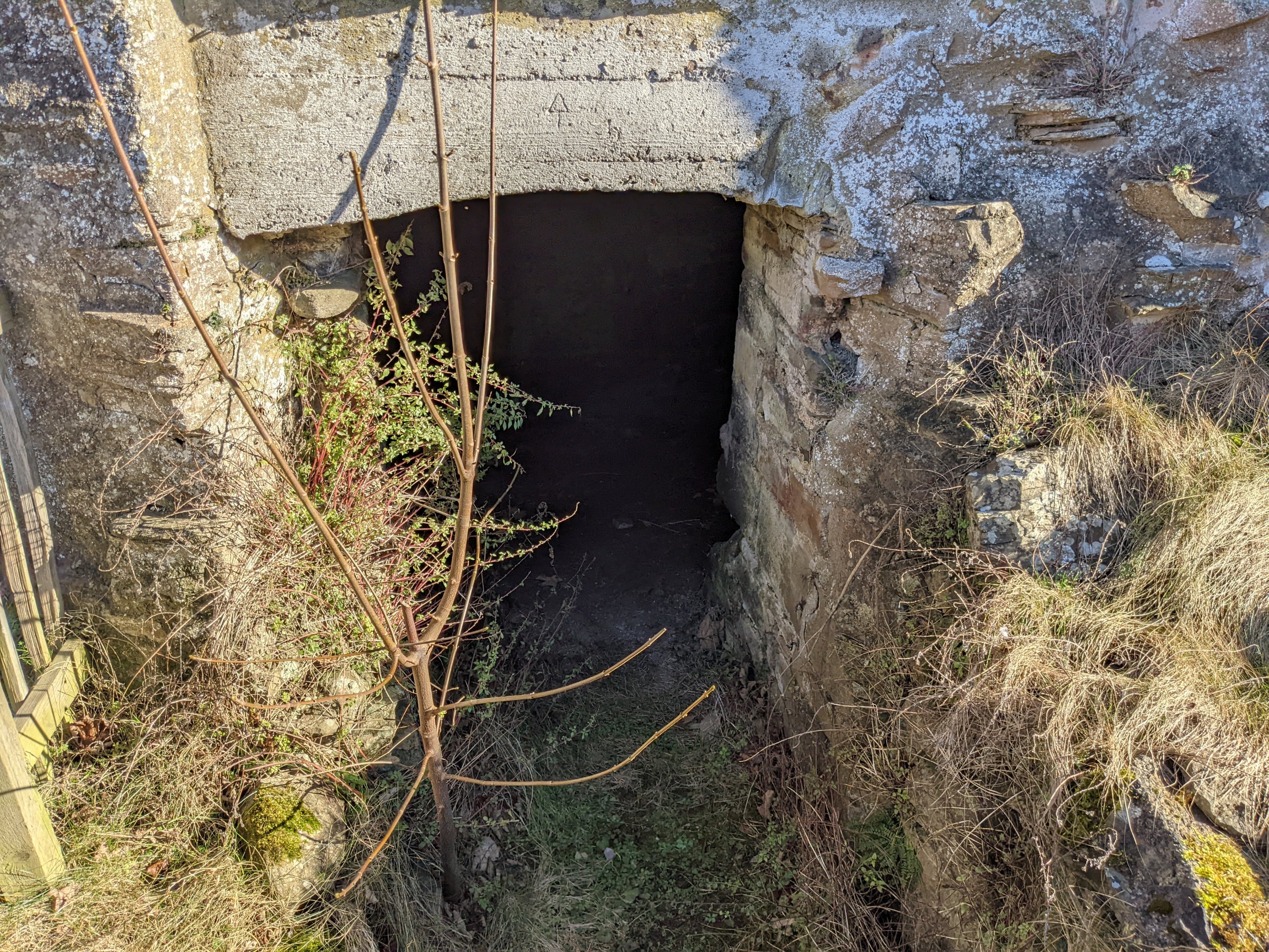
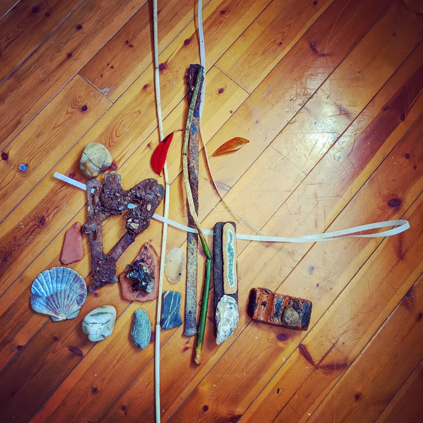
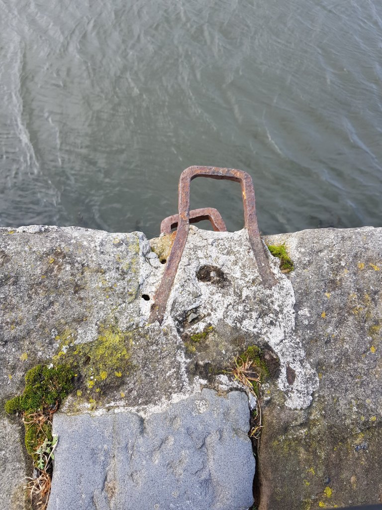
I deffinately felt that my work connected rather well with Cy Twombly’s lines.I thought it would maybe interesting to hand the things I make from the beach onto this tree.Oink!Found the marking on this piece of rock really interestingThe door to the abbey.A place where i hope to do potential filming I just need to find someone to film!Thought there was something really haunting about these lines as they reminded me of nail marks and the Cy Twomby painting above.Sadly these parts of the Abbey aren’t structurely safe enough to walk amongst.My favourite two findings are the rusted stick and rusted shape heart, I feel like they are just screaming to be welded together!!I wonder what they belonged to originally?
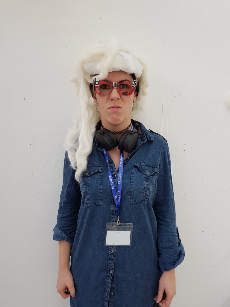
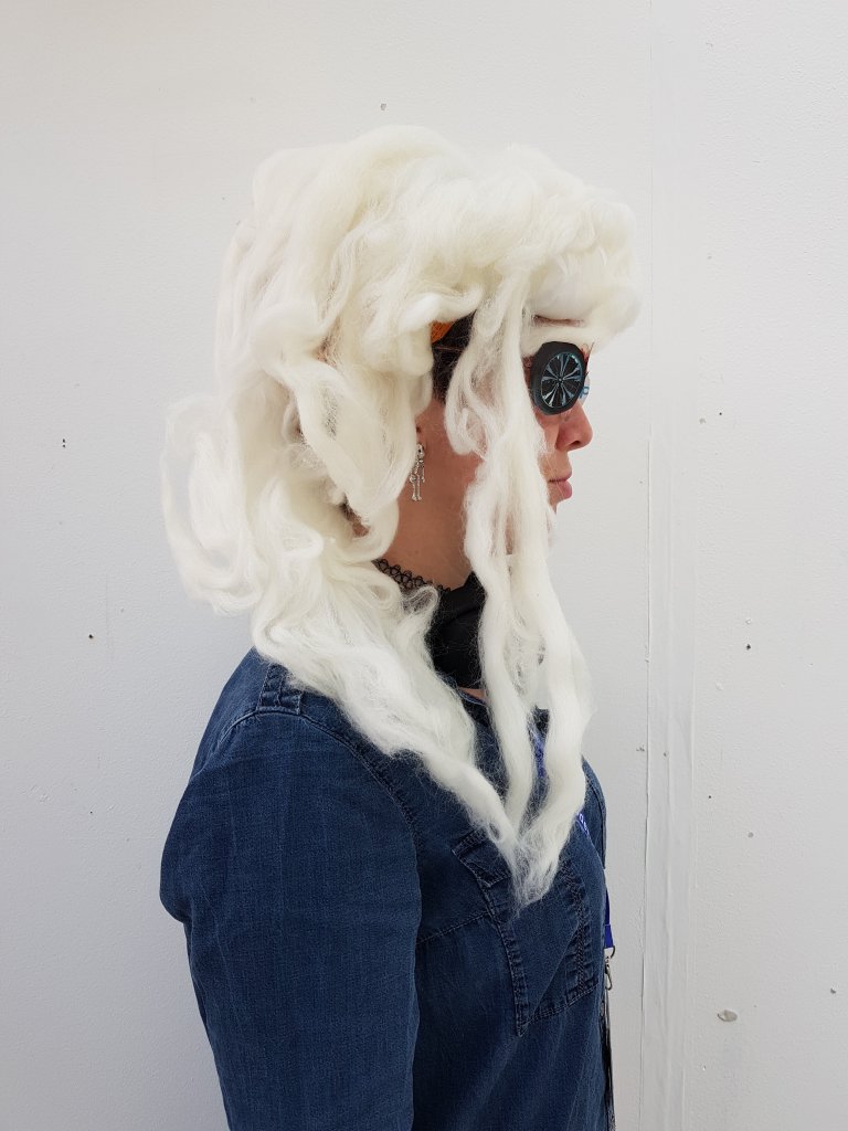
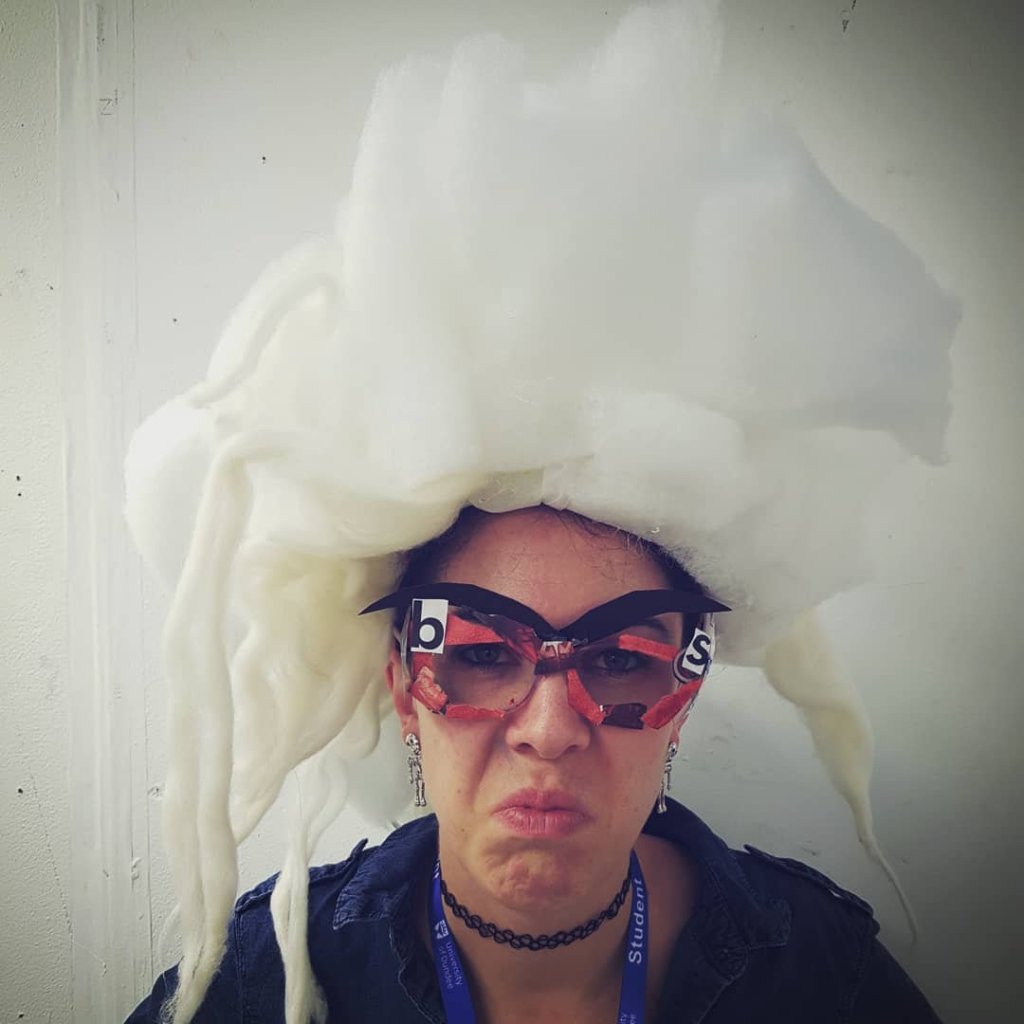
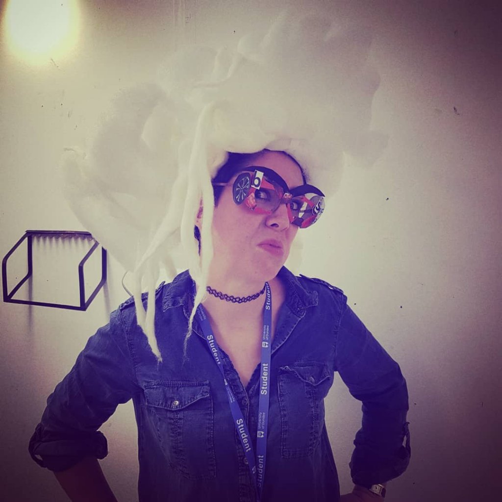
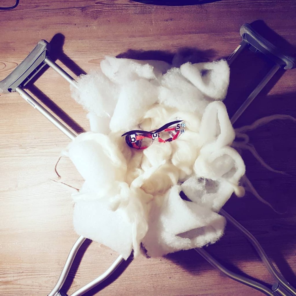
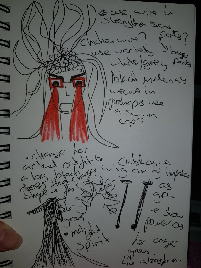
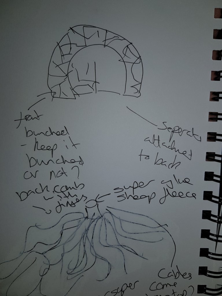
This week I started to create the wig for the character as well as creating the character herself. I also came to the decision that as the character develops so will the wig.
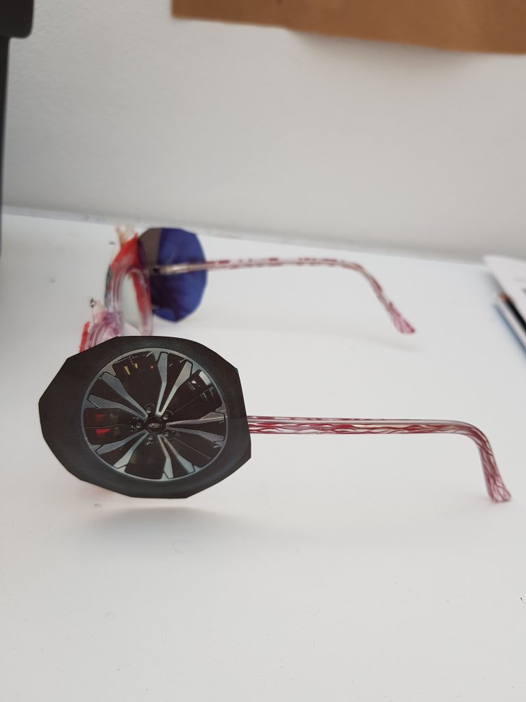
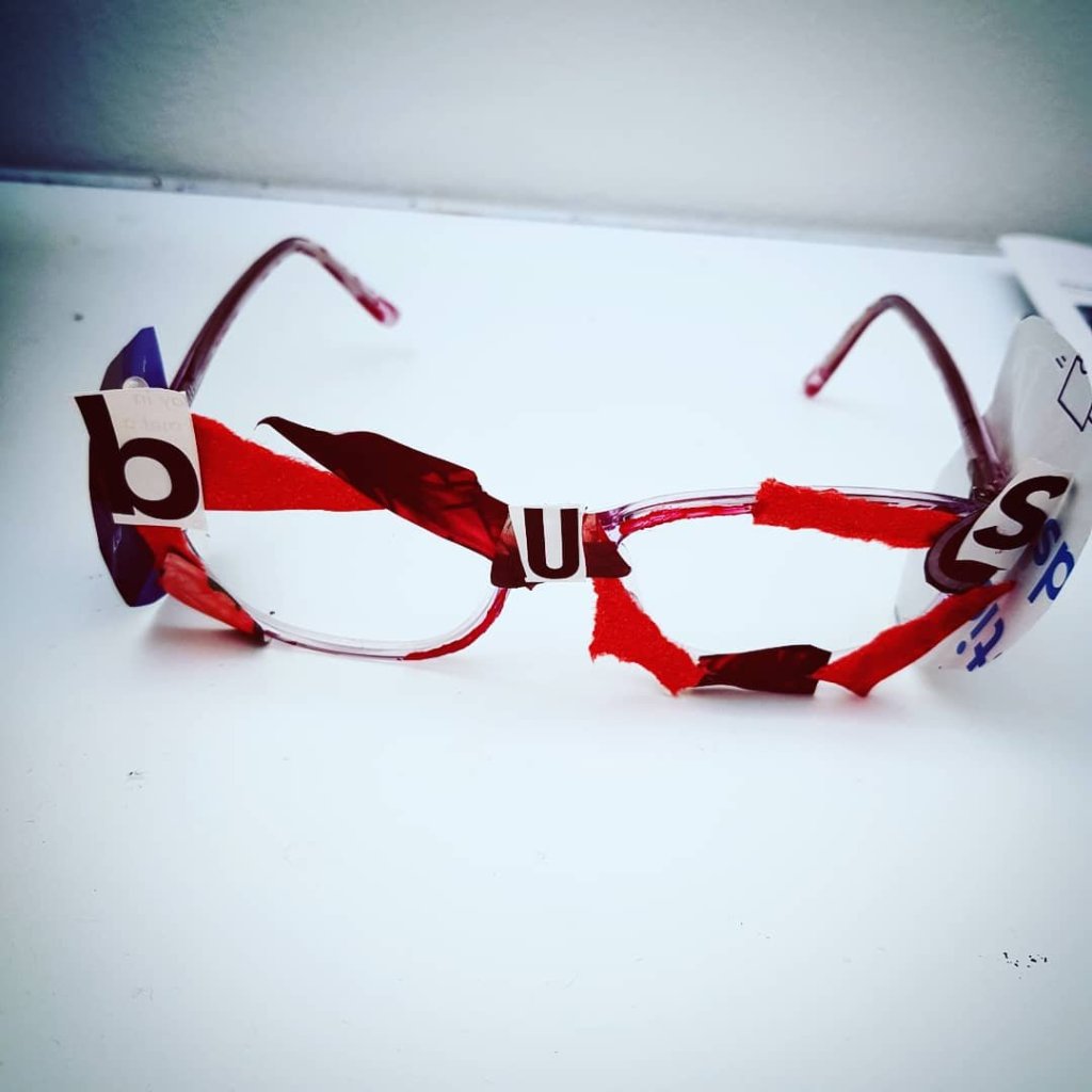
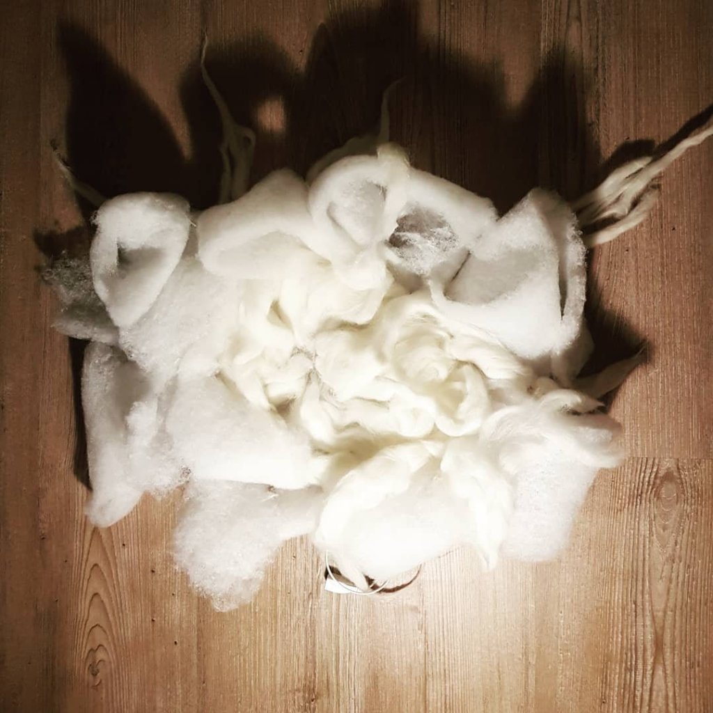
After some quick development sketches, I got to work creating the wig. The initial starting point was to use a mop-head but the one I had was too small for my head, so I decided to use sheep’s wool and stretched it out and attached it to the scrap material I had used to cover the top of the foam headband. The sheep’s wool didn’t give the desired effect as ‘bus shit crazy old lady’ has really big, almost foam like hair; so I decided to use some wadding mixed in with the sheep’s wool and super-glued it together which was very effective in giving the exaggerated look I wanted. I then took a pair of old glasses and decided to cover them with red collage and the word ‘bus’ at the top; I wanted the character to look like she had walked straight out of a story book with parts of it still attached to her.
Altho i liked the effect of the sheeps wool it wasn’t the effect i was looking for and reminded me more of the character ‘Jaquerline MCcafferty’ from the Limmy show
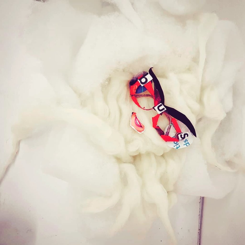
I wanted to give the impression that her glasses were part bus too
I wanted the glasses to look like they still partially belonged in a storybook and to be completely surreal yet comical.
The glasses had a much better effect once the eyebrows were added to them.I was inspired by a devil mask which I felt fitted in well with her character.
sculpture become really eerie and took on a life of it’s own after adding a mouth to it.Considering adding more human elements
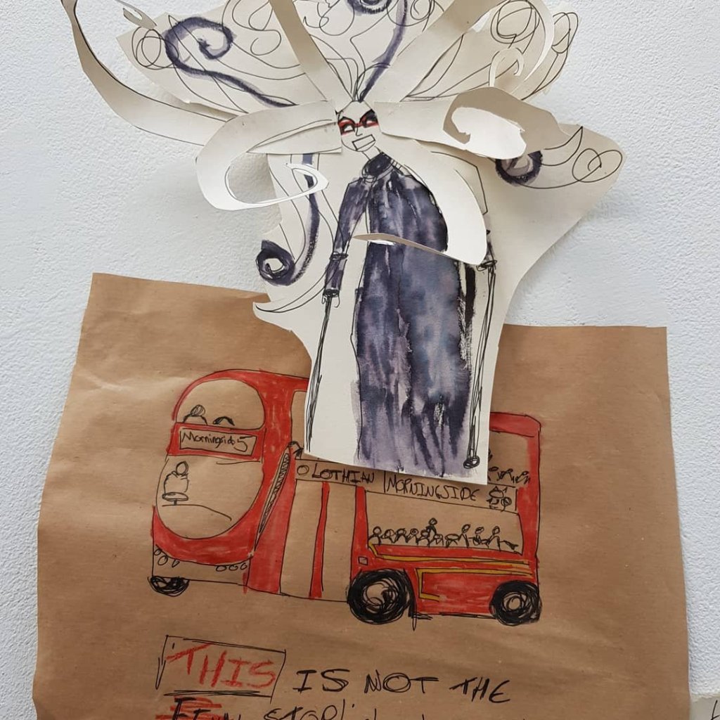
Wig and cross crutch.Becoming a warning flag of it’s own
The wig had started to become a free forming sculpture/character of it’s own. It amused me to think of her wig crawling off her head at night and going on adventures of it’s own. This is something I hope to work on in the near future. I was also lucky enough to acquire a pair of crutches from Tayside re-users which is perfect as the character uses these.
Some quick sketches/scribberlings on how I was planning to develop the wig further/eyes crutches etc.
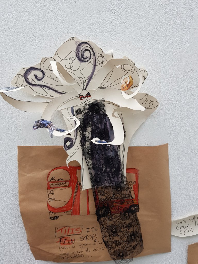
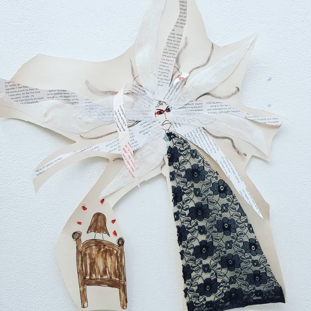
Decided to put lace on top of the image to see if it encouraged the ‘malificent spirit’ image I so desired.
The character frightening small children in their beds.(inspiration taken from the Babadook)
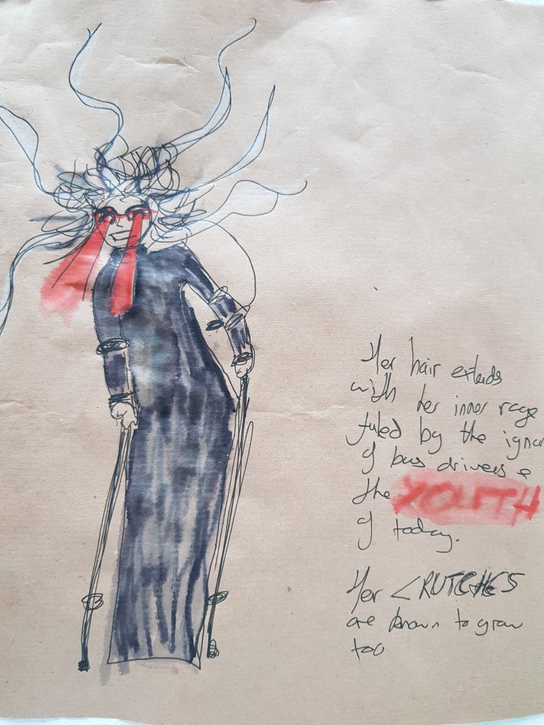
Quite liking the effect of the watercolour pen with the fine liner on brown parcel paper.It makes the colour more vibrant and noticable then if it was on white paper.
Some illustrations with character scenarios/descriptions/dialogue.
I also decided to change the name of the character to ‘bus shit crazy old lady’ in order to stray away from any kind of connection with poor mental health and the from the person that she is based on.
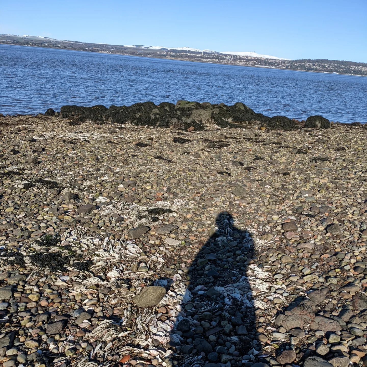
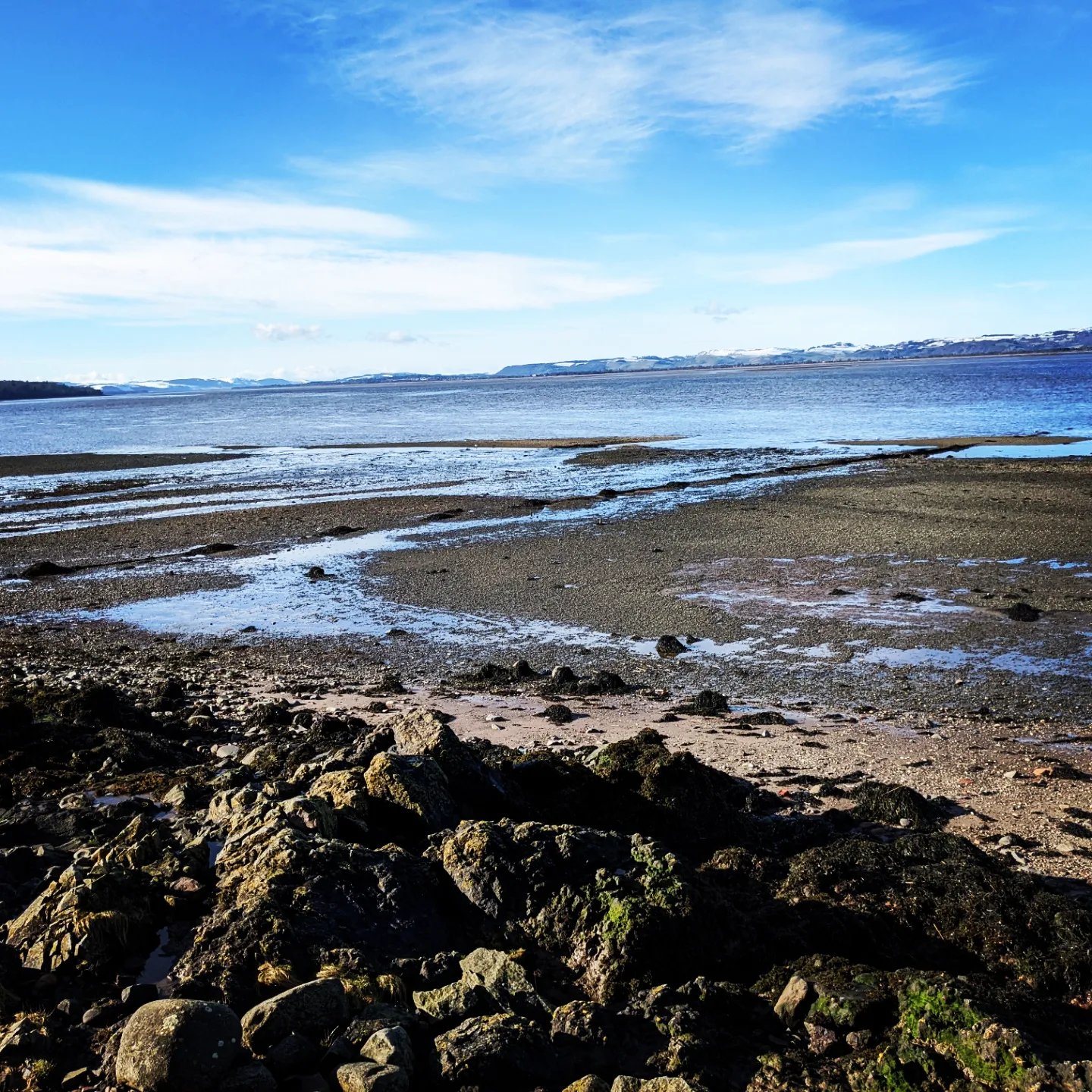
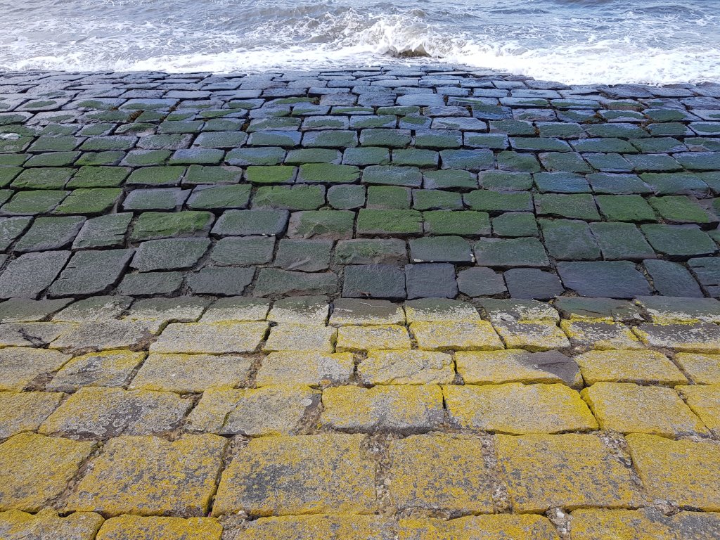
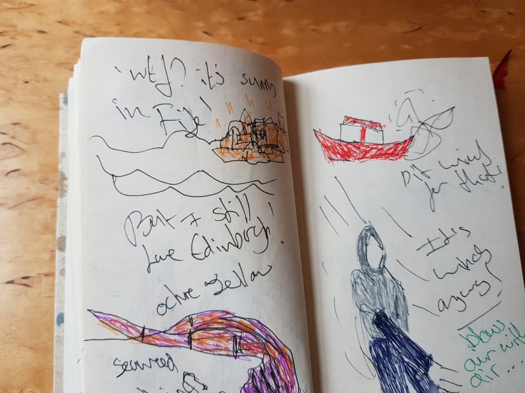
I decided to go on another derive with my partner as I felt like we needed a walk in general and because walks and fresh air often help our creative process otherwise our creativity becomes stagment.
It was an incredibly windy day especially down by the pier.I noticed a couple of things I hadn’t noticed before and tried to capture some sounds but due to the wind it was really hard to pick them up.I think once we move to dundee and are able to have access to DJCAD I will try to access DSLR equitement and attach a microphone with a windshield to my phone.
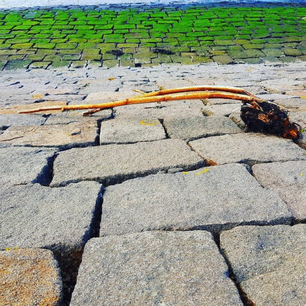
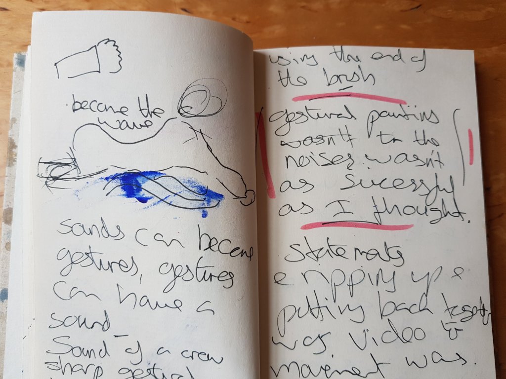
I also started to look at the sea and think of a physical gesture that would best represent the movement of the sea.
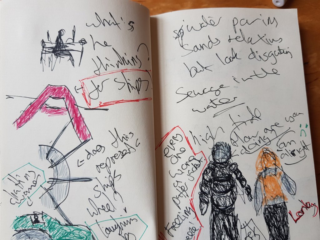
Observations of conversations,people,birds and objects.
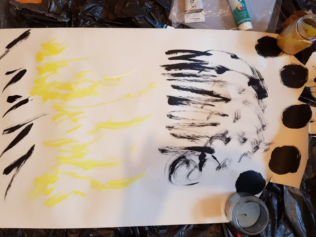
Some gestural marks made whilst listening to one of the videos with crow noises in it.The marks remind me of chinese characters and words.The yellow was the sweet sound of the sparrows,the loose black marks are the hum drum of the schoolchildren making there way past us.I found there conversations quite interesting (little bits you may be able to hear) such as ‘my phone is bigger then yours’ and something about the year 11s.I found the bragging quite interesting as this is usually something children mimick from their parents.
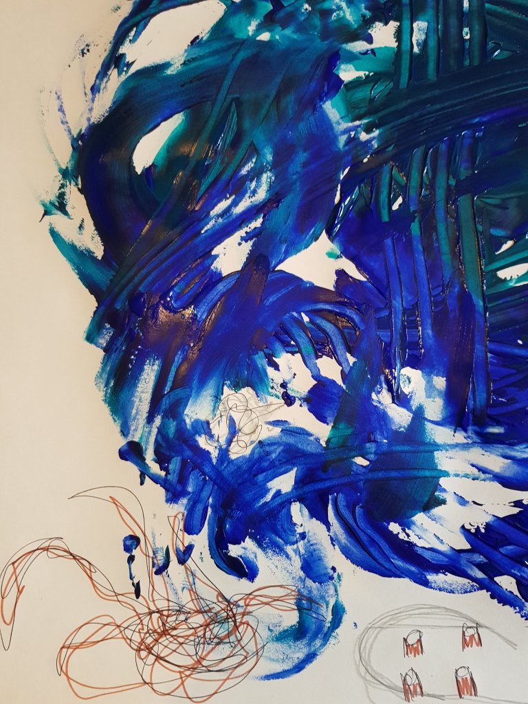
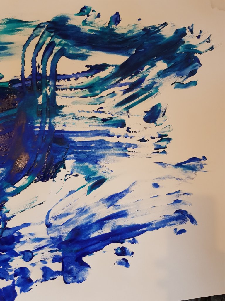
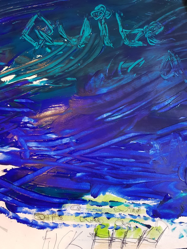
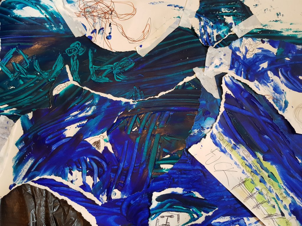
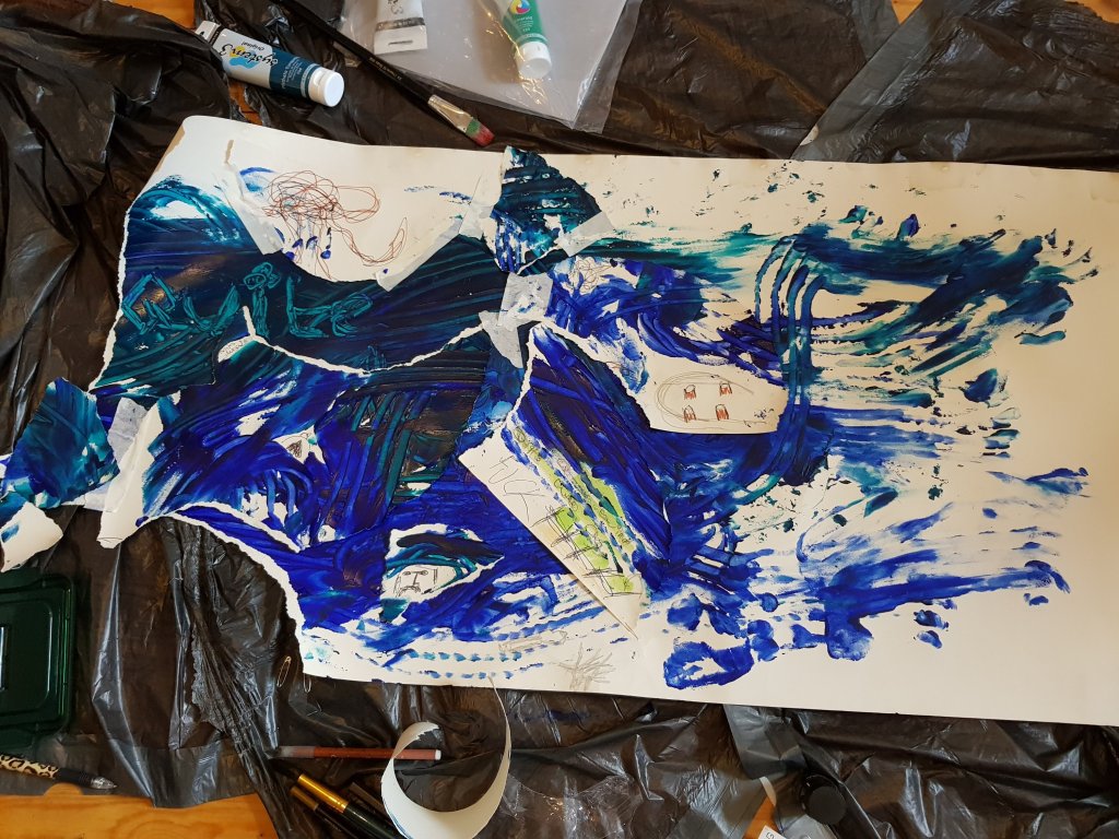
Gestural marks that i made using the same flowing gestural movements that are featured in one of the videos above.I feel that the mixed blues looked much better once I had deconstructed the painting and put it back together again as the illustrations created a map like effected within the ocean of blue and represented the characters and things i noticed on my walk.The use of gestural marks towards the end of the painting i feel were more effective then the mixed blues as you could see them more clearly and I felt that they captured the performative aspect much better and gave the impression of the flow and the crash of the sea.I think I would like to try making some more of thoose marks on paper and add some more illustrations to it.
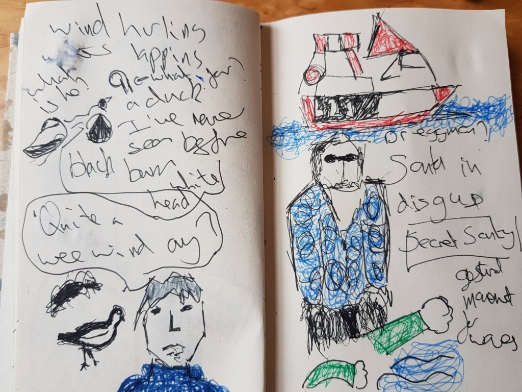
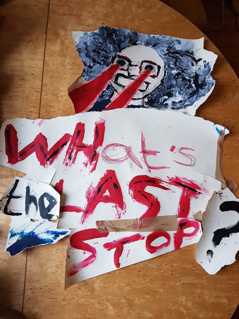
Some quick illustrations of ‘batshit crazy granny’ whom we bumped into on our first walk (she hates Louis for some reason and once turned on the bus with her fingers to her eyes then pointed at Louis as if to say ‘I’m watching you’…This is where the lazers come from streaming from her eyes.Her favourite thing to say when she gets on the bus is ‘WHat is the last STop on this BUses route?’ She tends to over pronounciate the beggining of her words which I also find interesting.I felt like ‘what is the last stop?’worked quite well with the theme of the project aswell.
Pic no2 is the ‘It’s a wee bit windy ay?’ character that we occured talking to his friend.
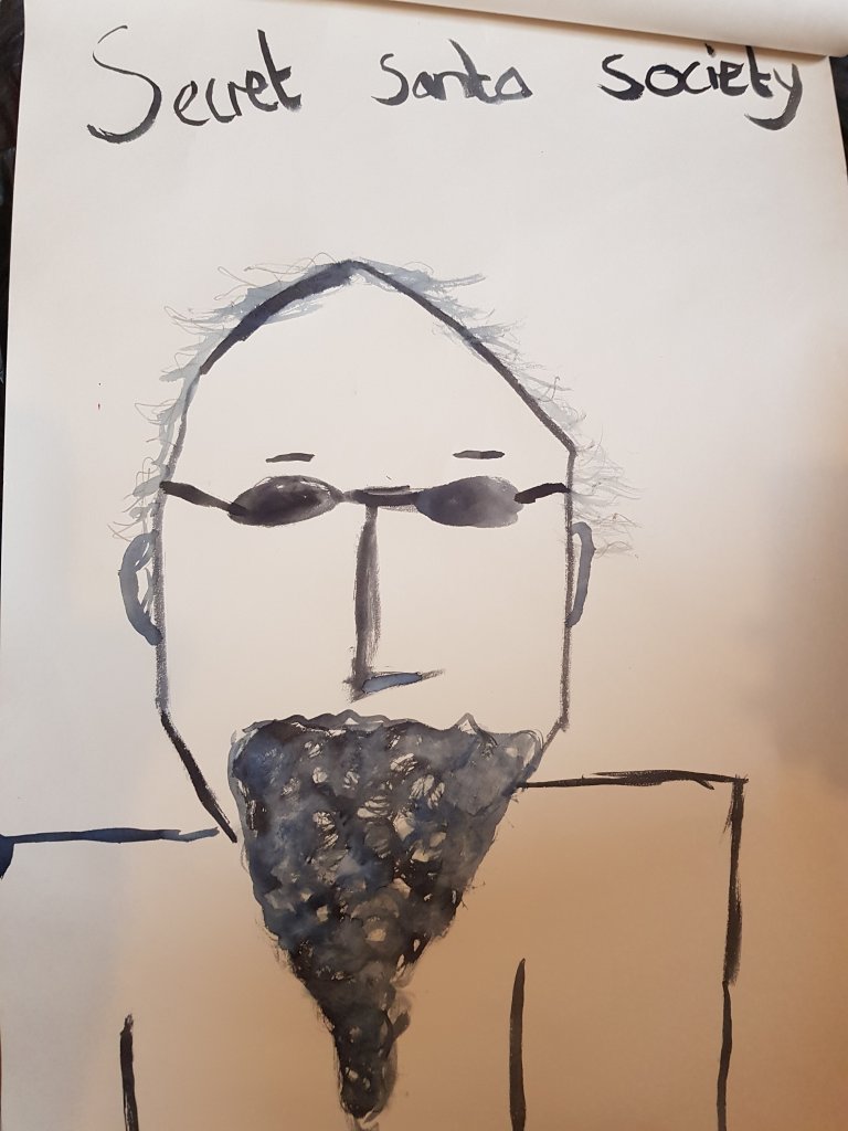
And a man I decided was in the ‘secret santa society’ walking along by the pier.He had quite the undercover look about him.
I feel like i have taken the oppertunity of the derive to make the most of the local characters in the area and giving them back stories. Aswell as paying attention to the noises and visuals around me and making marks and performative pieces to co-incide with that.I’m currently moving flat and don’t have access to the studio so I would like to of spent more time working on a large scale and focusing on the perfromative side of things but I haven’t had the chance.I will obviously be looking to focus more on that next week once we have moved up.
Born May 7th 1970 Saville lives and works in Oxford England and is a contemporary British painter and an original member of the Young British Artists.She is known for her large scale paintings of nude women.
She has been credited with originating a new and challenging method of painting the female nude and reinventing figure painting for contemporary art.
On October 5th 2018 Savilles ‘Propped’ (1992) sold at Sotheby’s in London for 9.5 million above it’s £3-4 million estimate becoming the most expensive work by a living female artist.
Her technique uses small brushstrokes to build up the painting and soften the image the finish of the painting is matte but doesn’t look ‘dry’
“She found a way to niche gender studies within a late flowering of the grand tradition of the swagger portrait… Saville’s provocative twist was to extend the bravura technique and monumental scale of such painting to naked and isolated (or in some cases sardined) young women”. David Cohen
Saville works with oil paint in heavy layers giving a flesh-like appeal.Her mark making gives life itself.
‘Torso’ Jenny Saville
Saville’s non-conventional look at beauty takes the traditional nude image into a way of making a statement about the body,gender politics,sexuality and even self realization.
Her works have been described as ‘depict distorted,fleshy and disquieting female bodies’ to create interest,confusion,questions and excitement. Saville’s style and subject matter has been compared to that of Lucian Freud. ‘I paint flesh because i am human’ she has said.If you work in oil as I do it comes naturally.Flesh is just a beautiful thing to paint’
“A confrontation with the dynamics of exposure… her exaggerated nudes point up, with an agonizing frankness, the disparity between the way women are perceived and the way that they feel about their bodies” Suzie Mackenzie
She experiments with the dual meaning of embodiment and what it means to be “feminine” or “beautiful” through the use of the distortion and “disgust”. The visual of disgust pushed people to the uncomfortable and forced many into the shoes of countless women in the Western world.giving some the decision to decide their own standard of beauty beyond society.
Jonathan Yeo
(Unknown) Jonathan Yeo
Born 18 December 1970in London, England) is a British artist who rose to international prominence in his early 20s as a contemporary portraitist, having painted Kevin Spacey,Dennis Hopper,Cara Develinge,Damien Hirst,Prince Philip,Erin O’ Connor,Tony Blair and David Cameron among others. GQ has called him ‘one of the worlds most in-demand portraitists’.He was educated at Westminster School.
His unauthorised portrait in 2007 of George W Bush, created from cuttings of pornographic magazines brought him worldwide notoriety, shown in London, New York and Los Angeles.
(Unknown) Jonathan Yeo
His paintings are included within the permanent collections of the National Portrait Gallery,London,The Laing Art Gallery,Newcastle,The museum of Natural History at Frederiksborg Castle in Denmark and the Royal Collection.
In March 2016, Yeo’s largest retrospective to date opened at the Museum of National History at Frederiksborg Castle in Denmark.A new series of paintings of the actor and model Cara Delevingne was unveiled at the museum as part of the exhibition. This series of portraits was made over an eighteen-month period and is concerned with image making and performed identity. Yeo said: “the way we manipulate and read self-portrait images, or ‘selfies’, in the last five years has far more in common with the activity of the 16th-century portrait artists and audiences than any art movement since the birth of photography”.A portrait of the former Danish Prime Minister, Helle Thorning-Schmidt, was also unveiled at the opening of this exhibition and will remain at the museum as part if its permanent collection. A new monograph, titled ‘In The Flesh’, was published by the museum to accompany the show.
Yeo taught himself to paint in his twenties while recovering from Hodgkin’s Disease. In the early 2000s, he became known for his contemporary realist portraits of well-known figures. His subjects include actors Dennis Hopper, Jude Law, Kristin Scott Thomas, Lily Cole, Nicole Kidman, Turner Prize-winning artist Grayson Perry, Savile Row tailor Ozwald Boateng, the former Danish Prime Minister Helle Thorning-Schmidt, The Duchess of Cornwall and media tycoon Rupert Murdoch.In 2005, his portrait of Erin O’Connor was used to advertise London’s National Portrait Gallery around the world. The painting was used as the front cover of ‘500 Portraits’, a survey of the BP Portrait prize published in 2011.
Yeo was commissioned by the House of Commons as the official Election Artist for the 2001 UK general election, and he painted the leaders of the three largest parties. His triptych of Tony Blair, William Hague, and Charles Kennedy, entitled, ‘Proportional Representation’, was made up of canvases sized according to the subjects’ popularity.
In January 2008, Yeo’s official portrait of former Prime Minister Tony Blair was unveiled and struck a public chord with its clear Iraq war reference. It showed an older and wearier-looking Blair wearing a red poppy – a symbol of war remembrance for the British..
Between 2010 and 2012, Yeo created works based on cosmetic surgery procedures. He presents the faces of women in pre and post-operative states, as a counterpoint to the traditional portrait. This collection of paintings was the subject of two solo exhibitions, ‘You’re Only Young Twice’ at Lazarides in London and ‘(I’ve Got You) Under My Skin’ at Circle Culture Gallery in Berlin.
Cindy Sherman
(Unknown) Cindy Sherman
Cynthia Morris Sherman was born January 19, 1954 in Glen Ridge, New Jersey, the youngest of the five children of Dorothy and Charles Sherman. Shortly after her birth, her family moved to the township of Huntington, Long Island. Her father worked as an engineer for Grumman Aircraft. Her mother taught reading to children with learning difficulties
In 1972, Sherman enrolled in the visual arts department at Buffalo State College, where she began painting. During this time, she began to explore the ideas which became a hallmark of her work: She dressed herself as different characters, cobbled together from thrift-store clothing.Annoyed with what she saw as the limitations of painting as a medium of art, she abandoned it and took up photography. “There was nothing more to say [through painting]”, she recalled. “I was meticulously copying other art, and then I realized I could just use a camera and put my time into an idea instead.
Sherman is an American artist whose work consists of photographic self-portraits, focusing on herself in many different contexts and as various imagined characters.She works in series, typically photographing herself in a range of costumes. To create her photographs, Sherman shoots alone in her studio, becoming many roles as author, director, make-up artist, hairstylist, wardrobe mistress, and model
Her breakthrough work is often considered to be “Complete Untitled Film Stills,” a series of 70 black-and-white photographs of herself in many of the roles of women in performance media (especially arthouse films and popular B-movies). In the 1980s, Sherman used color film and large prints, and focused more on costume, lighting and facial expression.
In 1995, Sherman was the recipient of a MacArthur Fellowship. In 2013 she received an honorary doctorate degree from the Royal College of Art, London
Images from her 2017 project where she collaborated on a “selfie” project with W Magazine that was based on the concept of the “plandid,” or “the planned candid photograph”. Sherman utilized a variety of photo-correction apps to create her Instagram portraits.
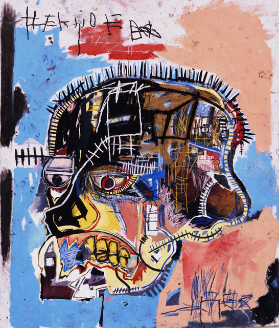
Jean Michel Basquiat
Untitled 1981
Born December 22, 1960 – August 12, 1988) Basquiat was an American artist of Haitian and Puerto Rican descent. Basquiat first achieved fame as part of SAMO, a graffiti duo who wrote enigmatic witty puns in the cultural hotbed of the Lower East Side of Manhattan during the late 1970s, where rap, punk, and street art merged into early hip-hop music culture. By the 1980s, his neo-expressionist paintings were being exhibited in galleries and museums internationally. The Whitney Museum of American Art held a retrospective of his art in 1992
Basquiat’s art focused on divisions such as wealth versus poverty, integration versus segregation, and inner versus outer experience. He appropriated poetry, drawing, and painting, and married text and image, abstraction, figuration, and historical information mixed with modern critique.
‘Dustheads’ 1982
Basquiat used social commentary in his paintings as a tool for introspection and for identifying with his experiences in the black community of his time, as well as attacks on power structures and systems of racism. Basquiat’s visual poetics were acutely political and direct in their criticism of colonialism and support for class struggle.
Fred Hoffman hypothesizes that underlying Basquiat’s self-identification as an artist was his “innate capacity to function as something like an oracle, distilling his perceptions of the outside world down to their essence and, in turn, projecting them outward through his creative acts.”Additionally, continuing his activities as a graffiti artist, Basquiat often incorporated words into his paintings. Before his career as a painter began, he produced punk-inspired postcards for sale on the street. On one occasion Basquiat painted his girlfriend’s dress with the words “Little Shit Brown”. He would often draw on random objects and surfaces, including other people’s property. The conjunction of various media is an integral element of Basquiat’s art. His paintings are usually covered with text and codes of all kinds: words, letters, numerals, pictograms, logos, map symbols, diagrams and more.


