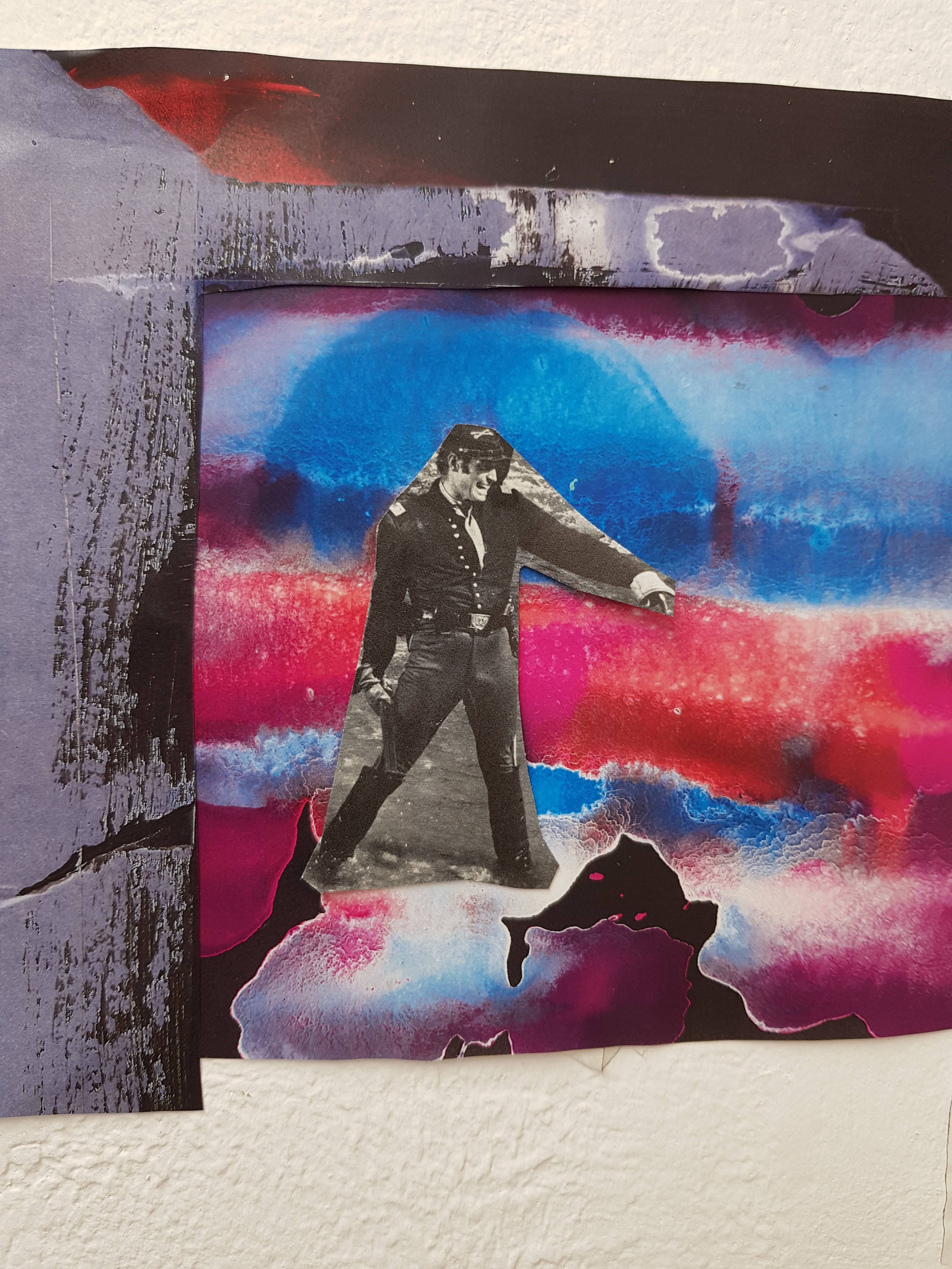
To start with I placed one cup but realised more cups had more significance in regards to the spreadIt can take between two to fourteen days for the symptoms of covid to show.The height show trickle like effect,one cup may be reached first but the spread will slowly reach the others.Overflow. ContaminationThe tension,the spread,the infection.
I don’t know if i would ever be able to gather enough mucus to fill a cup (nor am i sure i would want to)Altho my friend apparently managed to do it which is where i got the inspiration for filling the cups with mucus to start with.It does suprise me however that i have been met with shock from several teachers that I am one of the only students they have seen choosing Covid itself as a topic.(Prehaps they aren’t as morbid/gross as me)
This mucus wasn’t dark enough.And looked ‘more like pee’ according to Taylor.Allways glad for my fellow classmates feedback!I felt that this was sucessful tho and could potentially be used during the assesment period if I do more experiementation with it first.
Slow motion mucus pour in order to build the tension…
Taylors ‘rant’ about her flatmate and her covid.The tension is building…
I felt like the experiment this week went well but I want to try it on a wider plynth with the other cups surrounding it and see which works best.I’m also liking the strong link between Taylor’s covid household tension and the mucus pouring..
Not overly pleased with the effects of the video.I think the slow motion works well but you can’t notice it too well.I think the background needs to change to white aswell as it’s too busy so it overshadows everything else and I think the video needs to go back to the original plan of switching from the covid monster to Taylor.
Although I prefer this version,there are a few technicalities that I need to remember like Filming both films horizontal,and using the same high quality camera for both because now Taylor is fuzzy.But in a way it almost looks like she has been made ‘anonymous’ which was the idea for Taylor coming to the green screen to get interviewed.I think I will show this video for my presentation because the idea is good even tho it is rough around the edges,The party backgound behing the Covid monster really needs changed because it causes too much ‘visual noise’ but I couldn’t get hold of the I.T technician to help me change it and struggled to do it myself.
Literally the worse creation I have ever made in my life ever.Please remind me never to paint again.
I really should of gone for more of a ‘David Rees Davies’ approach.
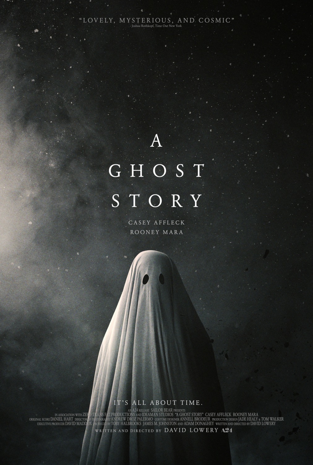
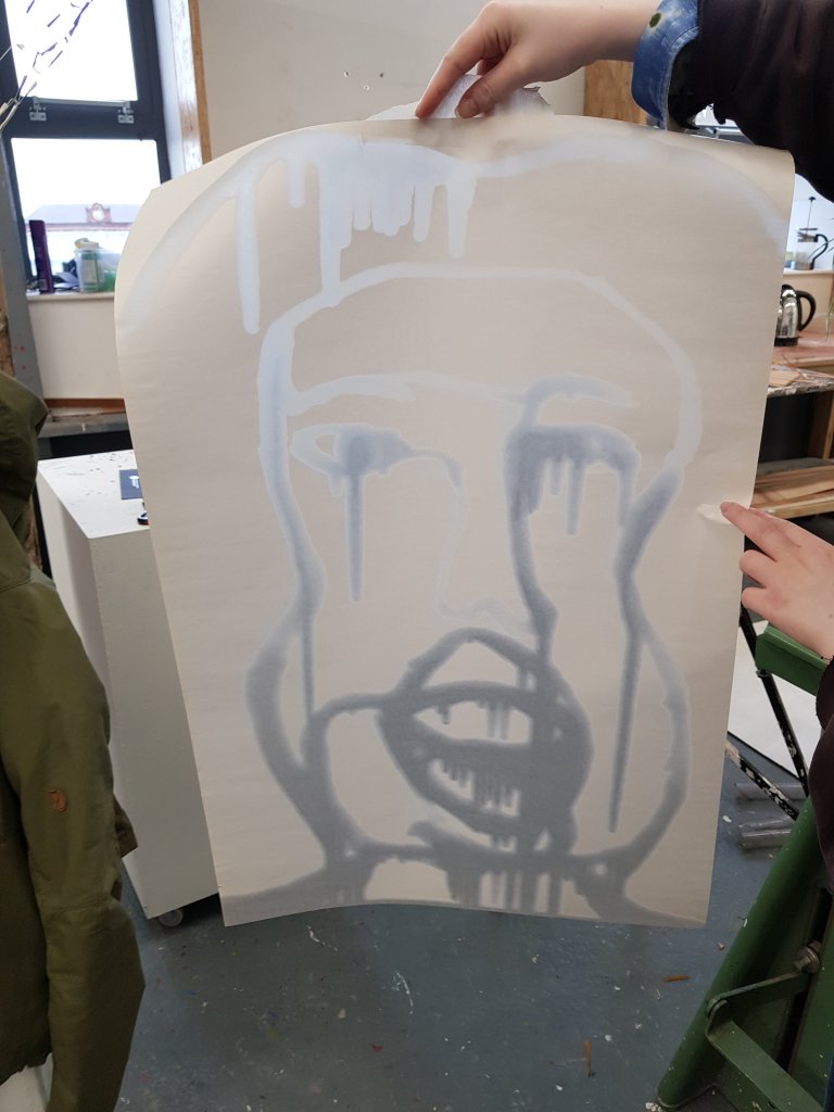
I felt that a bedsheet was the most fitting for the covid monster because if it was gonna spring up from anywhere it would be your bed!Especially as you spend the most time in it whilst ill.
Dylon dilueted in water and salt.The colour turned out much better then expected and esactly what I wanted considering the dye sachet was only meant for a small amount of material equal to that of a shirt.
I used a mixture of pva and olive green paint in order to gloop it onto the bedsheet and make it seem as realistic as possible giving the effect of snot/mucus.
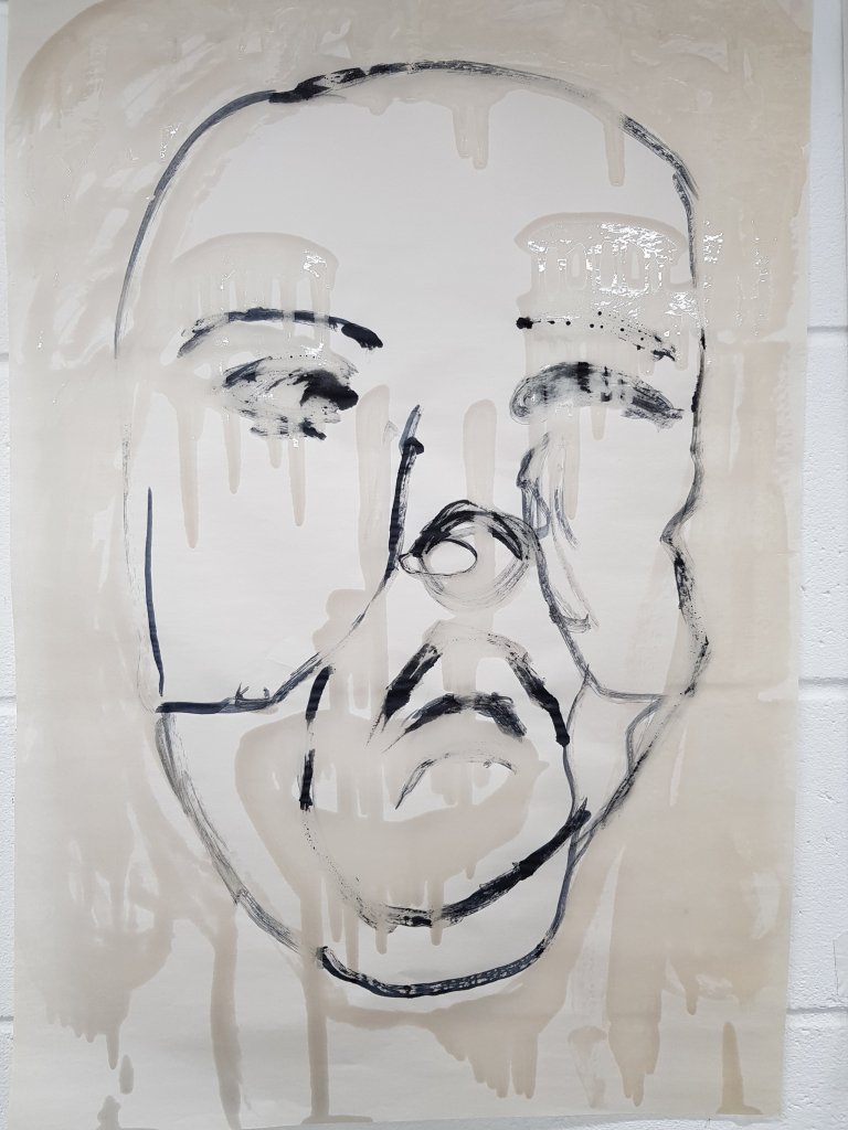
Using the plasma cutter in Welding I cut out the shape of the ripe sternum using the card maquette that I had made previously (something i do which helps me work out the size and how things will work/not work.I had drawn out the outfit but it wasn’t untill I tried ti on in realisty that I realised it could easily be mistaken for a hijab which ofcourse I didn’t want.It made sense that the ribsternum needed to be detached from the headband as it was the headband and the colour grey that as making the outfit look most like a hijab and that the rib sternum should be made into a necklace to sit where the ribs are.
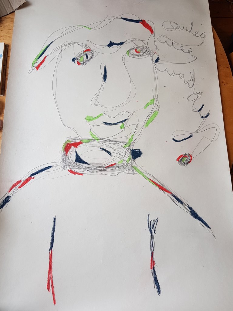
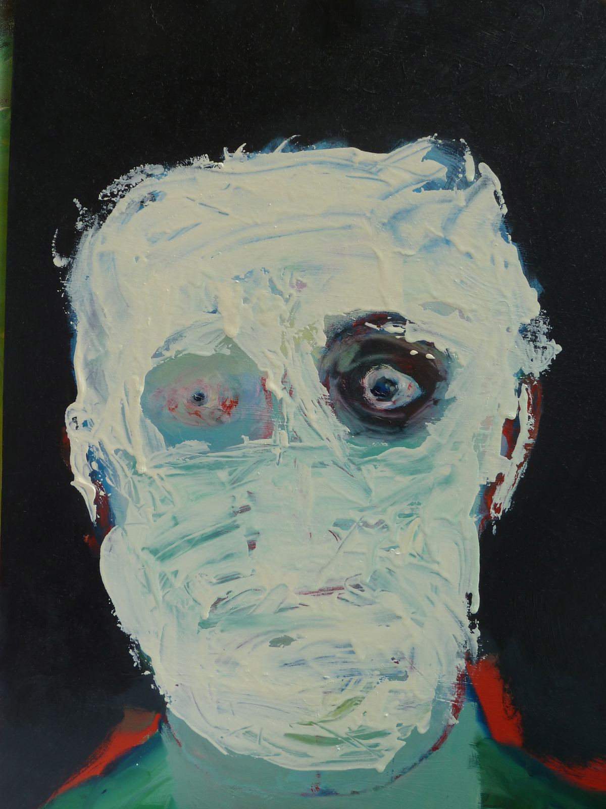
The theory behind the plague Doctor outfit was that it would ‘isolate’ the doctor meaning that they wouldn’t get contaminated.Much like the modern day PPE.I wanted one of the eyes to give resemble one of the plague dr goggles/gasmask.
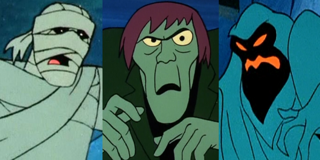
I wanted the covid moster to resemble almost that of a scooby doo villian in terms of it’s mischieviousness but with a more sinister intent.
Same of the scariest masks are some from the victorian era,outfits would most commonly be made using ‘crepe’ paper (something which was new to that era and everyone was very excited about) masks were however made using paper mache,fabric and paint all of this left terrifying results!I wanted the covid monster to be infuenced by the simplicity of outfits like these almost with a mixture of a ‘bedsheet ghost’
simple yet sinister
Amazingly sad movie but I love the fact that altho the outfit was just a bit sheet the meaning was so much more then that.
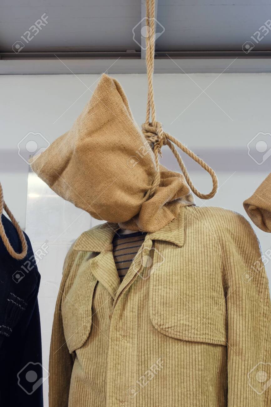
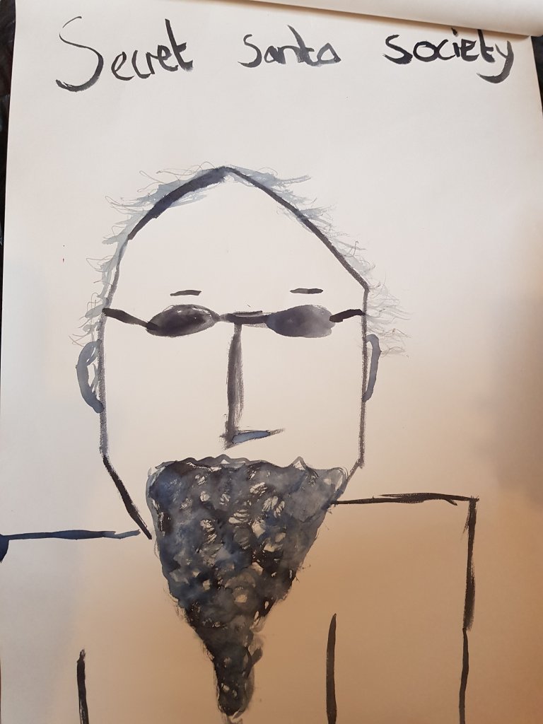
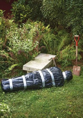
I decided to attach the positive covid test first using super glue and then by stitching them on and adding the positive symbol in the middle of the ‘eye’ and then adding the pva and ink gloob to the other eye area.The necklace then gave great shape to the head and the shape of the rest of the gown had a rather formed yet high fashion shape to it the fitted ends of the sheet giving great shape to the arms.It resembled a body bag tho but also the hood used before someone is hanged.I hoped that the body bag shape wouldn’t cause offense to anyone who’s family member had died due to covid as that isn’t what i have intended.
The hooded head reminded me of a hang mans sack.
‘Pirates’ was a show I watches as a child and the top right character who allways remained in a sack reminded me of the covid monster.As I child I forever wondered who was in the sack which I want the audience to do with covid also.
A mixture of pva,ink and olive green paint left int he plastic pot from pouring onto the sheet turned out to make a perfect eye!
A poster I made and put up in the corridoor in order to see what people would respond.The respose wasn’t as interesting as I thought it would be.I think I will mayb put more up around the uni and see what happens.
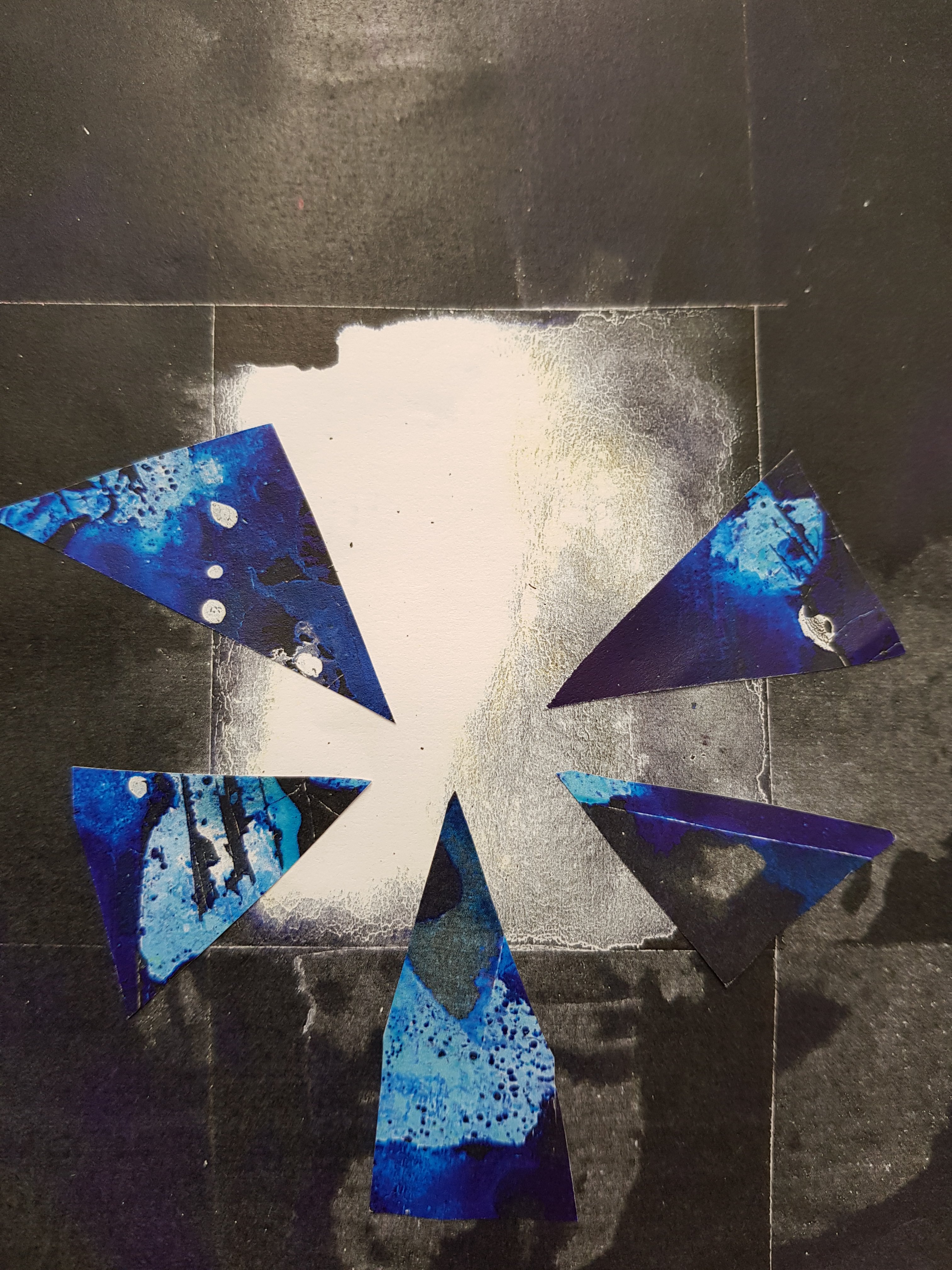
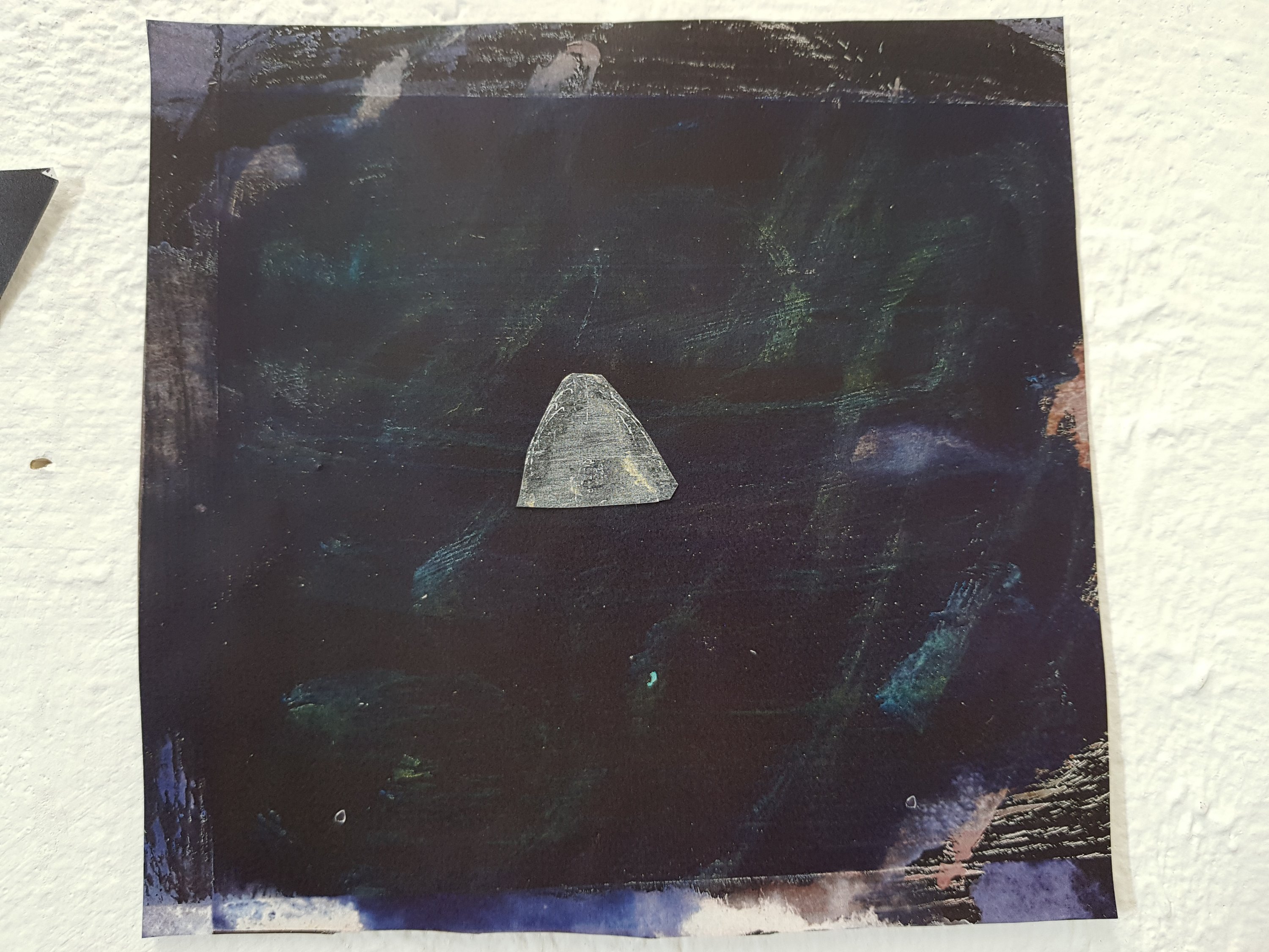
On the left a collage piece aiming to resemble the gloom of the covid monsters.I find this to be quite an effective way of resembling it.
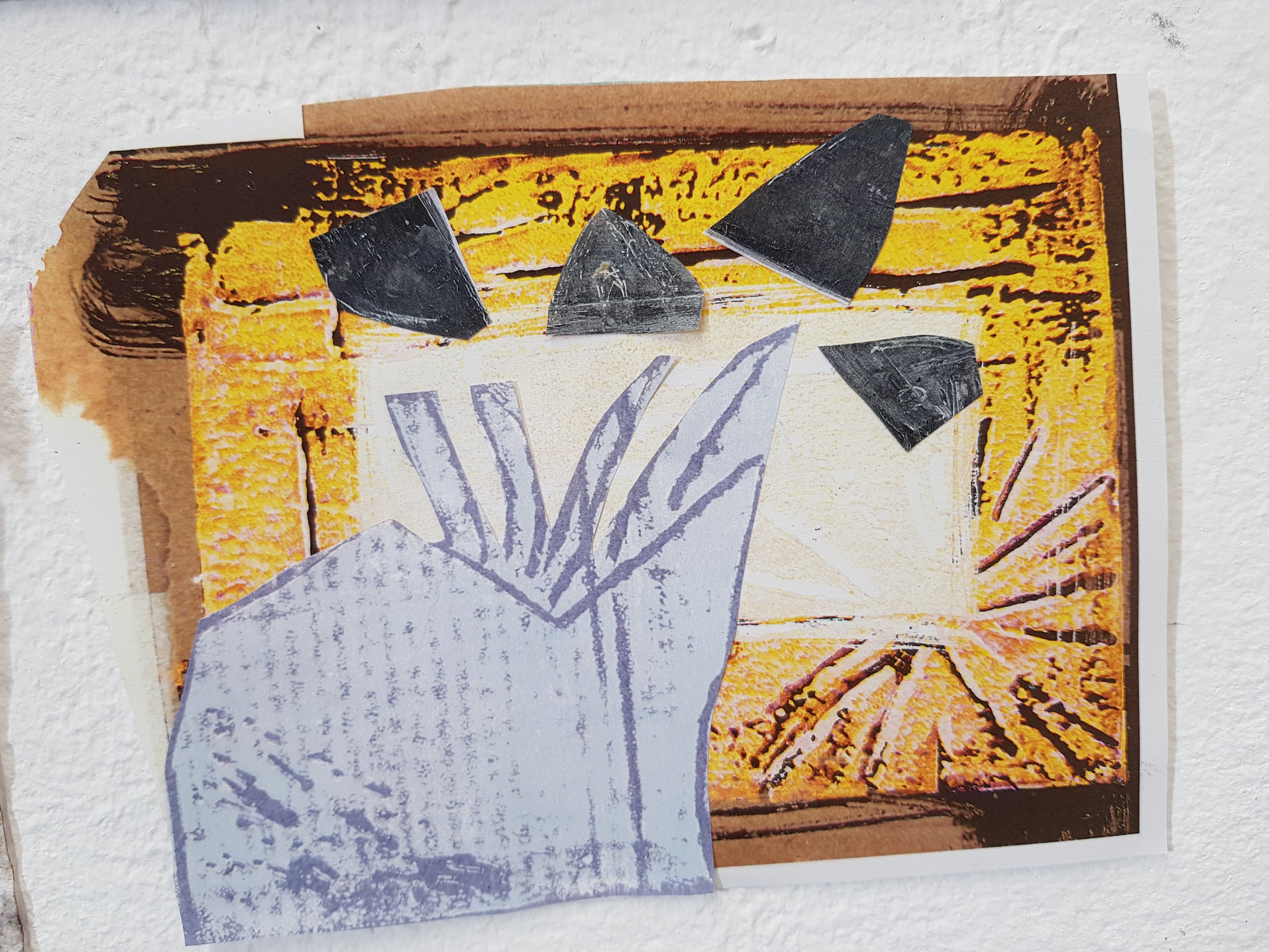
On the right is a page from the book ‘A brief history of the dance of death’ by Ian Breakwell.I think I would like to overlap the faces of thoose who have had covid with the covid monster.After speaking to a tutor who knew the artist himself he said that most of his work was actually done on the photocopier which is something I used to be really keen on years and years ago.
After choosing what turned out to be a module that completely wasn’t for me (designed based) I switched five weeks in and found myself completely at home in the landscape module.
It made so much sense choosing the landscape module (which had been my 2nd choice after all) Having spent the whole summer in Orkney and alot of last year I had plenty of inspiration right at my fingertips.
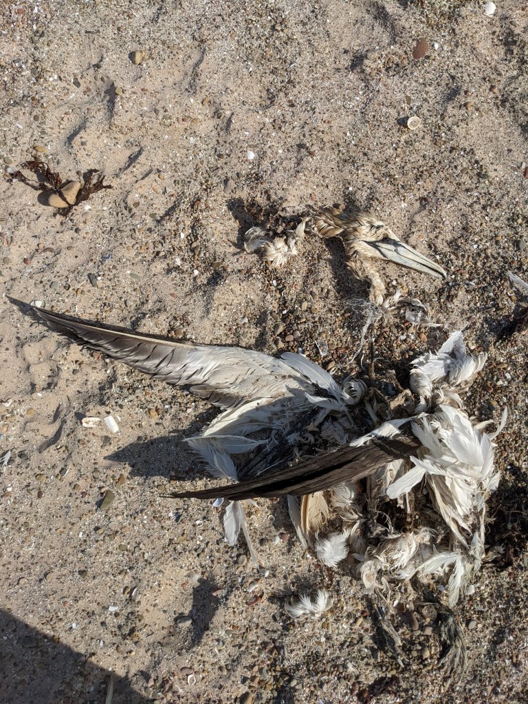
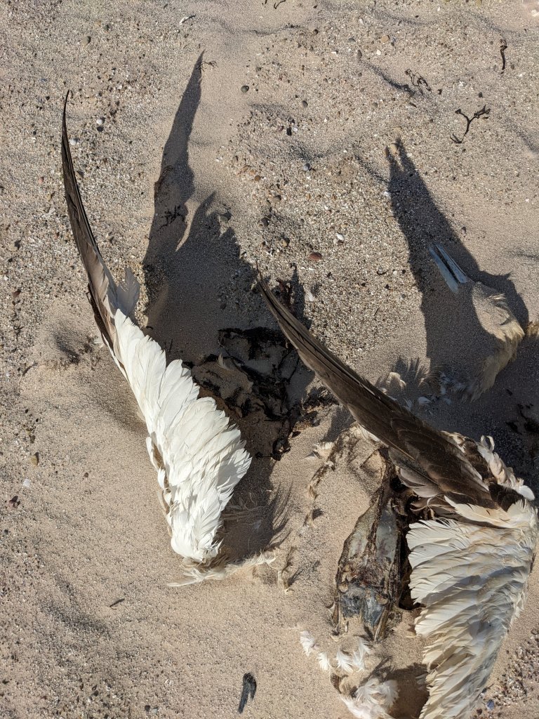
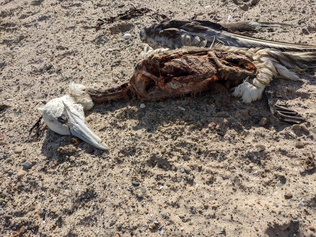
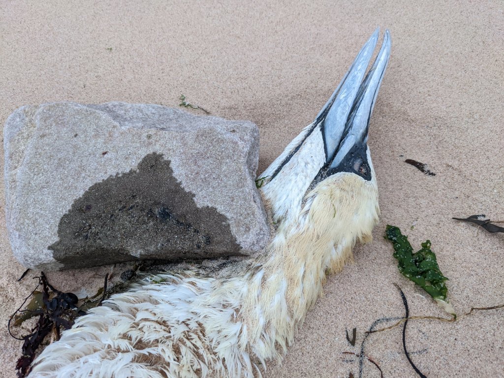
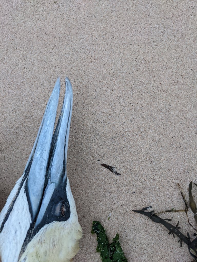
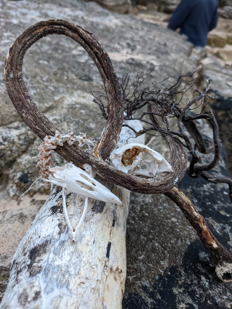
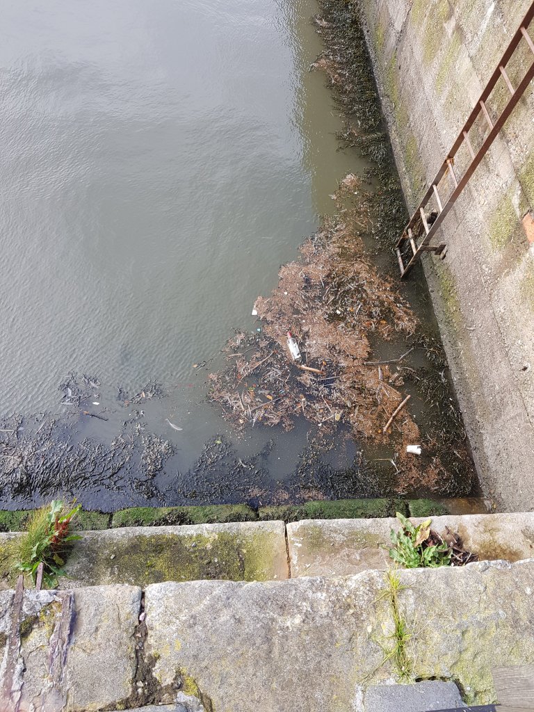
In my usual macarbre fashion I had a collection of dead bird photo’s due to the bird flu which is a really bad problem just now in orkney so much so that people were (and maybe still aren’t) allowed onto the beach in Birsay.
What drew my attention to these birds was their positioning,and how artful and interesting they were.I also found it an odd juxtaposition,the birds lying still and motionless whilst the sea moved,the people walked and life continued around them,the hands of time only effecting the decomposing effects on their bodies.
In the above article,it talks about how allready a quarter of gannets have died this breeding season,entire breeding colonies are being wipes out and due to gannets only laying one egg per year the recovery of the population will be slow.Not only this,but seabirds in general help the ecosystem as they have essential nutrients in their feces and are top predators which helps the food chain.Birds who are predators will surely die too from eating the carcasses and catching bird flu in return.Frustratingly,the level of this strong multi-strain has been known about for a while but no money has been put into protecting the birds,national and regional responses are needed now in order to protect the birds before more outbreaks hit.
Still lives in nature.
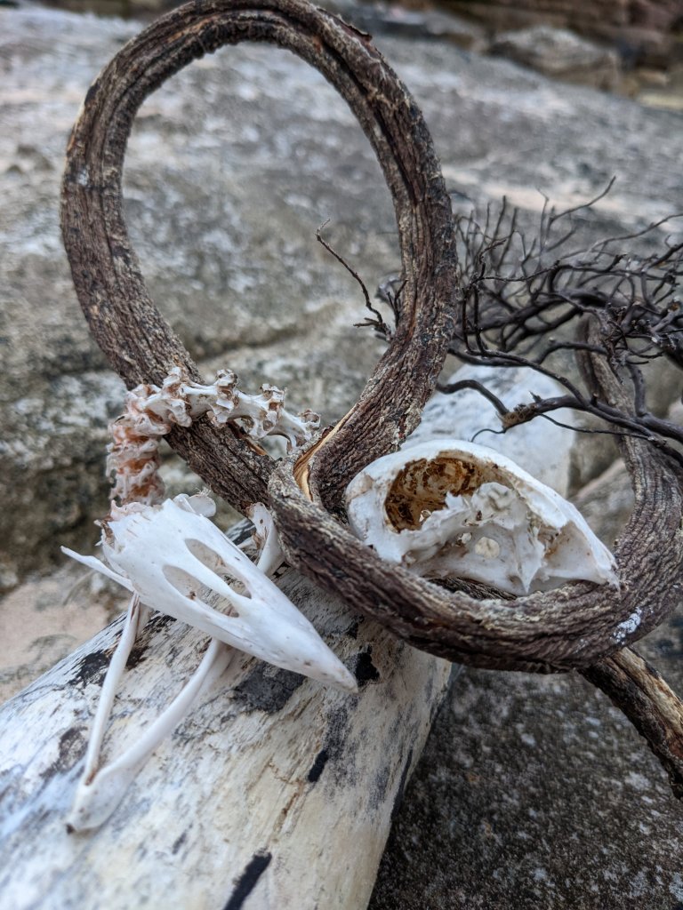
My direct response using the bones found from birds on the beach on Hoy island (which I later found out I shouldn’t of touched)
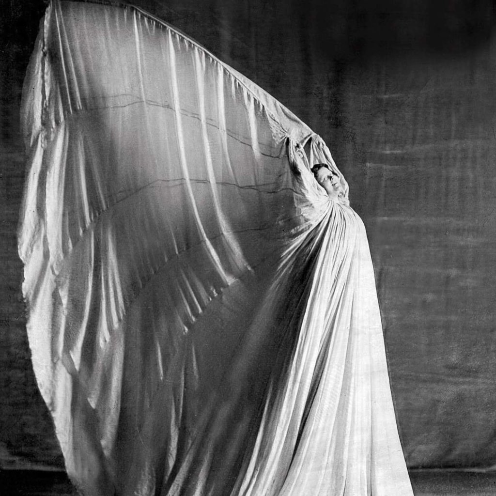
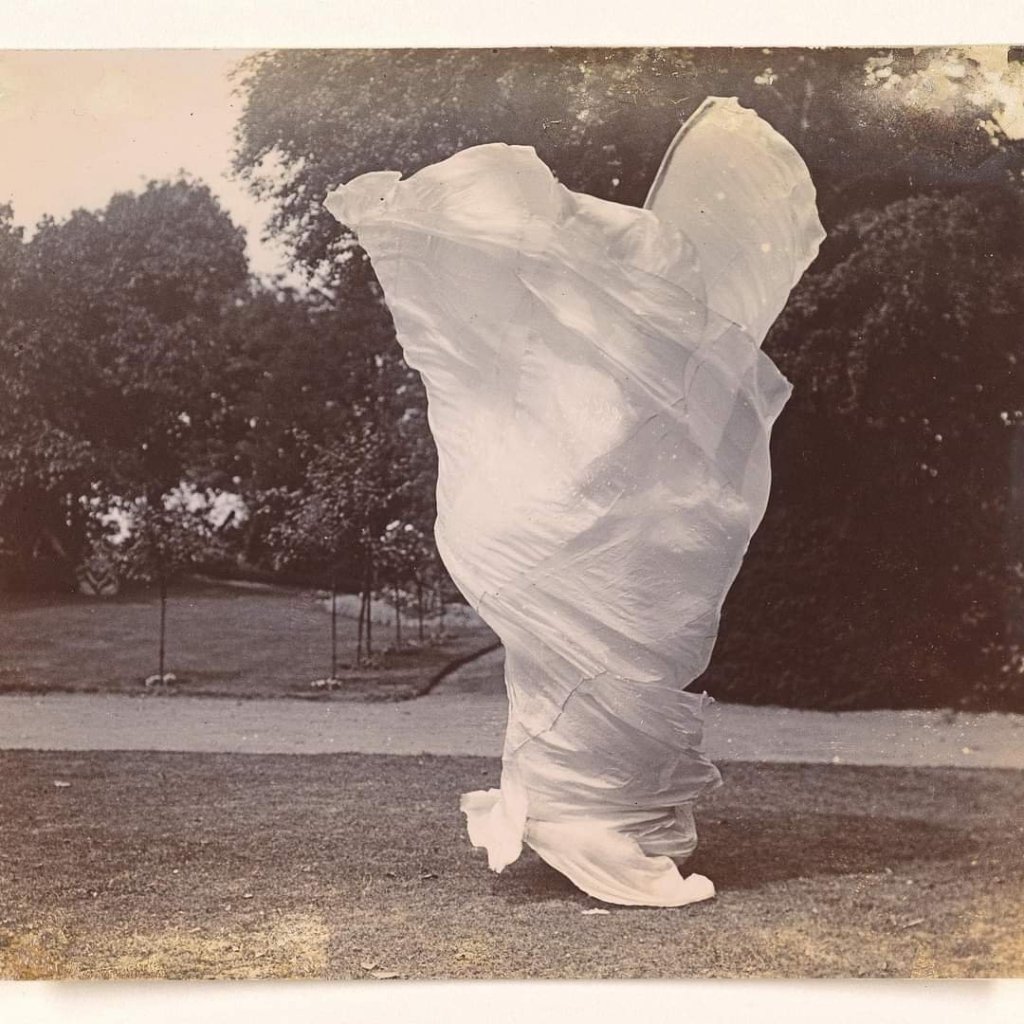
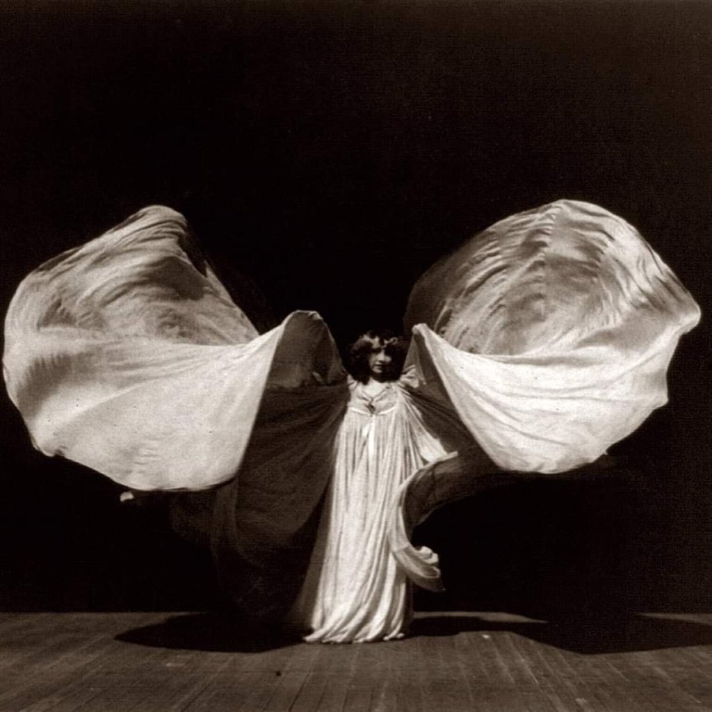
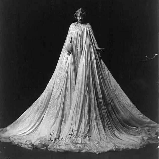
Loie Fuller
Over the summer I discovered and became facinated by Loie Fuller a ground breaking American dancer and performer who was a pioneer of both modern dance and theatrical lighting.She used swirling silks and multicoloured lights and her movements were inspired by nature,she helped inspire the art Noveau movement of the early 20th century.I started to think about how I could use this performance style in my own work encouraged by death and life in the landscape around me.How could I use movement to resemble not only nature but the time that moved by?
Rebecca Horne
There seems to be a kind of similarity in Rebbeca Horne piece ‘Weisser Körperfächer’ and Louis Fullers wings and I wonder if prehaps she was inspired by her too!
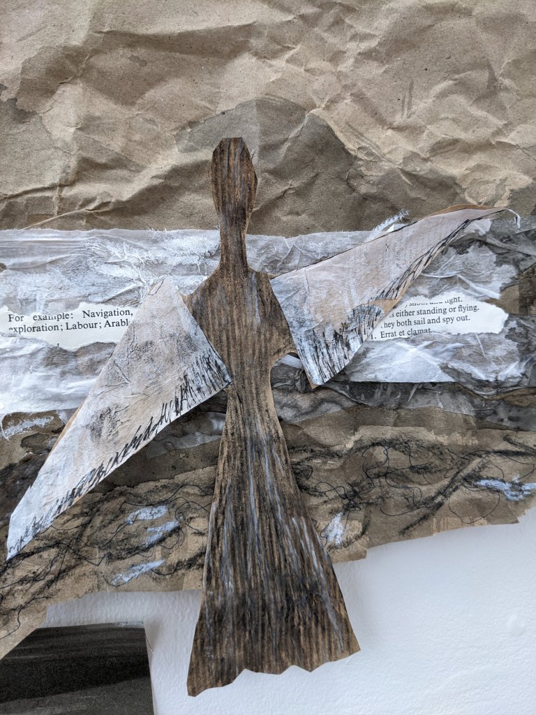
Starting the process
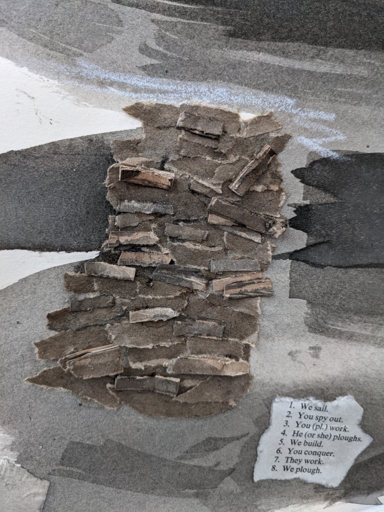
The cycle I work in is one of drawing out by using a variety of mixed media so that I am able to put together in my head what i am going to do performance wise then I perform then I go back to drwing out based on the perfromance or looking at where things can be tweaked.I decided the best way I could show the connection of time with death and life was to make these wings which would not only act as wings but the hands of a clock an show movement but within the landscape.I also had a latin book which has doing words in it which I was initially just planning on using to collage then thought about how great this would be as spoken word over the top of the video/photos showing how movement is constant within the landscape altho death may be present life never stops.
Maquette
Based on the above image I wonderd how I could make this in a sculpted form,I started off wanting to make a more realistic form in metal (a media which I am fond of working in) but it would occur too many issues,I make a thick card maquette before I weld because then it shows up what will and won’t work altho I have to keep in mind that metal does not hold the same flexibility that card does.So I choose to make a more abstract form which shows the flow and movement of the wings.I plan on taking photographs of it on the costal line.
I initally wanted to make a more realistic form making a skirt but then i realised that the metal would’nt bend like the card would and the circular shape would struggle to attach to the shape below so how best could I attach it?
I decided to simplify the shape.the bottom half could symbolise a skirt of legs and what did it really matter anyway?The arms symbolised balance and flow.It would be interesting to make this into a kind of see saw where it could balance from side to side showing balance and motion.The moving life and the stopping death.
The bottom had to be weighted down using two pieces of card but I know that this shouldn’t be an issue with the weight of metal.
‘The Wings of time’
I choose Balmerino as my location as it is a place i am very fond of and feel a connection with.Altho I would of liked to of done the performances in Orkney that’s not really an option right now.Although the weather forcast said sunny it proved to be very foggy,whether that was to do with the smog left after a massive fire in town it was hard to tell.However,I felt that this gave quite an atmospheric feel.It was hard to balance on the pebbles but I somehow managed.The wind made it rather difficult at times too.I felt that it was important to wear black in order to contrast the white,altho i originally planned on wearing a black dress like the drawings suggested i don’t think it would of been very practical for movement.I found myself with an audience of old people which made it hard to concentrate at times.But once I was in the zone it felt like a new form of Tai chi,I moved with the wind and with my breath as you would with Yoga.I would say I am pretty pleased with how the photo’s turned out and prefer them to the video.My next move is to try and put spoken word over the photo’s in almost a slideshow style fashion. Inspired by Rebecca Horn I also wish to try and paint and draw with them.
Location shot of Balmerino looking very dreary due to the mist.
Using the wings as a tool.
Inspired By Rebecca Horn’s piece ‘Finger Gloves’ (1972) I decided to draw using a black ink wash.I decided that black worked as a great ‘theme colour’ due to not only it’s symbolism of death and decay but it’s connection with oil and oil spills as before oil hits the sun it is black in colour.
Both colours have played an important part in the process,from the ink wash to the brown muddy slime on the wings.
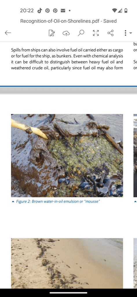
The above website states that oil should not be dumped into the sea if your vessel is less then 12 miles from land when i have witnessed this from a vessel right next to the land.
I hoped that by putting the hat on my head it would give a feeling of the elongated Gannet neck (a bird I had personally found dead in ebundance during the height of the bird flu pandemic in the Summer.
The wing bowing out in the middle was a happy accident as it helped me to see when painting with it.The split pin under the chin helped it hold on for the best part.
Wing put on my head to give me limited vision whilst painting,the same way a bird’s vision would be limited due to the virus causing blindness.The hat resembled that of a ‘Dunce’ hat.Painting with my head like this in the corner it certainly felt like it too!I tried to capture simultaneously with both arms at the same time images of myself wearing the wings and images of one of the birds i had found from a photo.I wanted to capture movement with my movement,the movement of myself and the movment of the bird,like that of an aboriginie cave painting.
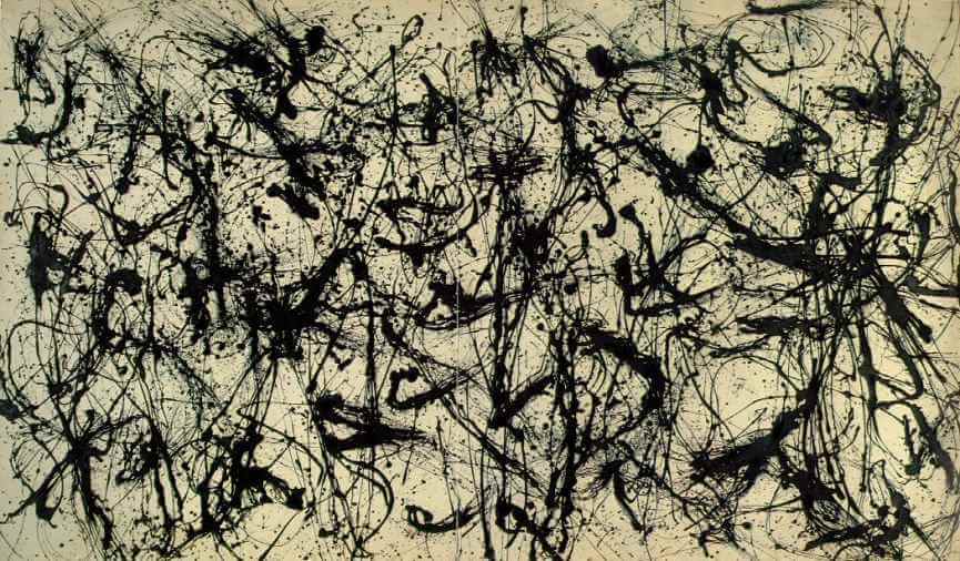
Jaxon Pollock no 32. I admire the gestural flowing free motion of this piece.I tried to create a similar effect in my painting altho the motions wasn’t quite as flowing due to the wings and width of the paper.
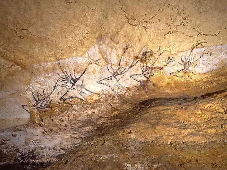
Five stag heads found inside a cave in the Nave region of Lascoux believed to be a stag in different stages of motion.Also believed to be one of the ealiest findings of ‘animation’
I wanted my paintings to reflect this due to it’s connection with nature it felt only right that the paintings should have a primitive feel to them.
‘Unicorn’ 1970-1972
Rebecca Horne ‘pencil mask’ was another inspiration behind using one of the wings to paint with.
Arm maquette
I really liked how much the card maquette resembled the shape of the human figure but with over exsagerated arms to capture the wings.I was really excited to make this maquette into a metal sculpture then take it down to the beach to take photo’s of it but then due to the strike the teacher never showed up.I had allready waited 3 weeks at this stage just to use the facilities and couldn’t afford to wait another 3 weeks as this would go right past assesment time.
The markings resembled the gentle pitter patter of bird feet,with other areas more chaotic which made me think of the Bird Flu virus itself seeping through effecting 90-100% of a flock within 48 hours
‘Passing through’,Sonnabend Gallery May 1977.Taken from the book ‘Rituals of Rented Island’ Interesting arm extensions of a human kind.I would be quite interested to know what they were made of altho it doesn’t seem to mention.Prehaps Paper mache?
Green Screen test
Altho asthetically pleasing I felt that these images didn’t reflect the bird itself when dying from bird flu/oil spill or a harsh death in general.The movements were to soft and fluid and suggested a gentle death,prehaps dying in it’s sleep or from old age.
I liked the movements but they were far too fluid and should of involved me squirming on the floor.I didn’t end up editing these photo’s in after effects due to this
Performing on the beach.
Looked too much like praying and didn’t want to cause any offence towards anyone.Trying to resemble the position of the dying birds i found.The images where i’m covering my head stripeed the idea of being a bird and was too much.Rocks on the wings as I found a bird which I believe may of been a mercy killing with a rock on it’s neck. (I obviously couldn’t do this without killing myself so did the wings instead.The headpiece was to blind me the same way the birds had been blinded by the virusSample collected from the slimy looking mud which covered the beachpollution such as this bottle is once of many items that I have found on this beach in the past.Infact it is a place i often come looking for found objects for projects.Clean water or dirty?Uncovered this phallic looking penis which had polluted looking water in it.Sample taking from the rock pool (whilst using gloves) The rock pool was shallow so couldn’t collect too much but the bottle got covered in a foamy substance and the water looked mildly yellow once inside the bottle.Frothy parts of the bay looked infected.
The image of this gloopy slime type mud resembled that that i found on the beach.
Birds are often ‘beached’ when they loose there buoyancy due to the oil as the sea becomes to cold for them to return to.
The above is something I really wanted to bring into my final piece but i am not naturally a great contortionist!I would however in the future try a different series of photos on the beach prehaps using facial expressions to express the pain. I did have a series of photo’s where I was flat on my back on the ground but I had the headpiece on which i felt was too ‘distracting’ and ruined the piece.Below I thought of the seabird chick who jump into the sea prematurely if their parents have died,still attempting to gently flap their wings as the disease takes hold.It is also said that as the virus takes hold of the brain the bird itself starts to loose it’s eyesight and become disorientated.
Final performance.
This over exposure actually made for a great final picture in the series of photo’s as it told the end of a story where the baby bird finally passes away.I decided that the Colour should return as death is a comfort.
This piece made more sense,after some discussion with my tutor we discussed how the movements should really display the struggle of dying and how i should really get involved and grotty on the beach. I tried to immerse myself and really feel the birds’s last moments and how uncomfortable it would of been.Would they of been comforted by listening to the sea in their final moments whilst looking up at the sky?
Taken from ‘Student body’ by Marina Abramovic.After looking at the video it was decided that the images were stonger then the video itself and that one of the final pieces would work well as a series of images.I felt particualry inspired by this performance I found where the woman acts out a different celebrity in each shot.However,I decided to just have rachel snap photo’s every time i moved in a slow and static fashion even tho the pain of the pebbles underneath my knees made me want to move fast!
An example of what I could see in some of the photo’s with the headpiece on my head whilst lying on the beach. It was comforting yet clostraphobic at the same time.It obscured my view the same way the virus would as it slowly made the bird go blind.
Final installation
I looked at a variation of ways I could display the wings.Firstly a paper plane?Two sheets was more simplistic and looked more at bird to bird contactI considered showing how the disease spread through contact aswelll as the contact of oil within the water.But I also felt that this was too cluttered visuallyReally struggled to get these pieces at the right length due to being dyspraxic and the only person availible to help me in class had dyscalcula so was an absoloute nightmare so the sheet on the far left was shorter but I had given up the will to live by that point.Super pleased with how the print turned out.Altho the university printing unit was closed so had to use the one down the roadDecided on what looks like the simple contact between two birds where the beaks would connect to show how bird flu is viral.The bottom half of the installation connects with the photo’s and the movement aswell as symbolising how birds become part of the pollution once dead and part of the cycle,not only that but how they become trampled on and forgotten about and return to dirt/dust.As allways seems to be the case unkowingly with my gestural work it was commented on by a friend of mine that it looked ‘cult like’.
I am really pleased with the final results of my work and mostly the presentation for assesment altho my measuring isn’t great!But otherwise my placement in general I think flows as one item directs you to another.I also decided to have the lighter markmaking over to the left as it would otherwise be swamped by the darker colours and you wouldn’t notice the delicate detail as much.
I decided to go on another derive with my partner as I felt like we needed a walk in general and because walks and fresh air often help our creative process otherwise our creativity becomes stagment.
It was an incredibly windy day especially down by the pier.I noticed a couple of things I hadn’t noticed before and tried to capture some sounds but due to the wind it was really hard to pick them up.I think once we move to dundee and are able to have access to DJCAD I will try to access DSLR equitement and attach a microphone with a windshield to my phone.
I also started to look at the sea and think of a physical gesture that would best represent the movement of the sea.
Observations of conversations,people,birds and objects.
Some gestural marks made whilst listening to one of the videos with crow noises in it.The marks remind me of chinese characters and words.The yellow was the sweet sound of the sparrows,the loose black marks are the hum drum of the schoolchildren making there way past us.I found there conversations quite interesting (little bits you may be able to hear) such as ‘my phone is bigger then yours’ and something about the year 11s.I found the bragging quite interesting as this is usually something children mimick from their parents.
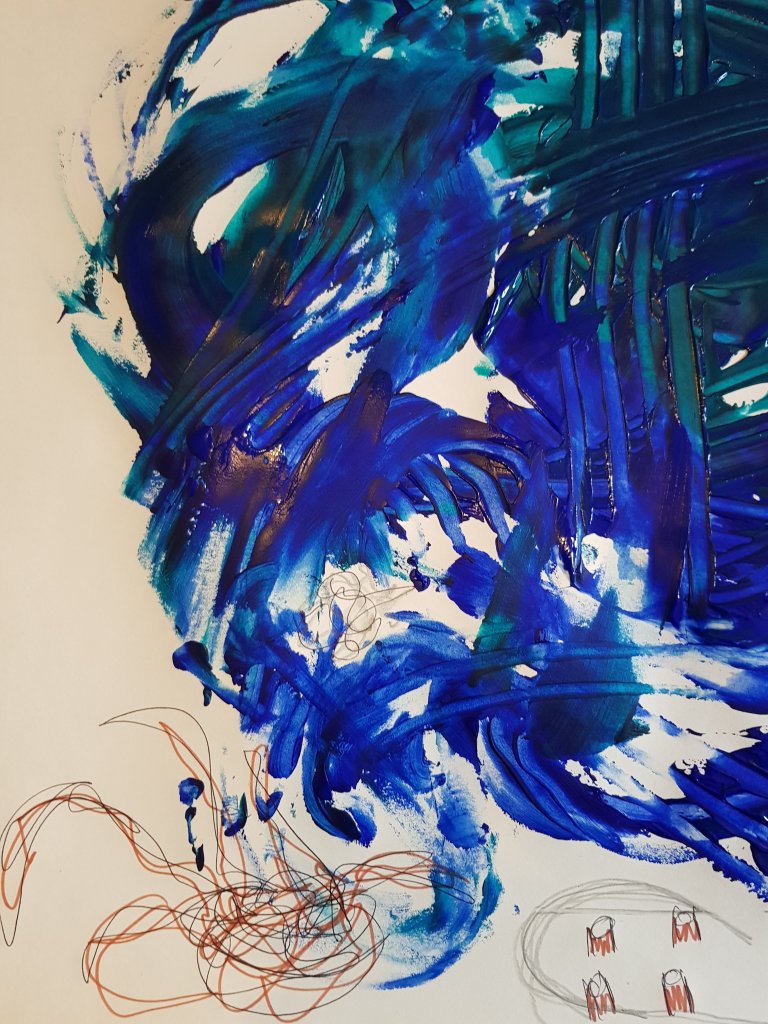
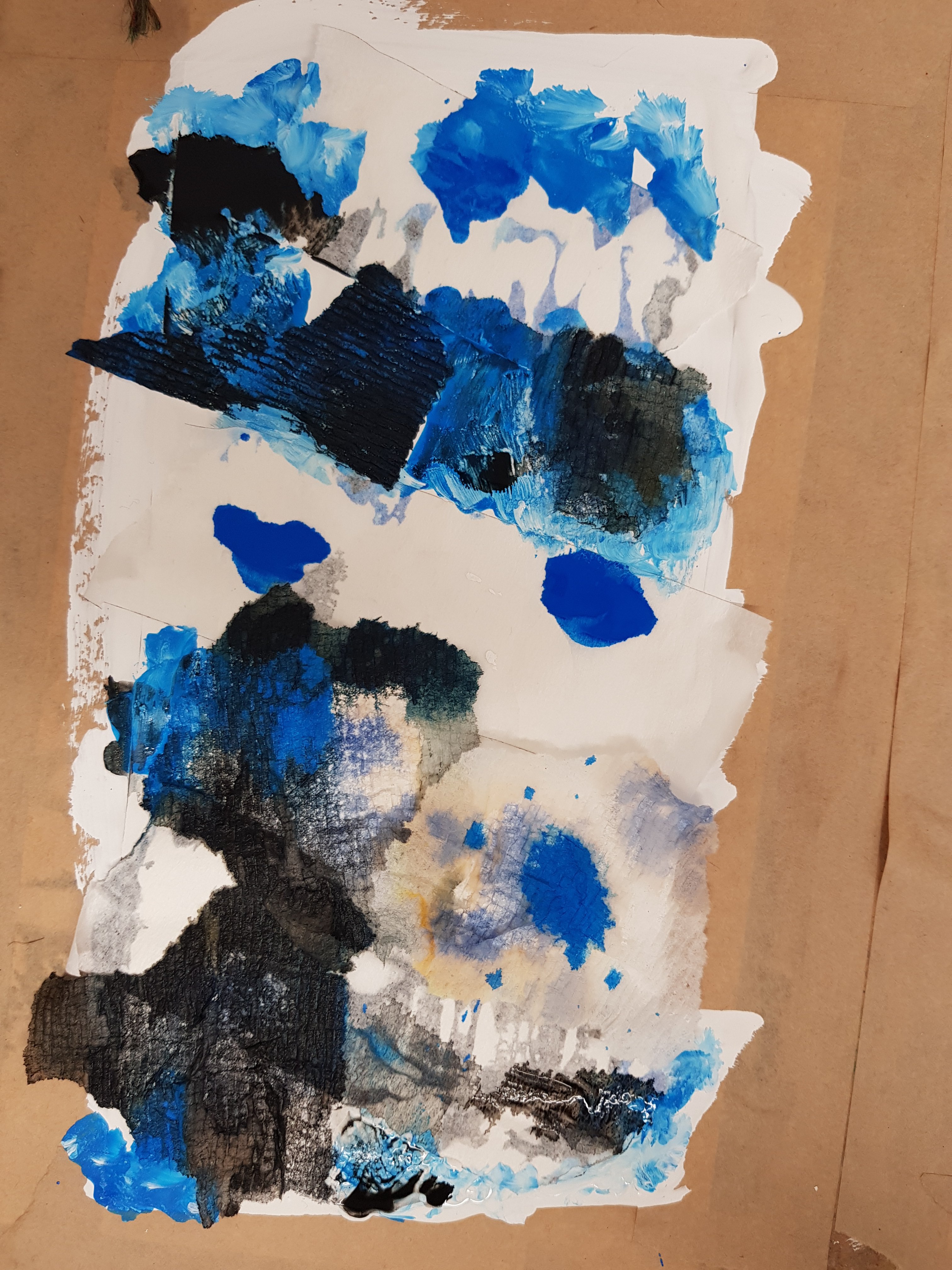
Gestural marks that i made using the same flowing gestural movements that are featured in one of the videos above.I feel that the mixed blues looked much better once I had deconstructed the painting and put it back together again as the illustrations created a map like effected within the ocean of blue and represented the characters and things i noticed on my walk.The use of gestural marks towards the end of the painting i feel were more effective then the mixed blues as you could see them more clearly and I felt that they captured the performative aspect much better and gave the impression of the flow and the crash of the sea.I think I would like to try making some more of thoose marks on paper and add some more illustrations to it.
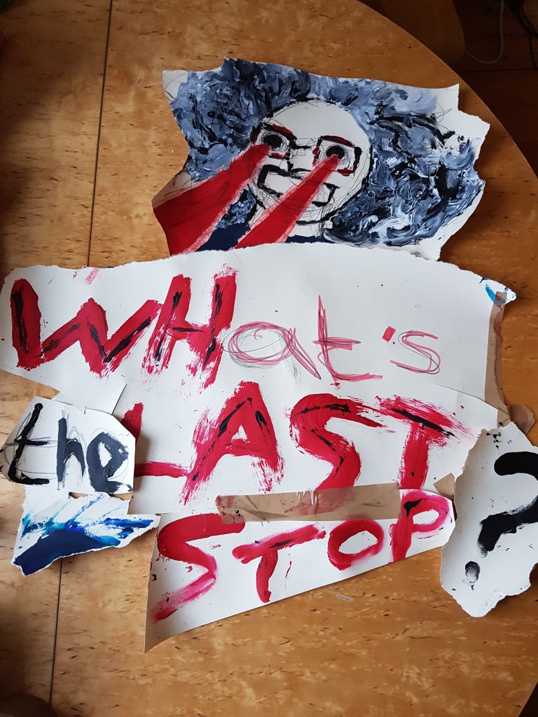
Some quick illustrations of ‘batshit crazy granny’ whom we bumped into on our first walk (she hates Louis for some reason and once turned on the bus with her fingers to her eyes then pointed at Louis as if to say ‘I’m watching you’…This is where the lazers come from streaming from her eyes.Her favourite thing to say when she gets on the bus is ‘WHat is the last STop on this BUses route?’ She tends to over pronounciate the beggining of her words which I also find interesting.I felt like ‘what is the last stop?’worked quite well with the theme of the project aswell.
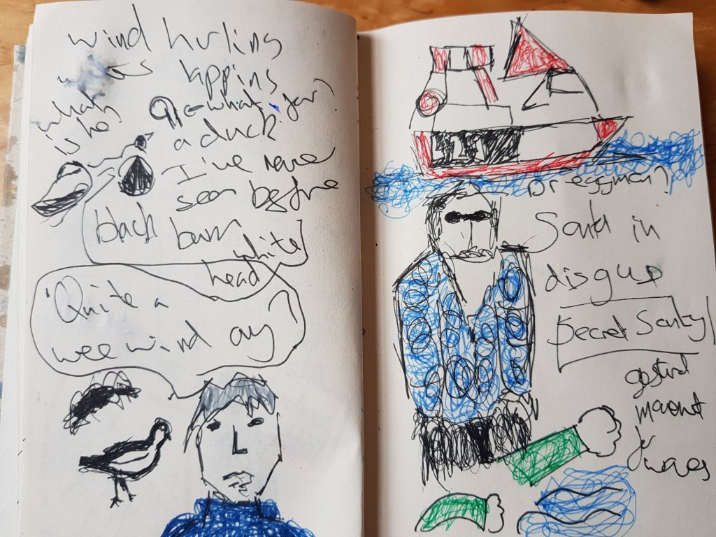
Pic no2 is the ‘It’s a wee bit windy ay?’ character that we occured talking to his friend.
And a man I decided was in the ‘secret santa society’ walking along by the pier.He had quite the undercover look about him.
I feel like i have taken the oppertunity of the derive to make the most of the local characters in the area and giving them back stories. Aswell as paying attention to the noises and visuals around me and making marks and performative pieces to co-incide with that.I’m currently moving flat and don’t have access to the studio so I would like to of spent more time working on a large scale and focusing on the perfromative side of things but I haven’t had the chance.I will obviously be looking to focus more on that next week once we have moved up.
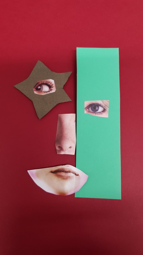
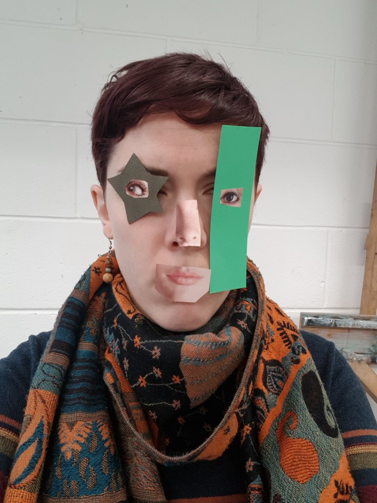
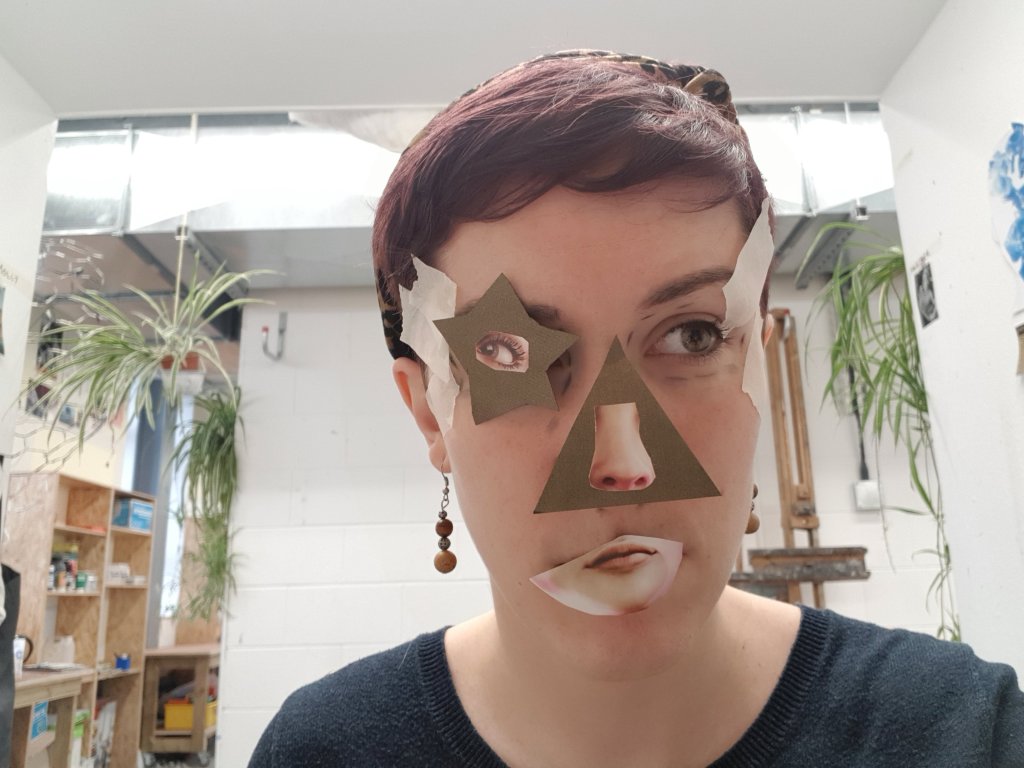
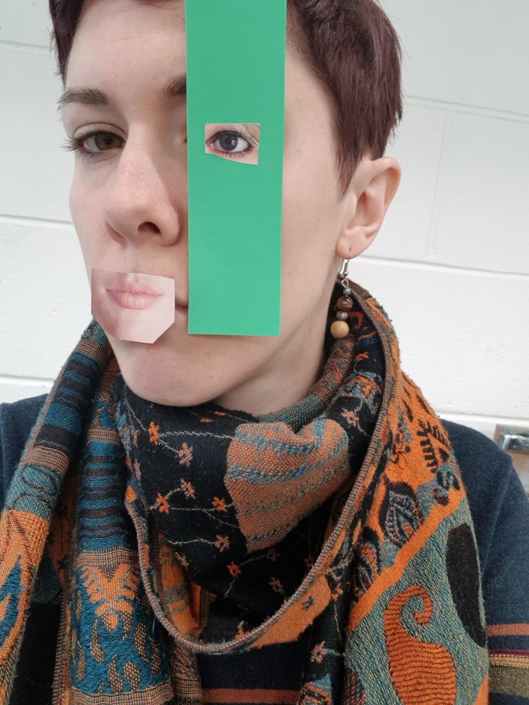
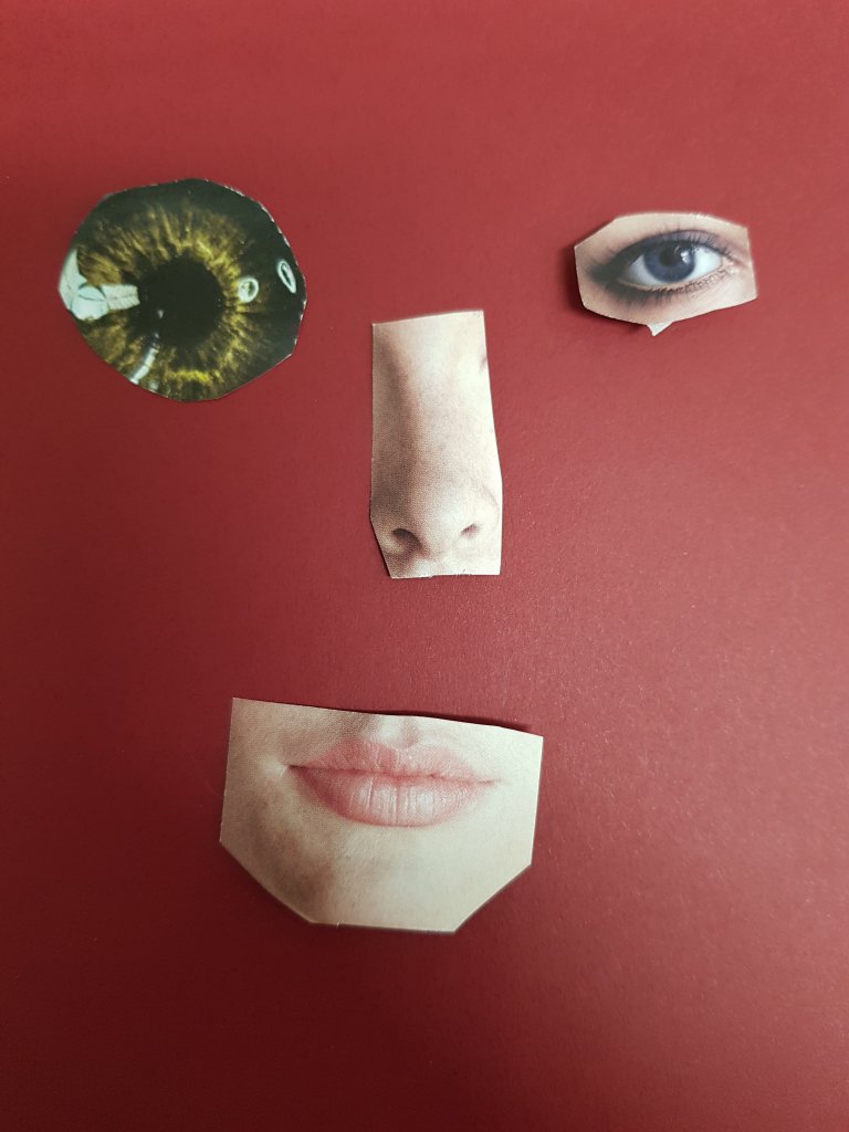
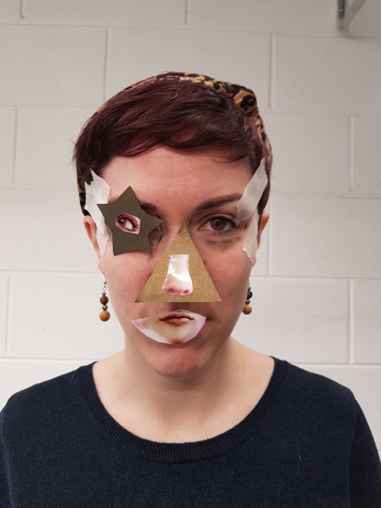
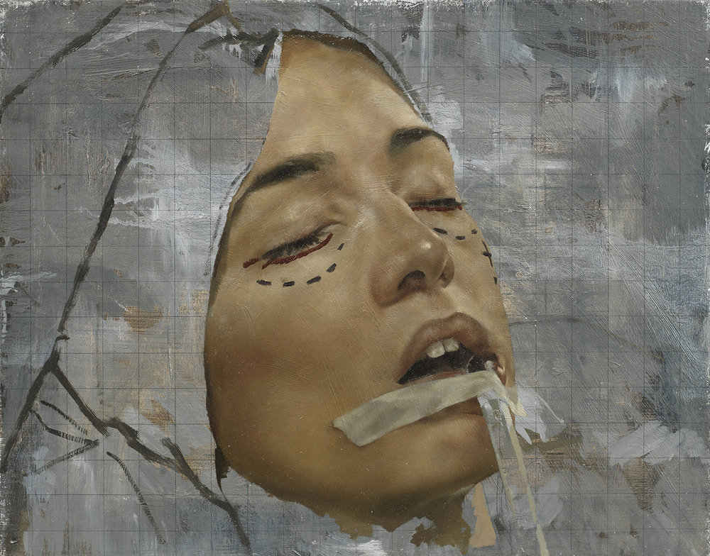
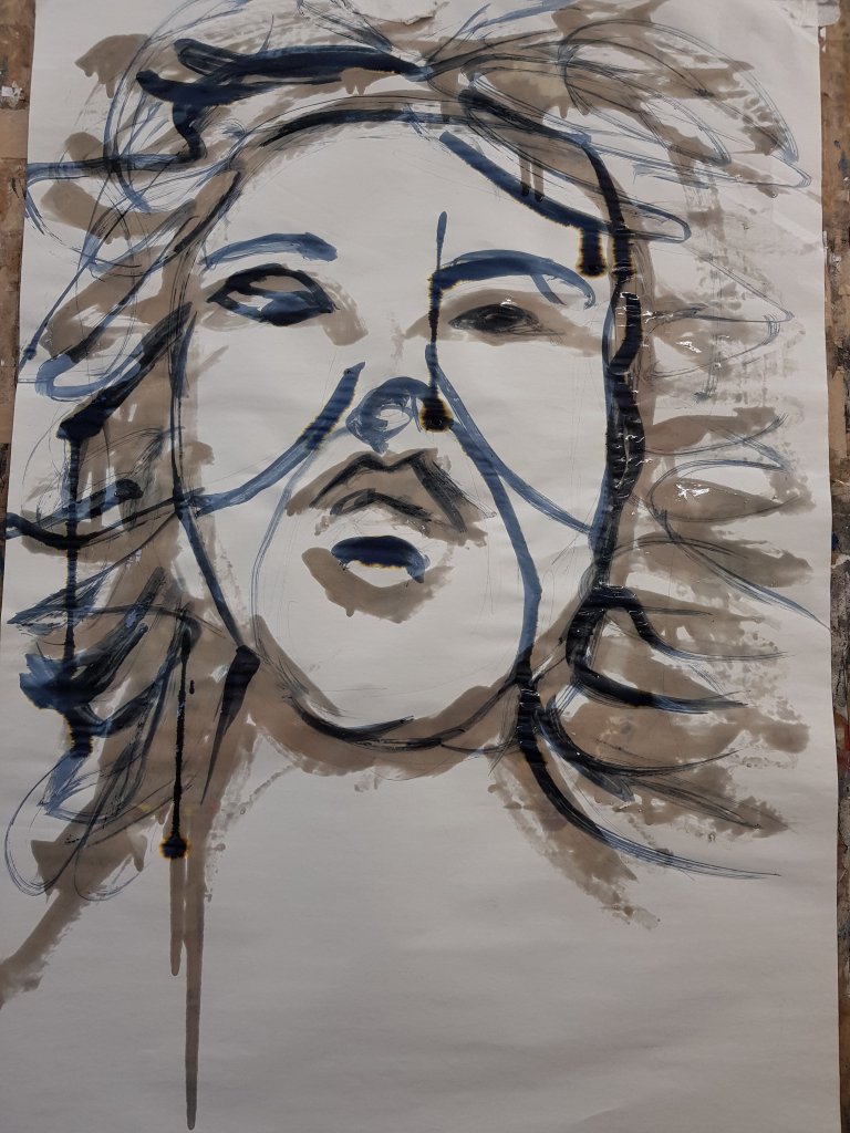
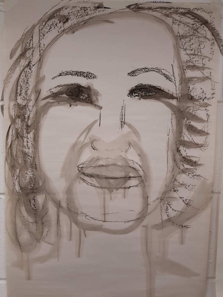
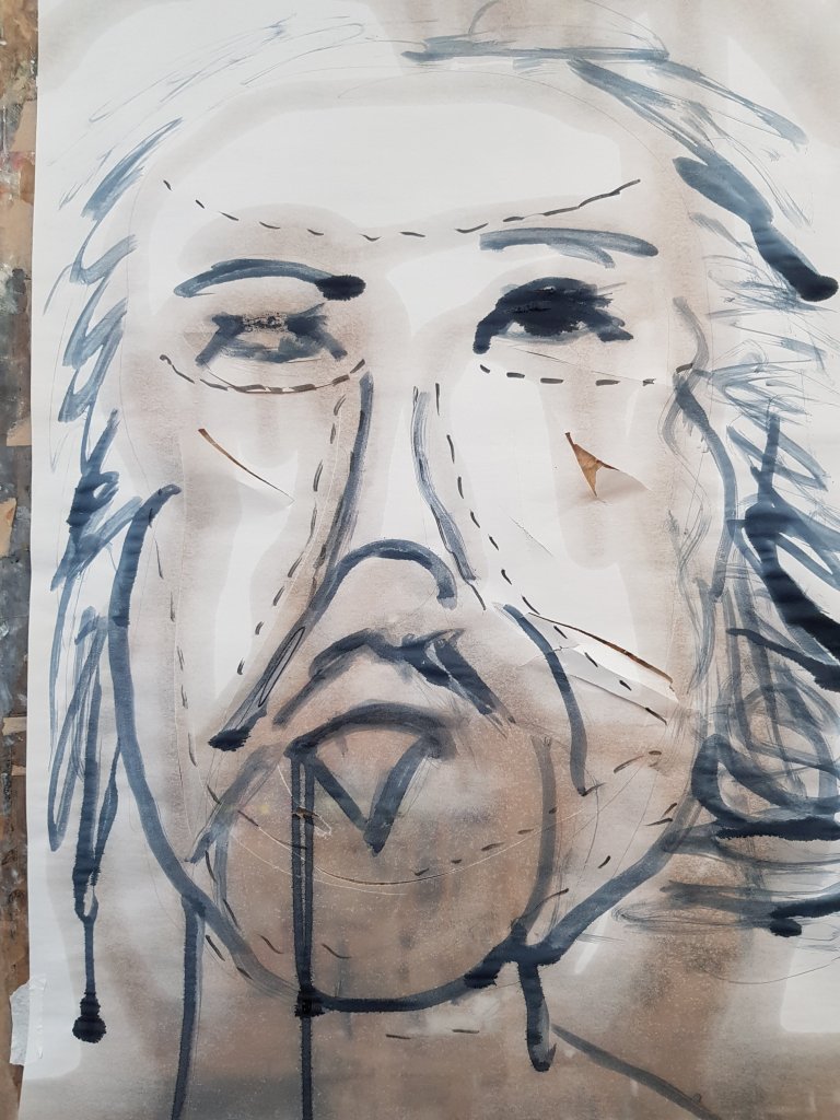
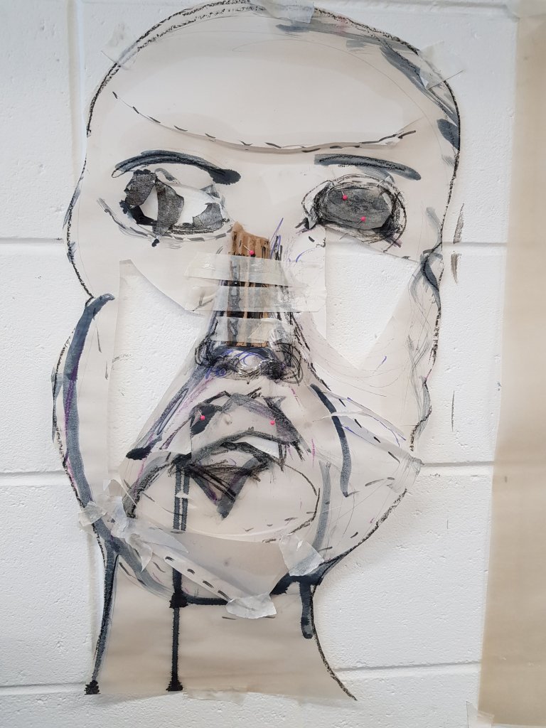
I started looking at replacing the features of the face with cut outs form magazines to show the commercial element of plastic surgery and how people are influenced by it.I used red in the background of the original image as symbolism for danger/warning.
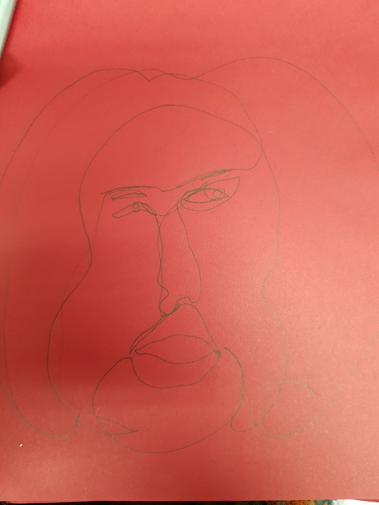
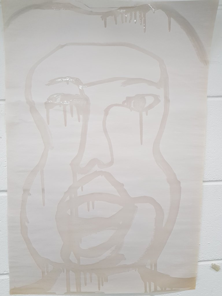
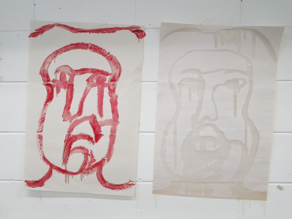
I then started to focus on the continous line drawing I had drawn of Hang Mioko.How could i develop this further?I decided to use cooking oil to paint continous line pictures of her.I found it very interesting the way the oil slowly seeped into the newsprint paper and made it become transparent.
I used this piece by Jonathan Yeo to influence my performance art piece.By using the incisions lines around the eyes to suggest where to cut.I like the mixed media appeal to this painting.
I think the next stage is to start injecting oil into different items to see how it reacts and doccumenting this.
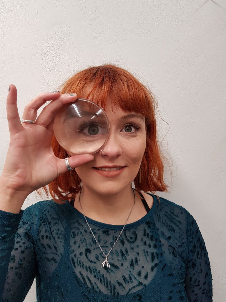
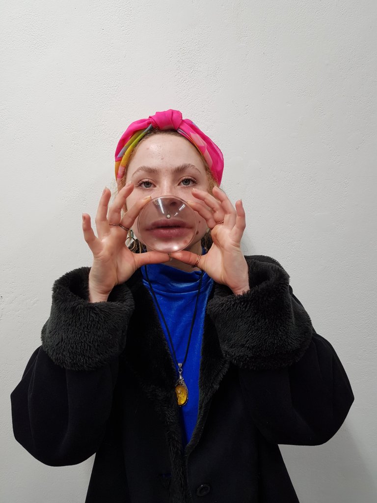
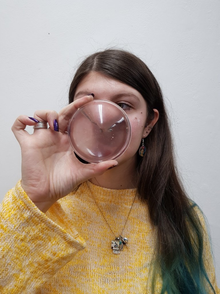
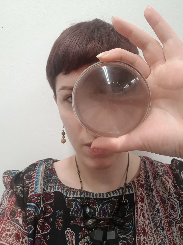
‘Under the lense’ Looking at different elements of the face under a magnifying glass in the same way someone with body dismorphia might.And Also from the point of view of a surgeon.
I think i want to experiment with some more photography/performance art pieces involving the surgeon and patient and play around with the control aspect.
After my one to one i was advised to prehaps veer away from the use of orange peel as a media and focus on using more varying media so that i have more that i can develop from.She mentioned that my research didn’t link very well with the work i had done either so i started to look at vintage adverts from the 1950’s promoting skincare and modern day adverts and what the slogans are/were was there many differences?
I also remembered my mum saying that once you got to 50 people don’t see you anymore and you just become ‘invisable’ i spoke to different people int he class for their opinion and to other older women that i knew and that point of viewed differed depending on that women’s confidence and attitude towards life one woman saying that ‘life was too short to care of what people thought’ and another woman saying that she felt it was a cultural thing because the brittish and americans don’t respect there elderly which is shown by putting them into care homes.I also watched a bbc interview with some online ‘influencers’ over the age of 70.One comment that stood out for me was one of the women saying ‘if you don’t live your life and try to stand out then you become ‘invisable’.
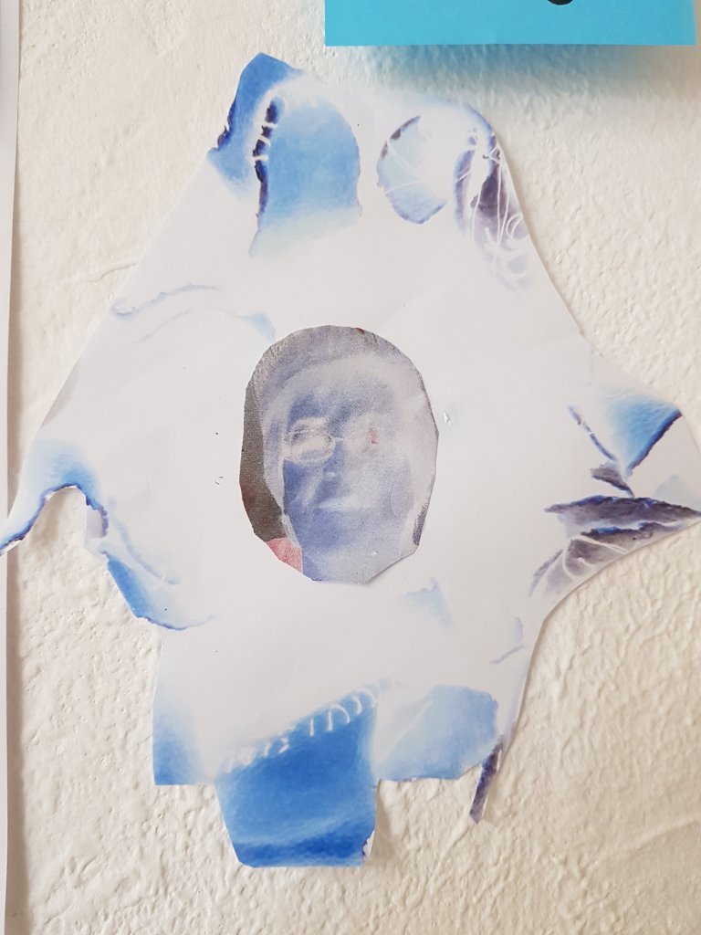
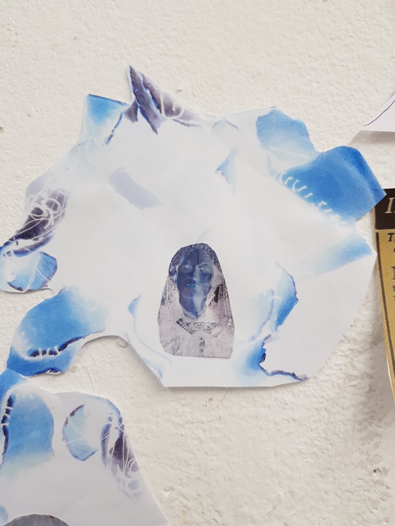
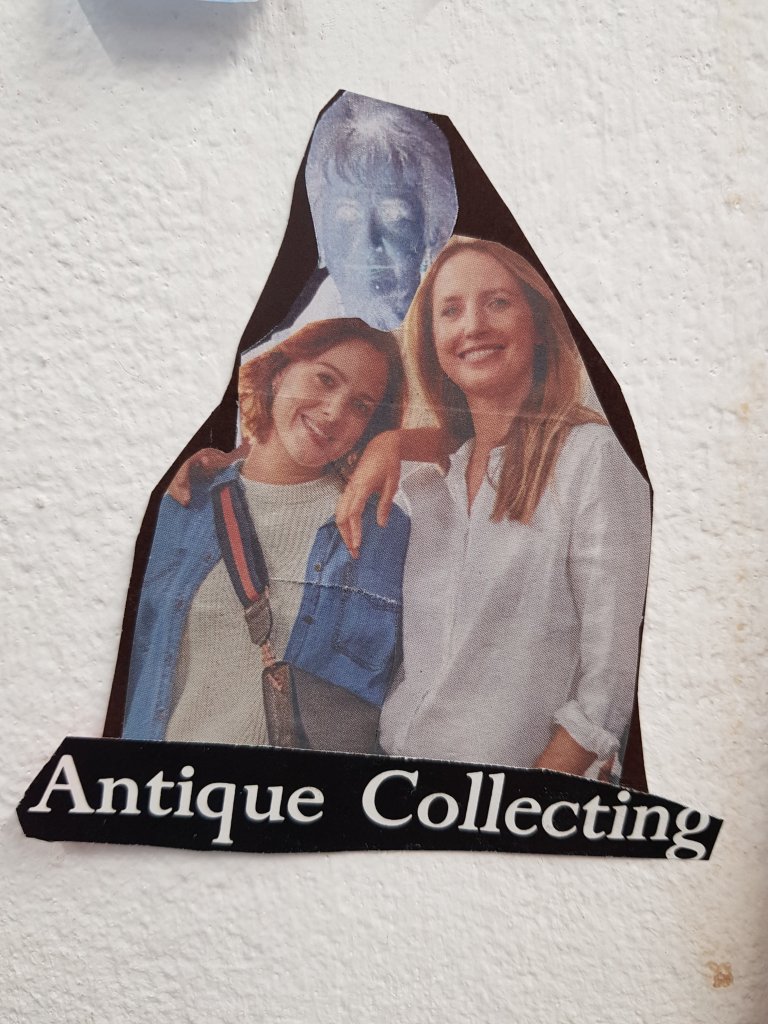
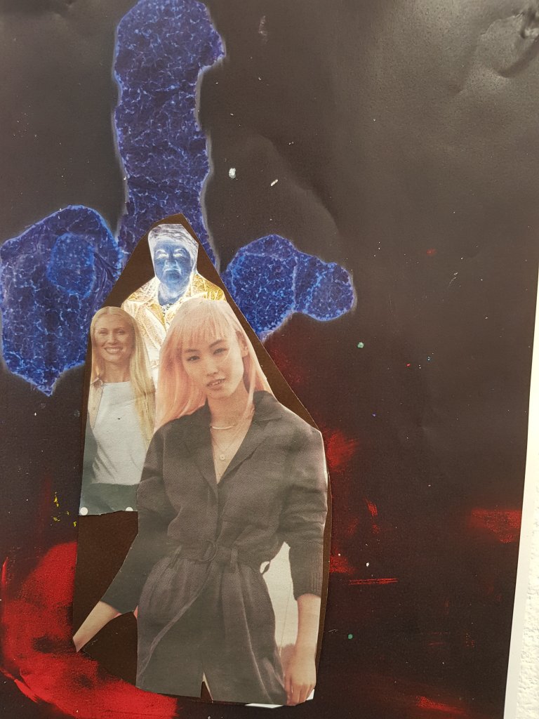
The word invisable started to stand out for me so I started to look at way’s i could make elderly women look invisable and realised when using collage as a medium that elderly women were invisable in the press!I found a totaly of 4 pictures of women i would think to be over the age of 50 in comparison to the overwhelming amount of women age 40 and under.If the media act like this age range doesn’t exsist then that has a huge effect on the viewer.
I didn’t really mind using the orange peel as much in these pieces as i feel that it has transended away from it’s original form using the photocopier and in the first couple of images it frames the image but also gives a feeling of stitches/surgery.
In the image of the woman and the half human/half dog I wanted to examine how a lot of homeless people aren’t allowed to have accommodation due to having a dog but are offered dogs by adoption charity’s in order to keep them company on the streets.Having a dog is often detrimental to a lot of homeless peoples physical and mental well being.
I also wanted to explore more abstract forms and continue with the void/space like theme mixed in with capitalism.
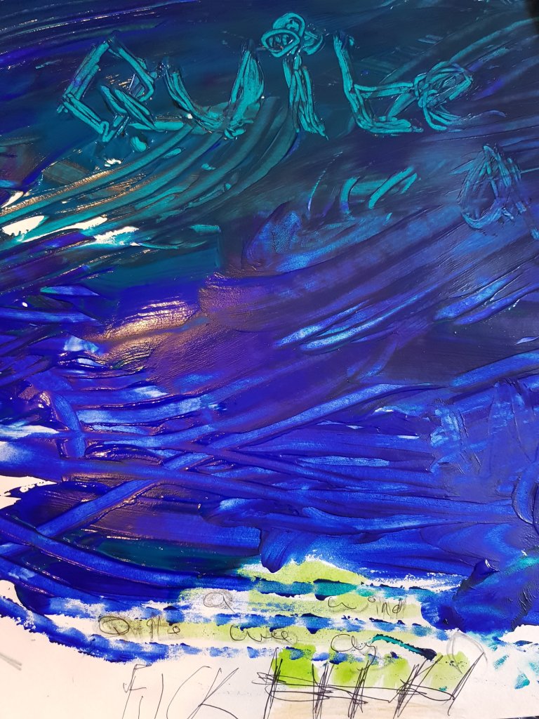
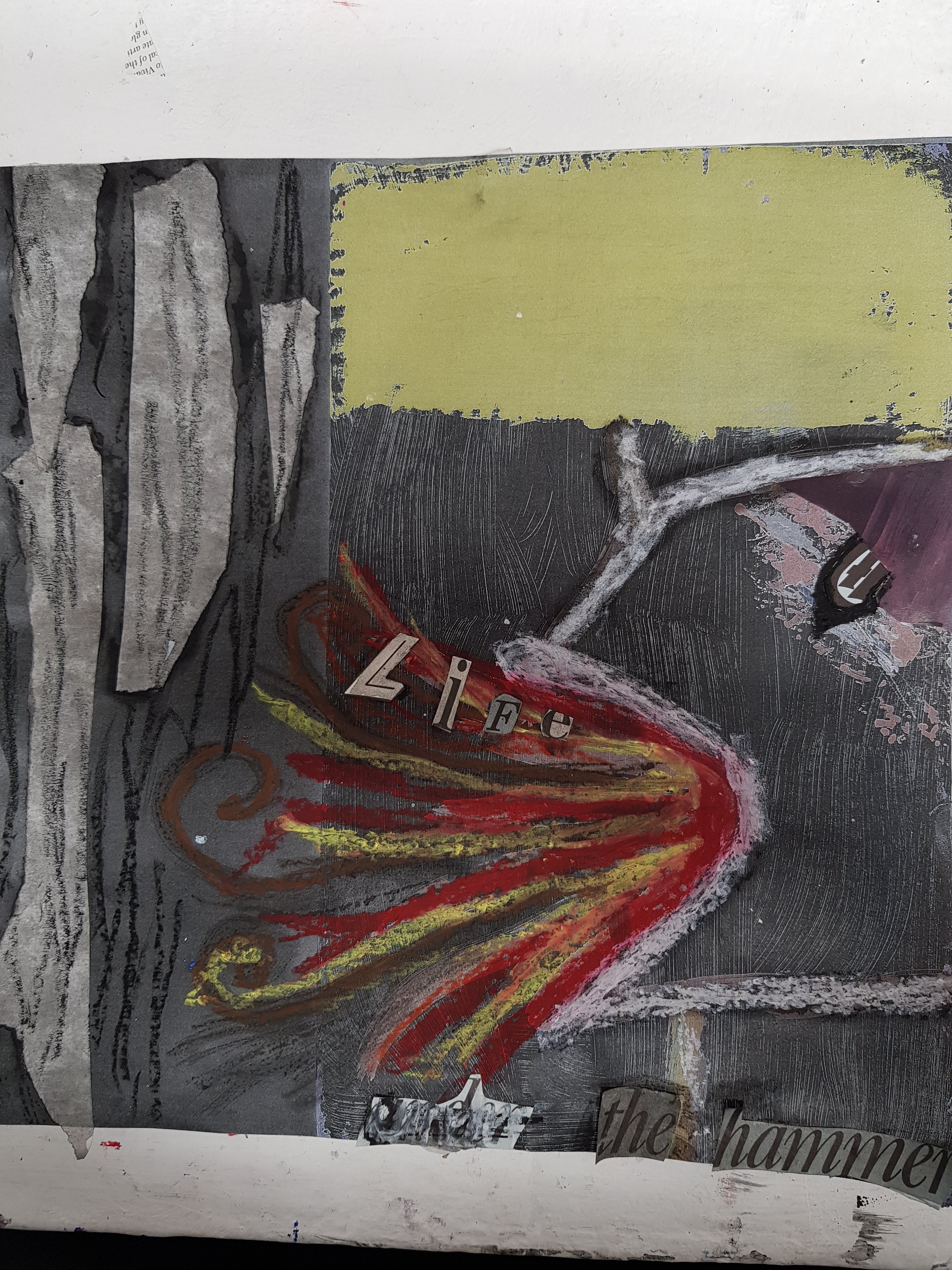
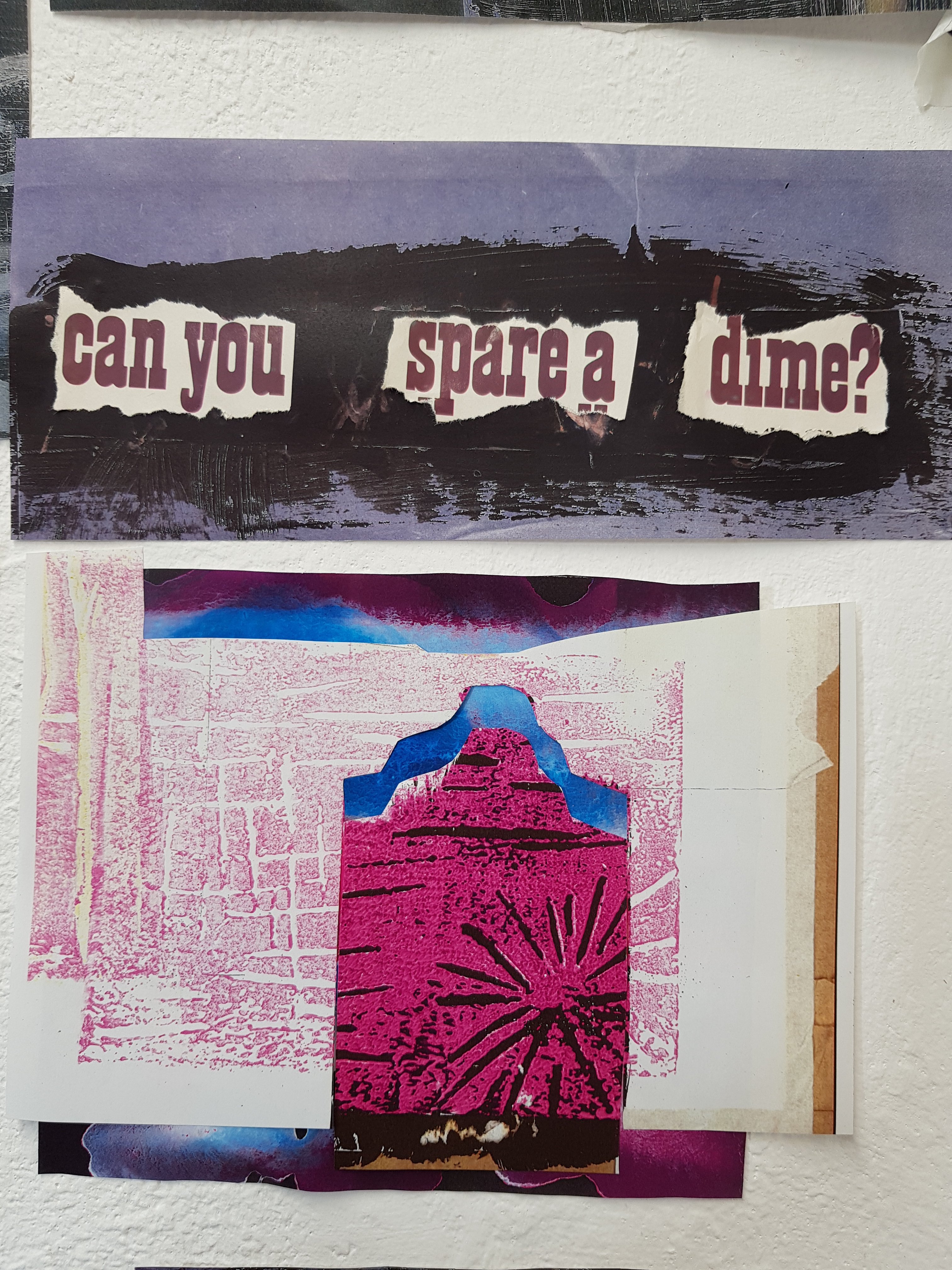
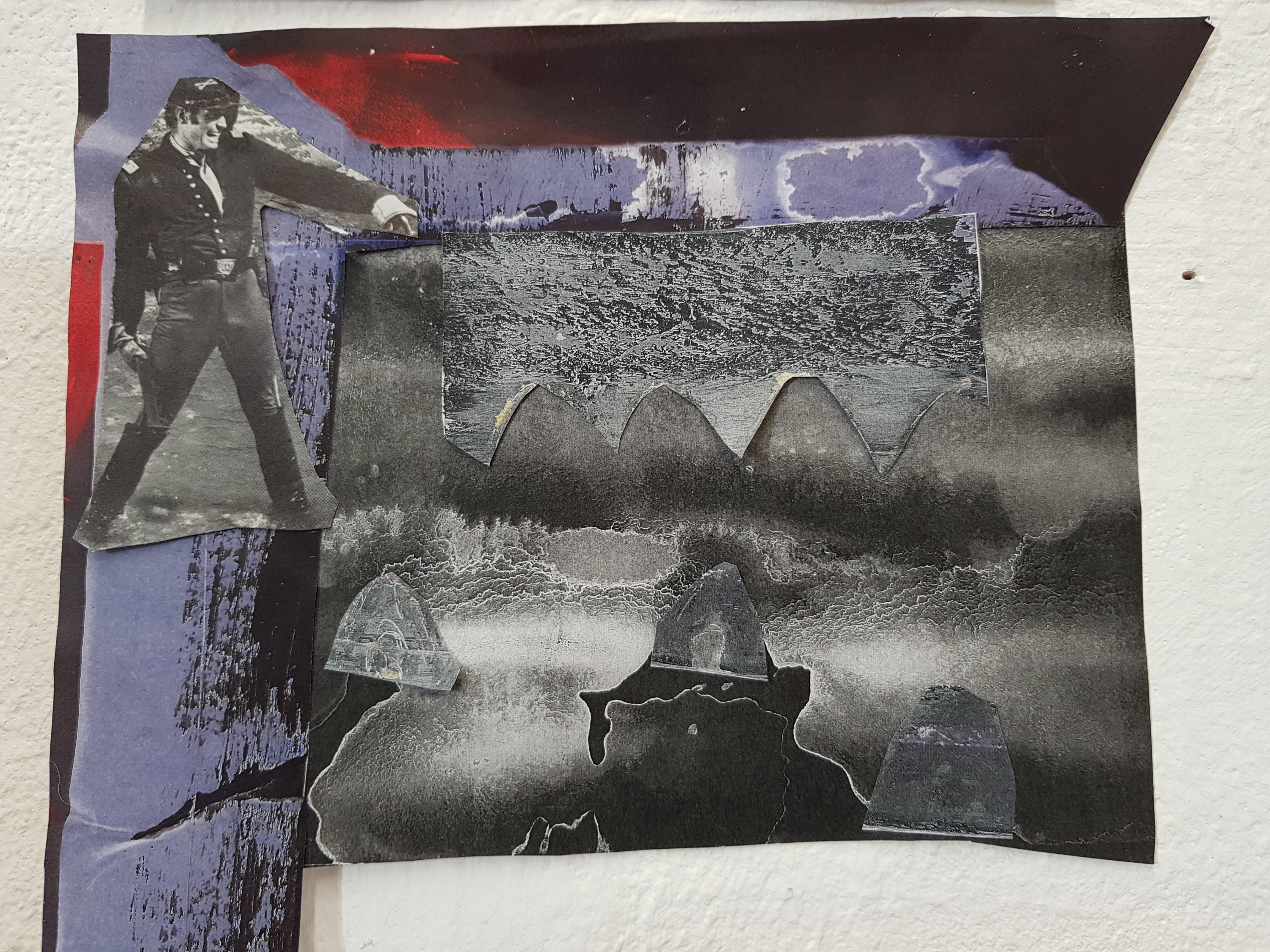
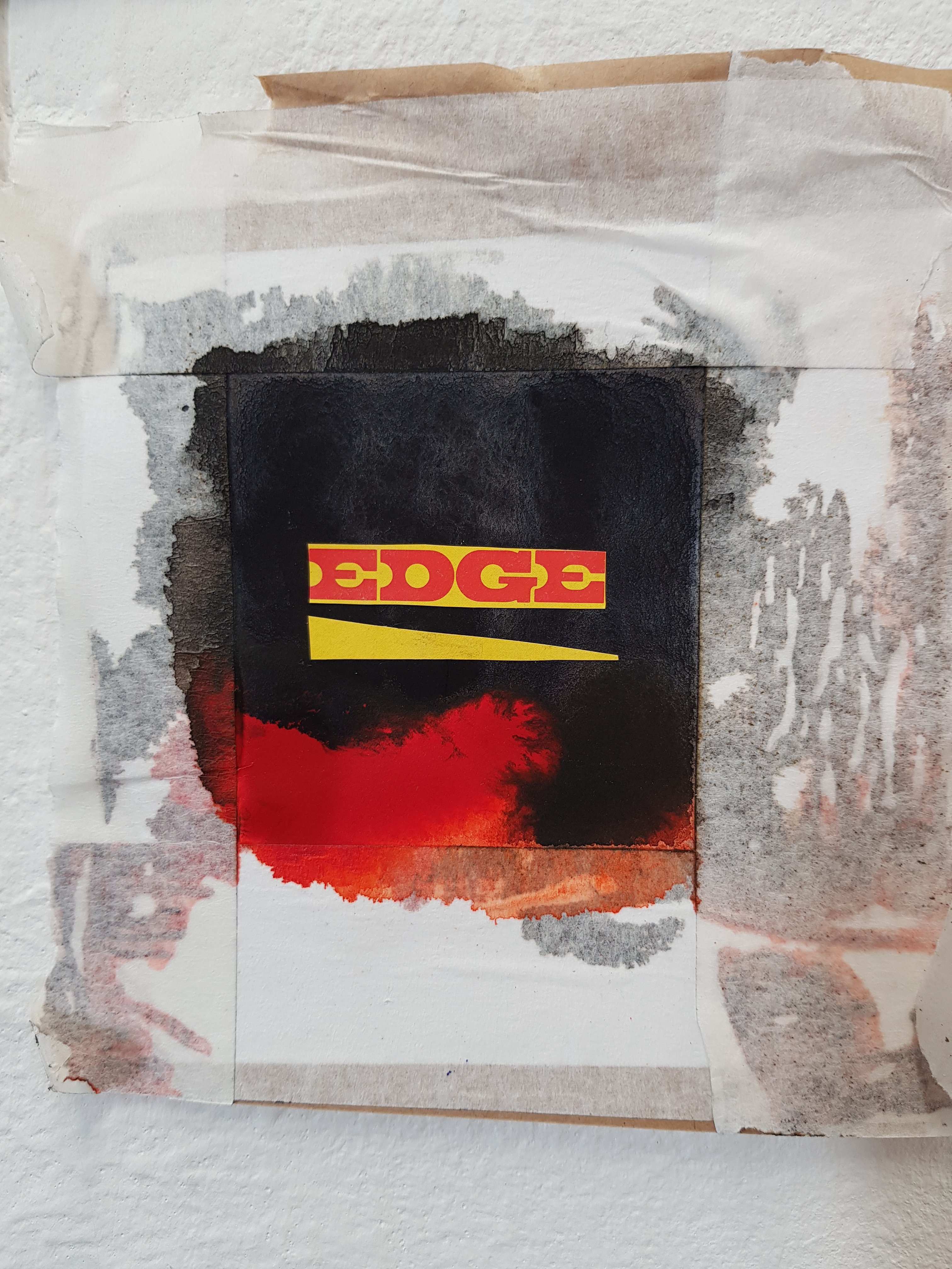
Some collages I have been working on exploring the theme of ‘eviction’ and the void that comes from that in terms of feelings/emotion and that person having a place in society.
I also explored capitalism and the effect that has on homlessness.
I was lucky enough to discover some old magazines which worked well with my project and contrasted nicely against newer images from newspapers/magazines. I used images I had photocopied from paintings and worked on top of those as it was good to see the transition and development of these particular pieces.
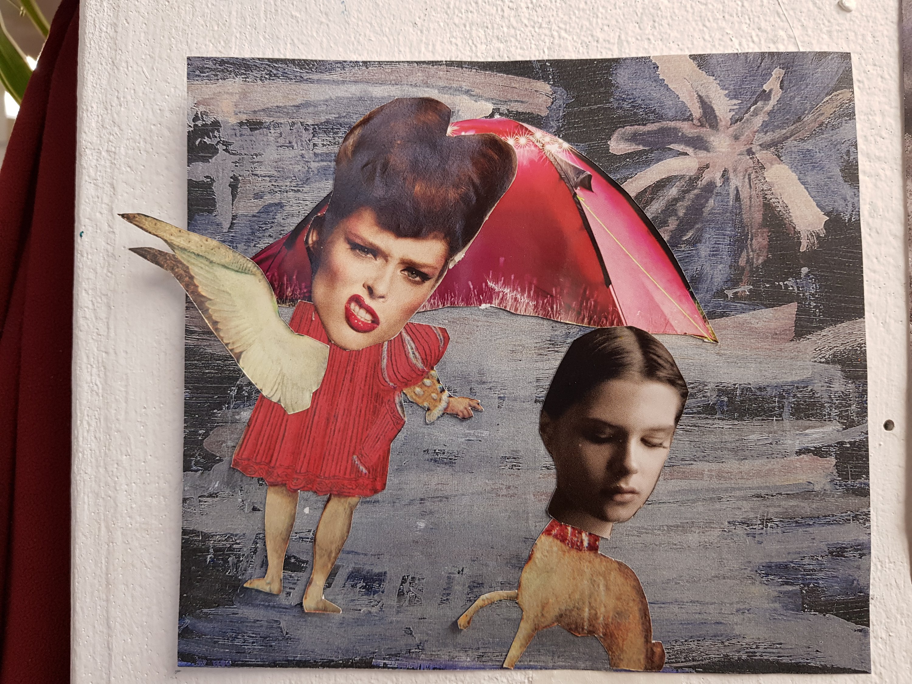
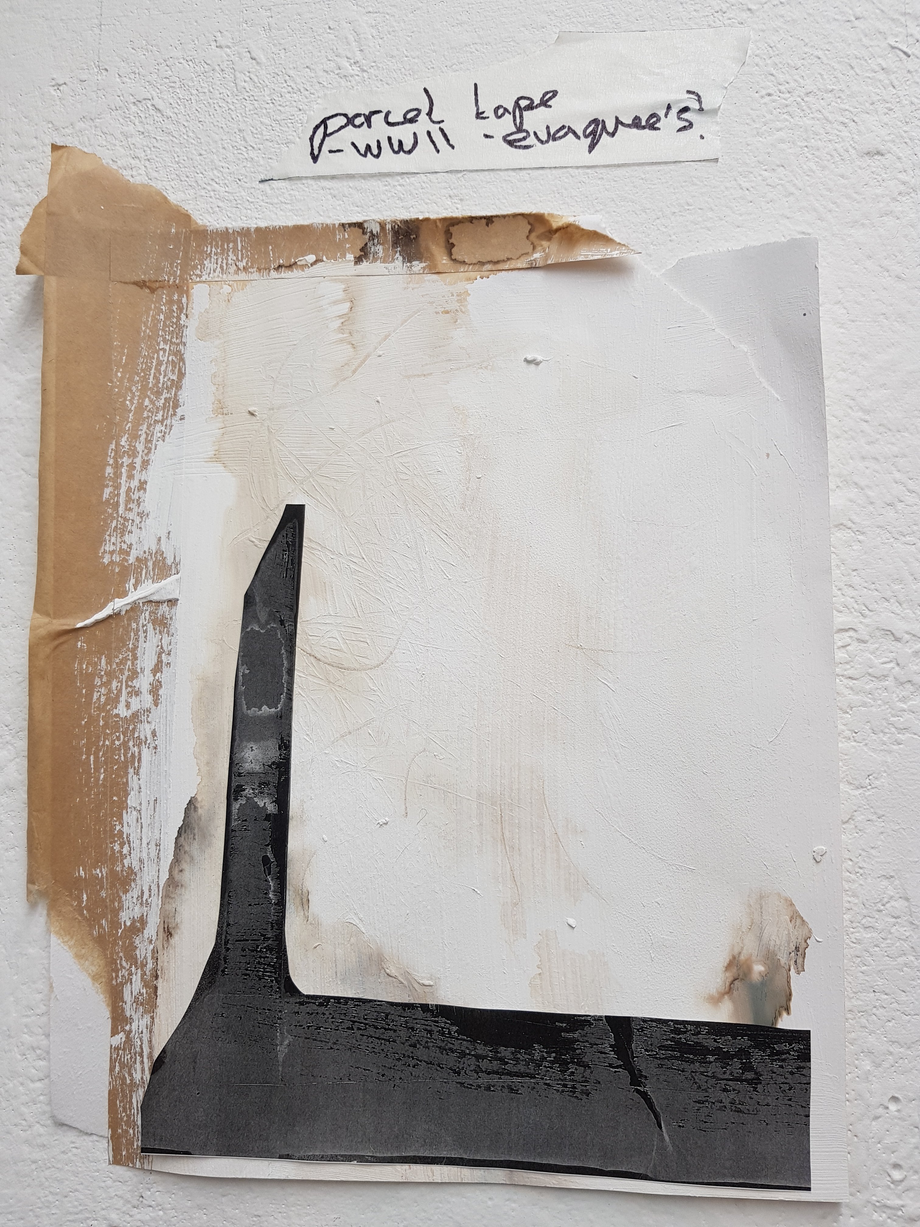
Today i experimented further with mixed media,I questioned things such as what is a home?I also thought about the control and power a landlord/council have to be able to make someone leave somewhere they consider home all of a sudden and the feeling that comes with that which i displayed using an array of blues/blacks and browns and seeping black ink into tissue/masking tape to show how mental illness slowly takes over.I aso used the image of a tent wich i first discovered from a newspaper article during the day today project in the first week along with drawing the imageof one if the parcels i made in week two which represents people being sent away.I also think more care is taken of parcels then human beings.
I found my collage to be the most sucessful piece but also the most colourful.I’m not sure if these are the right colours for this theme and may try to create something similar using more muted colours.
I also think the photocopied ‘postive to negative’ prints worked out pretty well but i still need to explore other options on the photocopier.
I also thought about how the homeless are considered as invisable and kind of washed out by society by white washing over tissue etc.


:max_bytes(150000):strip_icc()/scarecrow-825431640-5a1f2c5d89eacc0037061278.jpg)