Third year week 4:The birth of the covid Monster.

I felt that a bedsheet was the most fitting for the covid monster because if it was gonna spring up from anywhere it would be your bed!Especially as you spend the most time in it whilst ill.

Dylon dilueted in water and salt.The colour turned out much better then expected and esactly what I wanted considering the dye sachet was only meant for a small amount of material equal to that of a shirt.

I used a mixture of pva and olive green paint in order to gloop it onto the bedsheet and make it seem as realistic as possible giving the effect of snot/mucus.

Using the plasma cutter in Welding I cut out the shape of the ripe sternum using the card maquette that I had made previously (something i do which helps me work out the size and how things will work/not work.I had drawn out the outfit but it wasn’t untill I tried ti on in realisty that I realised it could easily be mistaken for a hijab which ofcourse I didn’t want.It made sense that the ribsternum needed to be detached from the headband as it was the headband and the colour grey that as making the outfit look most like a hijab and that the rib sternum should be made into a necklace to sit where the ribs are.

The theory behind the plague Doctor outfit was that it would ‘isolate’ the doctor meaning that they wouldn’t get contaminated.Much like the modern day PPE.I wanted one of the eyes to give resemble one of the plague dr goggles/gasmask.
I wanted the covid moster to resemble almost that of a scooby doo villian in terms of it’s mischieviousness but with a more sinister intent.
Same of the scariest masks are some from the victorian era,outfits would most commonly be made using ‘crepe’ paper (something which was new to that era and everyone was very excited about) masks were however made using paper mache,fabric and paint all of this left terrifying results!I wanted the covid monster to be infuenced by the simplicity of outfits like these almost with a mixture of a ‘bedsheet ghost’
simple yet sinister
Amazingly sad movie but I love the fact that altho the outfit was just a bit sheet the meaning was so much more then that.

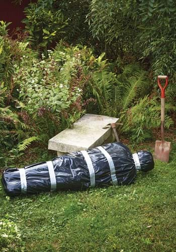
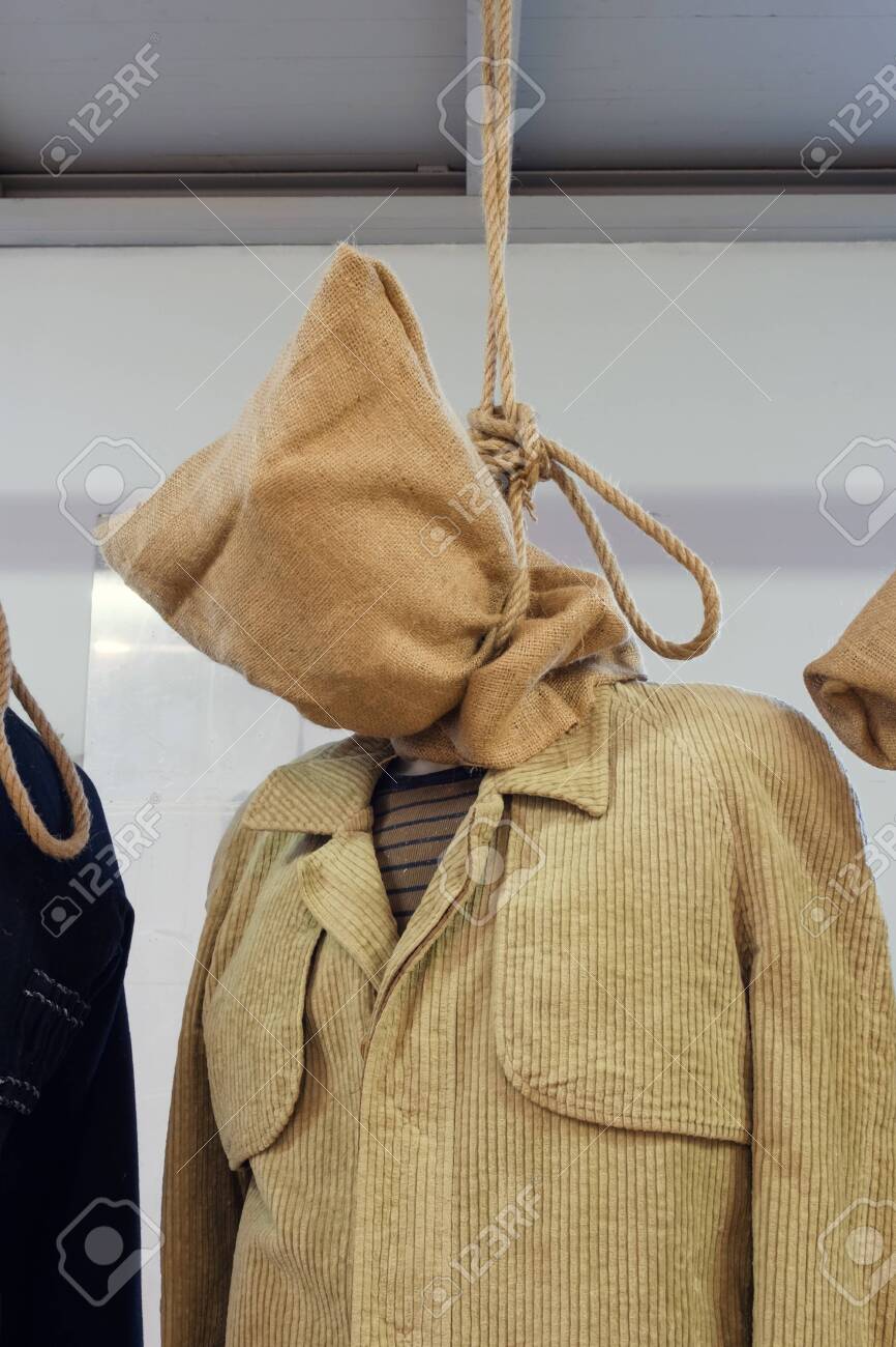
I decided to attach the positive covid test first using super glue and then by stitching them on and adding the positive symbol in the middle of the ‘eye’ and then adding the pva and ink gloob to the other eye area.The necklace then gave great shape to the head and the shape of the rest of the gown had a rather formed yet high fashion shape to it the fitted ends of the sheet giving great shape to the arms.It resembled a body bag tho but also the hood used before someone is hanged.I hoped that the body bag shape wouldn’t cause offense to anyone who’s family member had died due to covid as that isn’t what i have intended.

The hooded head reminded me of a hang mans sack.
‘Pirates’ was a show I watches as a child and the top right character who allways remained in a sack reminded me of the covid monster.As I child I forever wondered who was in the sack which I want the audience to do with covid also.

A mixture of pva,ink and olive green paint left int he plastic pot from pouring onto the sheet turned out to make a perfect eye!

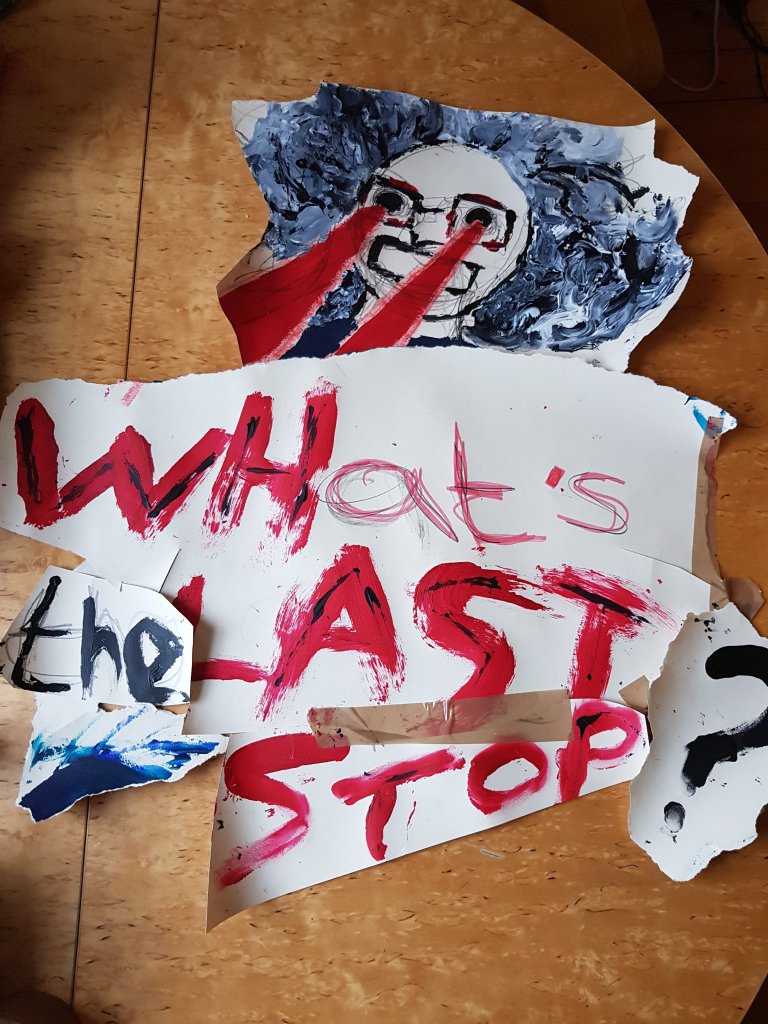
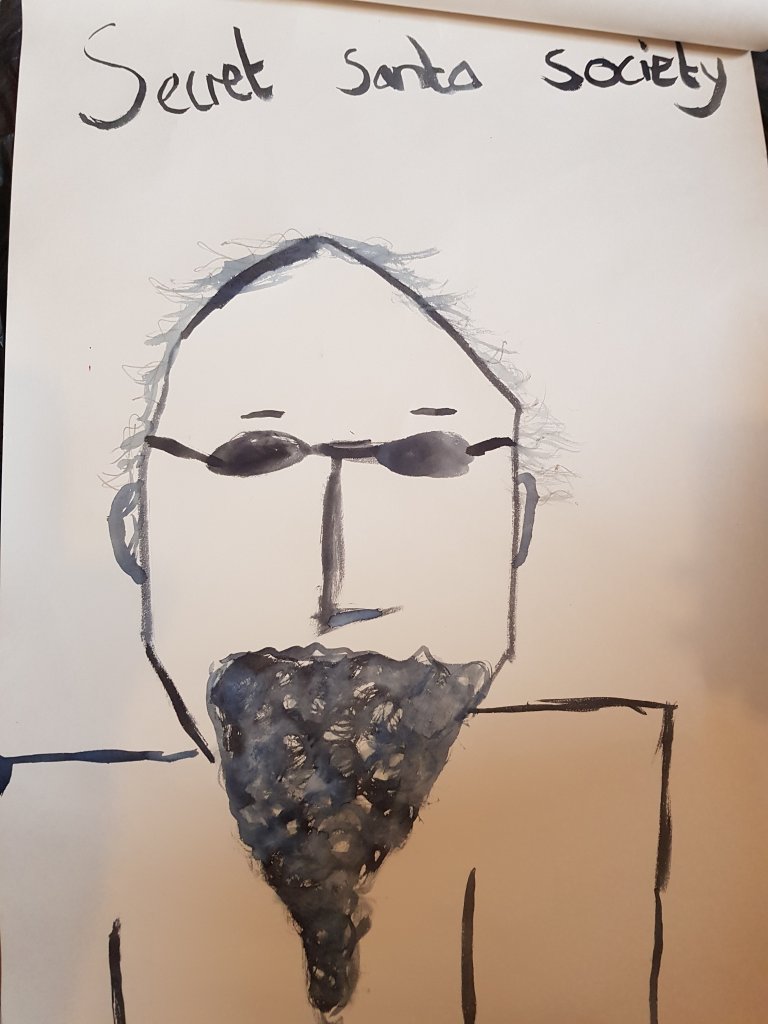
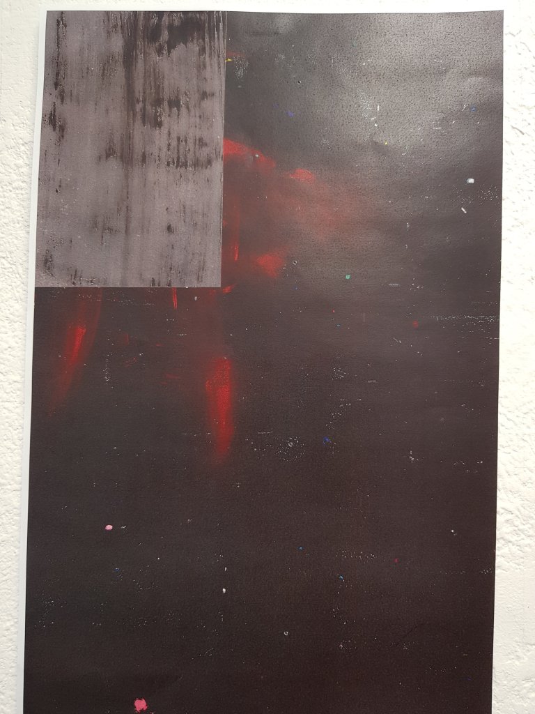
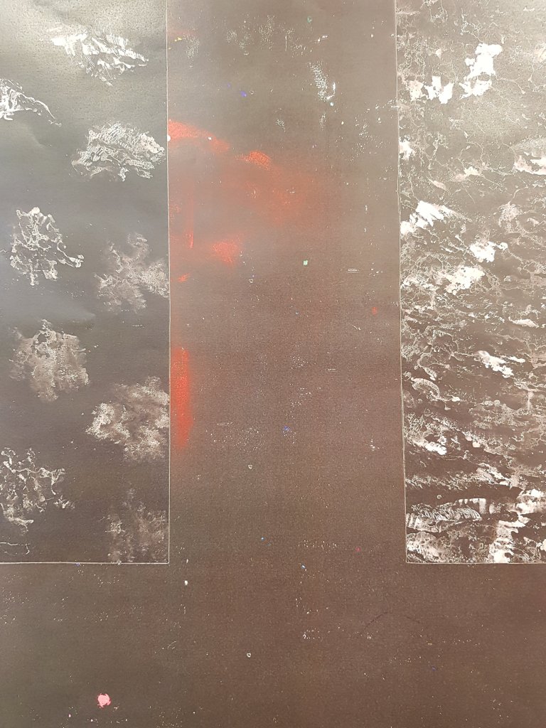
A poster I made and put up in the corridoor in order to see what people would respond.The respose wasn’t as interesting as I thought it would be.I think I will mayb put more up around the uni and see what happens.

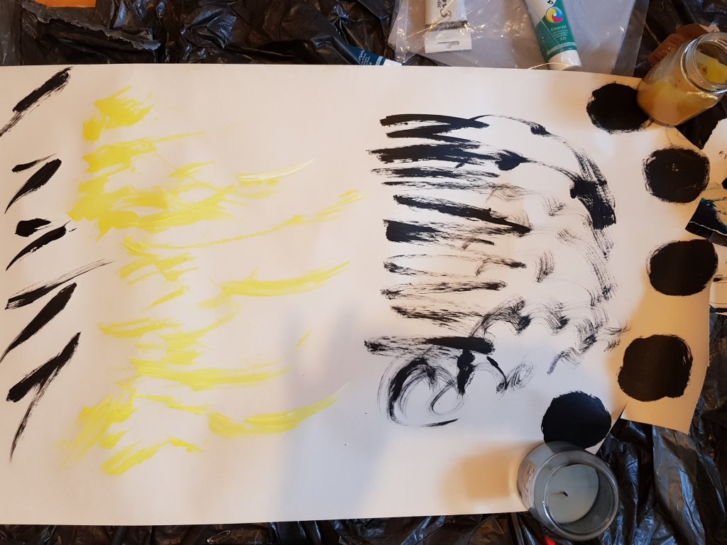
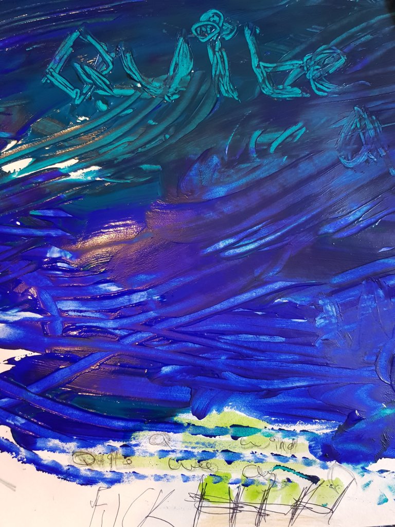
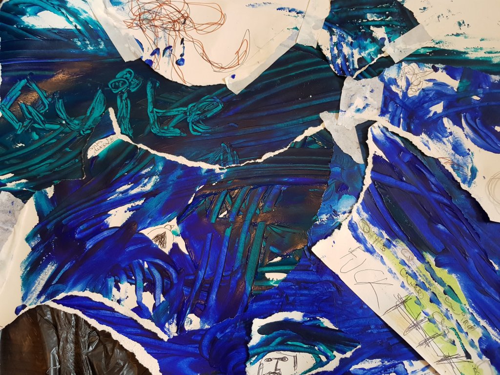
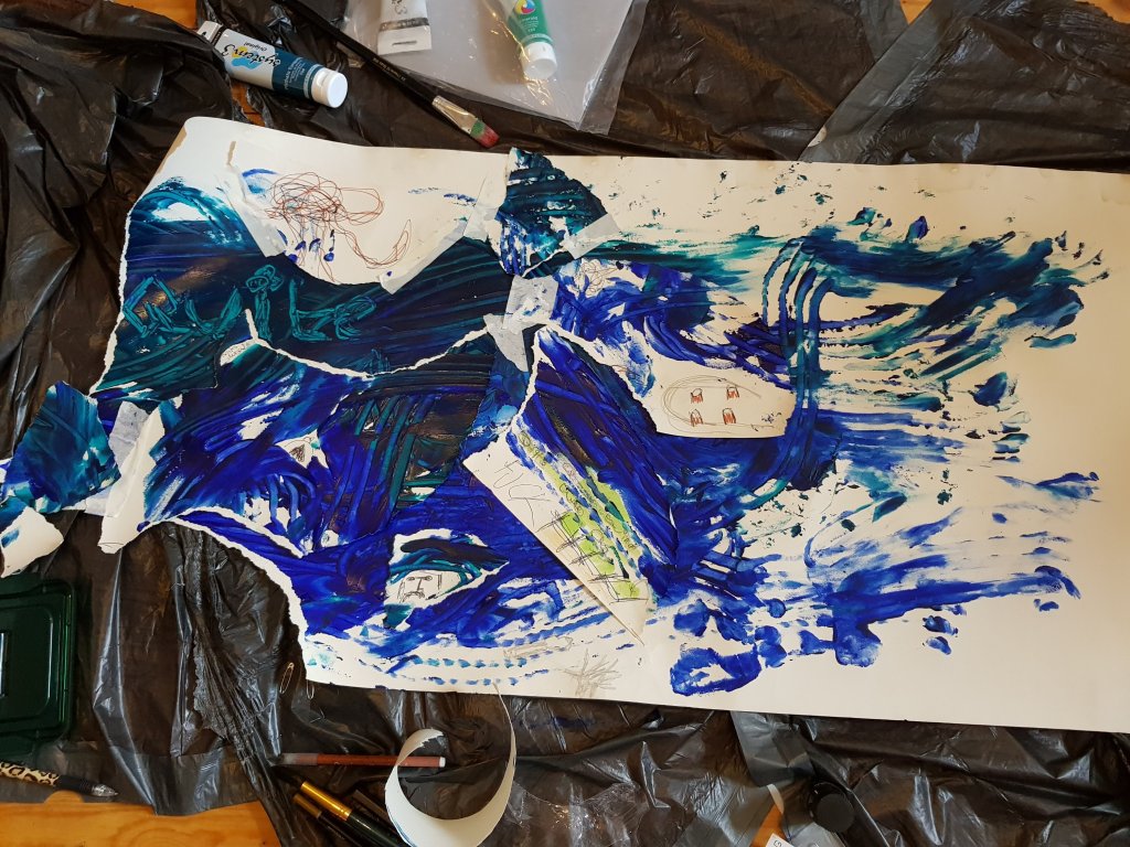
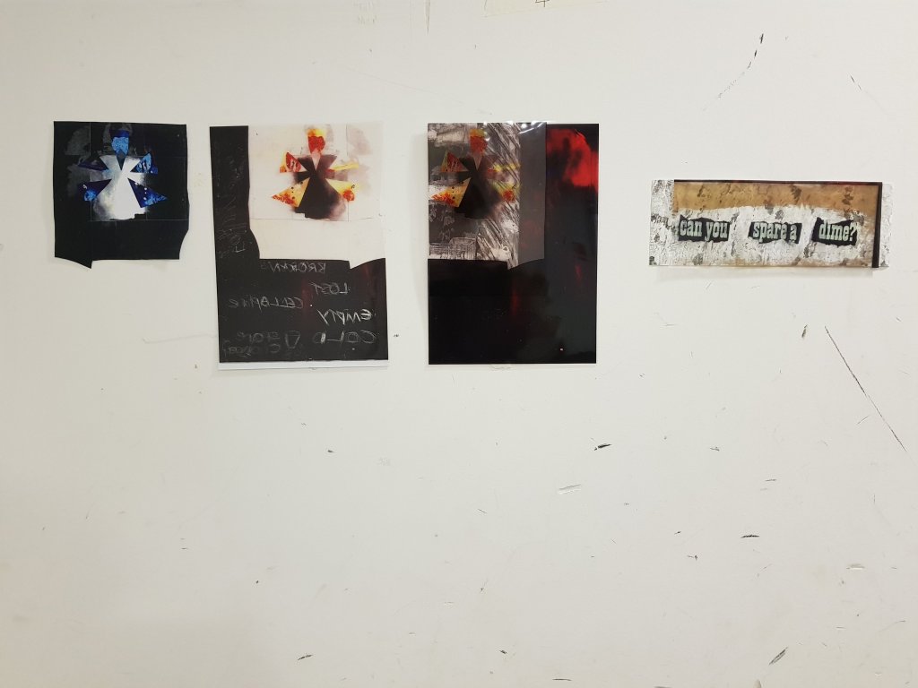
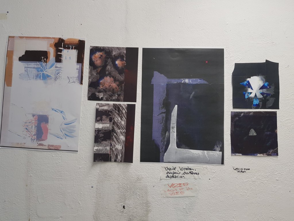
On the left a collage piece aiming to resemble the gloom of the covid monsters.I find this to be quite an effective way of resembling it.

On the right is a page from the book ‘A brief history of the dance of death’ by Ian Breakwell.I think I would like to overlap the faces of thoose who have had covid with the covid monster.After speaking to a tutor who knew the artist himself he said that most of his work was actually done on the photocopier which is something I used to be really keen on years and years ago.

Week 3 Another derive and mixed media work.

I decided to go on another derive with my partner as I felt like we needed a walk in general and because walks and fresh air often help our creative process otherwise our creativity becomes stagment.

It was an incredibly windy day especially down by the pier.I noticed a couple of things I hadn’t noticed before and tried to capture some sounds but due to the wind it was really hard to pick them up.I think once we move to dundee and are able to have access to DJCAD I will try to access DSLR equitement and attach a microphone with a windshield to my phone.

I also started to look at the sea and think of a physical gesture that would best represent the movement of the sea.

https://drive.google.com/file/d/1aXBzgCGLzjCTkoyYxUWd0aM9XZM8xmAz/view?usp=sharing

https://drive.google.com/file/d/1aT-0Ec_c_nZ7Cs77zSGgHuR0vFzo0ZK5/view?usp=sharing

https://drive.google.com/file/d/1aPFXVPpD6hoft9XBrJtFCt57lTNlpAu6/view?usp=sharing

https://drive.google.com/file/d/1aIAsozU-qych5F-0QZUL7XpfWLGsNf2e/view?usp=sharing

https://drive.google.com/file/d/1aH-U8HOT6KVIgKQ8oNbF1gyKLVR4QuHO/view?usp=sharing

https://drive.google.com/file/d/1aSZHGX7ieEOMsHP4GjVcMA4DxJ-ICkp9/view?usp=sharing

https://drive.google.com/file/d/1aEaO24ZS67b-FIpiseEKi0loCpSDMszr/view?usp=sharing

https://drive.google.com/file/d/1aFcWO3lXQICpFKlDVPjKc57Q5AEnZe6k/view?usp=sharing

https://drive.google.com/file/d/1aCEMUfJxQ-1k5TxkxAFklg_dTDuOJaGR/view?usp=sharing

https://drive.google.com/file/d/1aCUK3SHoQujYSeebV8Zn8etS4QHNTWXf/view?usp=sharing

https://drive.google.com/file/d/1a14Afocc1CocJLj7HzVr39IR7xQJH2GI/view?usp=sharing

https://drive.google.com/file/d/1a4rHKCArhlmRixWj_zDflOFNNvi7WnKv/view?usp=sharing

Some gestural marks made whilst listening to one of the videos with crow noises in it.The marks remind me of chinese characters and words.The yellow was the sweet sound of the sparrows,the loose black marks are the hum drum of the schoolchildren making there way past us.I found there conversations quite interesting (little bits you may be able to hear) such as ‘my phone is bigger then yours’ and something about the year 11s.I found the bragging quite interesting as this is usually something children mimick from their parents.

Gestural marks that i made using the same flowing gestural movements that are featured in one of the videos above.I feel that the mixed blues looked much better once I had deconstructed the painting and put it back together again as the illustrations created a map like effected within the ocean of blue and represented the characters and things i noticed on my walk.The use of gestural marks towards the end of the painting i feel were more effective then the mixed blues as you could see them more clearly and I felt that they captured the performative aspect much better and gave the impression of the flow and the crash of the sea.I think I would like to try making some more of thoose marks on paper and add some more illustrations to it.

Pic no2 is the ‘It’s a wee bit windy ay?’ character that we occured talking to his friend.

And a man I decided was in the ‘secret santa society’ walking along by the pier.He had quite the undercover look about him.

I feel like i have taken the oppertunity of the derive to make the most of the local characters in the area and giving them back stories. Aswell as paying attention to the noises and visuals around me and making marks and performative pieces to co-incide with that.I’m currently moving flat and don’t have access to the studio so I would like to of spent more time working on a large scale and focusing on the perfromative side of things but I haven’t had the chance.I will obviously be looking to focus more on that next week once we have moved up.

2D Project evaluation/Group Crit

Work I selected and decided to feature on the gallery wall.

We decided to use the new gallery space within the college in which to feature our work.I had alot of resolved pieces that i was torn between but didn’t want to hang them all up.Looking back I realise that i should maybe of asked members of the class which were my strongest pieces before hanging them.For some reason I also thought that only your more recent pieces could/should be hung.The tutor reminded me that this is not the case.As alot of the class believed my earlier abstract shapes within space worked better and were alot stronger and had more potential to move forward into other medias such as digital animation.This is an idea I have allready considered and plan to use noise with it such as the scraping noise of a brick against concrete with it. It was recomended that prehaps I look at some Russian animation by the tutor.

Workshops : Working with collage,I felt that it allowed me to process a lot of ideas in a short space of time and alltho collage did not end up being a part of my final piece i felt that the development helped my thought process.Working with mixed media has always been a strength of mine but using the photocopier to produce different versions of the images I had created definitely added strength to my work as a whole and helped towards more of a resolved piece.

Altho my screenprint was strong I tended to apply too much paint when working on lino/mono prints so the image wasn’t particularly crisp but there was a couple of ‘happy accidents’ where the paint had created marks which looked intended.Emulsion on wood/paper I found effective but I struggle to stick to just paint without involving other media.

Development I found that the best way to develop and refine my ideas was to look at what had been working and what wasn’t. Collage was successful in producing ideas but it was straying too far away from my theme and did not have the minimalist ‘void’ approach I was looking for.My minimalistic mixed media/experimental paint approaches seemed to work the best so I decided to create as many different experiments as possible before photocopying the images and reversing the colours.I think finding out what works best and creating many paint/mixed media experiments worked to my advantage.

Outcomes My best outcomes came from the most minimalistic and perhaps less considered (to a certain extent) approaches.Such as my paint experiments/mixed media photocopied pieces. Worst outcomes was definitely working with lino/mono print but I think this comes with refining the technique.

Time Management: I felt that my time was managed effectively throughout each workshop and when working towards my final pieces.But I felt that I should have spent more time editing and selecting my final piece and perhaps should of asked my peers opinion in order to help develop my own.I think this has been a learning curb and will remind me in the 3D project to take a more considered approach when it comes to the final selection process

Questions that were brought up during the crit was whether I would think about furthering the typography as it seems to of worked well.I agreed with this and also the fact that the backwards writing worked well with the acetate and that maybe I should think about taking it further later on in the project.

Was asked about whether I had used printmaking and whether I had considered prehaps using this more.My reply was that I didn’t like the texture of printmaking because it didn’t photocopy very well and looked quite grainy.I was looking for a smoother effect in order to keep the illusion of ‘the void’.

Alot of people agreed that using the acetate was a good idea as it greated nice shapes and that it was evident that I had looked at early work and progressed it.

Reflecting back I feel that the group crit was pretty sucessful as I was able to identify how the project should move forward.I think i need to think alot more about the strengths and weaknesses within my work so that I am better enabled to identify which pieces are the strongest when it comes to the editing process when hanging final pieces.

Evaluation of current work

After a discussion with my tutor,we tried to look at what direction my work was going in and which direction I wanted to take it in.

Altho aesthetically I liked my collage work I felt like it was too ‘busy’ and did not reflect the core of my subject.I decided that it was time to refocus on ‘the void’.Advised by my tutor I took down all my collage work from my studio wall and moved it to my other wall so that I could still reference it if need be.

Reflecting back on my work I also realised that the more minalmalistic work worked better and the darker tones.Since my usual style is anything but minalmalistic and full of contrasting colours I decided it would be good to challenge myself.

The work I decided to focus on was my mixed media photocopied work.I intend to make a series of developed works focusing on this feeling of ‘void’ but continuing to use emulsion paint and ink aswell as abstract shapes.I want to focus on different tones of dark and light and experiment with the use of it.I like the kind of ‘heavenly’ glow that appears from the darkness in my photocopied piece of the ink with blue triangles.I also aim to work on a variety of different scales.Ideally I would like to work on a very large scale but I don’t think this would be very realistic due to the timescale.And does it really need to be large in order to create a feeling of being in some kind of void?There is also the possibility that I focus all my time souly on that one piece and it doesn’t give me the desired effect in comparison to the variety of works I could produce working on smaller pieces.

A couple of minmalistic works I have looked at for inspiration are:

https://images.app.goo.gl/MrXULEZbJy6JVPCR9

I felt that suprematism fit in perfectly with my work as the abstract shapes used in Malevich’s work often have a feeling that they are floating .

https://images.app.goo.gl/2Q8fFHqTjk1ANmQ4A

Black square also fits in well with the black forboding backgrounds giving the spac elike appeal.I really like the texture that black square has.

Donald Judd Unititled 1972
Altho this is a 3D piece there is still a feeling of ‘void’ about it.A kind of ‘Is it empty is it full?’ question I feel is raised when you see it in a photographic form.I want my piece to be minimal but evoke a feeling of emotion from the audience.
Carl Andre-Magnesium Square. I like the different tones of the squares and the way they reflect in the light.
Dan Flavin ‘Momnument’ This piece reminds me of my ink piece with the light coming through.I also like the use of the oblong shapes creating a feeling of movement within the darkness.